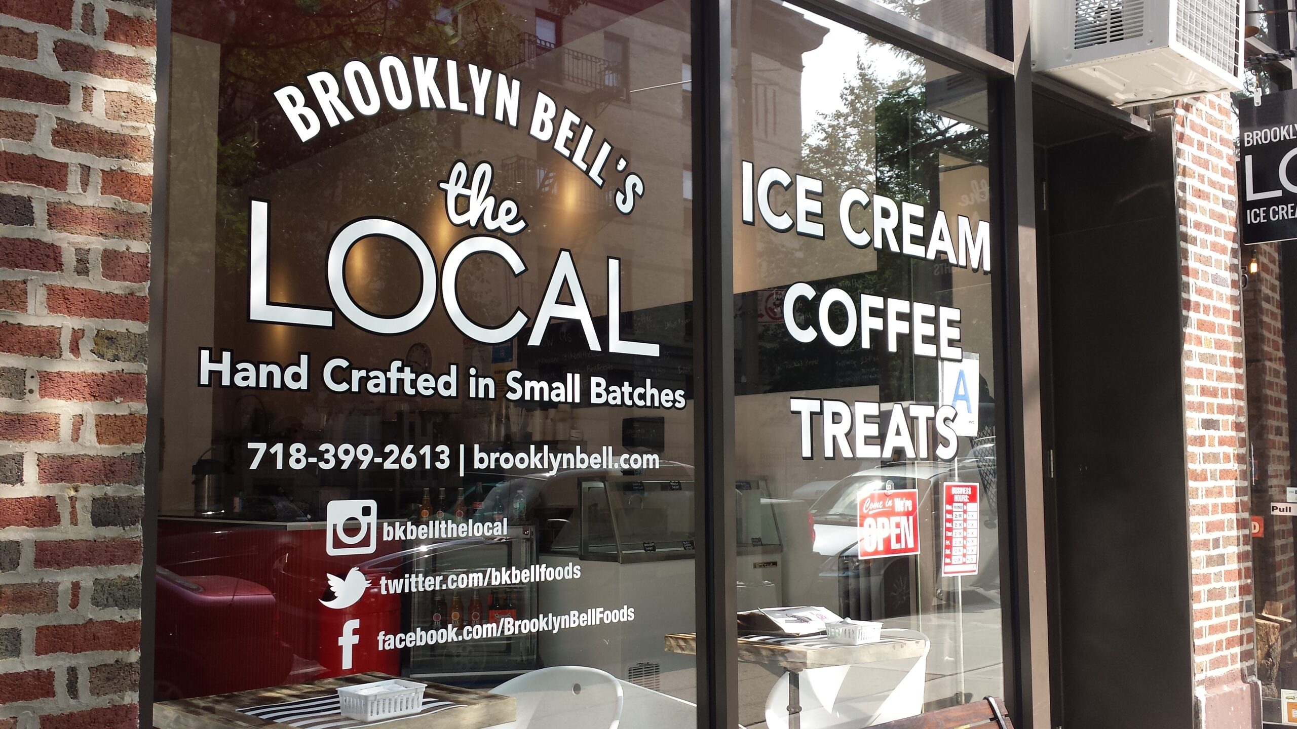
A storefront has only a few seconds to answer an important question for someone passing by:
Is this place worth stopping for?
Sometimes the answer comes from a familiar brand name. Sometimes it comes from a window display, a product in view, a busy dining room, or a promotion near the entrance. But for many businesses, the first thing a potential customer notices is the storefront sign.
That sign has a simple job at first: identify the business.
A good storefront sign does more than that. It helps people notice the location, understand what the business is, remember the name, confirm they have arrived at the right place, and feel confident enough to walk through the door.

This is especially important for businesses that depend on local traffic:
- Retail stores
- Restaurants
- Salons
- Medical offices
- Professional services
- Fitness studios
- Grocery stores
- Cafes
- Specialty shops
- Showrooms
- Service businesses
At Gogi Signs, we have been producing commercial signage for New Jersey businesses since 2005. One thing we see repeatedly is that storefront visibility is rarely determined by the sign alone. The result comes from the relationship between the sign, the building, the windows, the entrance, the viewing distance, the surrounding businesses, and the way people move past the property.
A storefront sign that works well on one building may disappear on another.
That is why the right question is not simply:
What storefront sign should we buy?
It is:
What does this storefront need to make the business easier to notice, understand, and enter?
Storefront Signs Are Part of the Customer’s First Decision
Walk-in traffic begins before someone reaches the front door.
A person may notice the business:
- while driving past
- while walking down the sidewalk
- from across a parking lot
- while visiting another tenant
- while waiting at a traffic light
- after seeing the location several times
- after searching for the business online and arriving at the address
In each case, the storefront needs to communicate quickly.
A strong storefront sign can help answer:
- What is the name of the business?
- What kind of business is this?
- Is it open?
- Where is the entrance?
- Does this look established and professional?
- Is there something here that interests me?
The sign does not need to answer every question by itself.
In fact, trying to make one sign communicate too much usually hurts readability.
The storefront works as a system. The main sign handles identification. Windows can communicate products or promotions. Door graphics can show hours. A projecting sign may help pedestrians approaching from the side. A monument sign may help drivers find the shopping center.
The goal is to give each element a clear job.
Our complete guide to business signage for commercial properties explains this broader sign-system approach in more detail.
Visibility Comes Before Style
A storefront sign can be beautifully designed and still fail if people cannot see it at the moment they need it.
Before discussing materials or fabrication, look at the storefront from the customer’s point of view.
How do people approach the business?
Are most customers:
- walking parallel to the storefront?
- approaching from across a parking lot?
- driving along a busy road?
- entering through a shopping center?
- coming from a train station or sidewalk?
- finding the business after following navigation directions?
The approach angle affects what type of sign is useful.
A wall-mounted storefront sign may be easy to see from across a parking lot but difficult to notice for pedestrians walking directly beneath it.
A blade or projecting sign can help with side-angle visibility.
A monument sign can identify a business or center before a driver reaches the building.
Window graphics can catch attention closer to the storefront.
There is no single “best” storefront sign because different signs solve different visibility problems.

Viewing Distance Changes the Design
One of the biggest differences between a logo on a screen and a sign on a building is viewing distance.
A logo may look excellent when it fills a laptop screen.
Mounted 40 feet away and 15 feet above the ground, small details may disappear.
The farther away the storefront sign needs to work, the more important several design choices become:
- letter height
- stroke thickness
- contrast
- spacing
- overall sign size
- amount of text
- illumination
- background clutter
This is one reason storefront signs often benefit from simpler layouts.

The business name may need to be the dominant message.
A tagline that is readable on a business card may add little value if no one can read it from the street.
The Building Is Part of the Sign Design
The storefront sign does not exist against a blank background.
It sits on architecture.
That architecture may include:
- brick
- stucco
- metal panels
- glass
- stone
- an awning
- decorative trim
- a sign band
- columns
- upper-floor windows
- lighting fixtures
- neighboring tenant signs
The building affects both appearance and installation.
A black sign may look strong in a design proof but disappear against dark brick.
Thin white letters may stand out on a dark wall during the day but become difficult to see if the storefront is poorly lit at night.
A sign that looks correctly sized in isolation may feel too small once placed above a wide storefront.
This is why storefront design should be reviewed using photographs, accurate measurements, and site conditions rather than artwork alone.
Contrast Helps a Storefront Get Noticed
Contrast is one of the simplest ways to improve sign visibility.
The sign should be visually distinct from the surface behind it.
That can come from:
- light letters on a dark background
- dark letters on a light facade
- a contrasting sign panel
- dimensional letters creating shadow
- illumination
- a strong brand color against a neutral building
Brand standards still matter, but they need to work in the real environment.
If a company’s main brand color is similar to the storefront facade, the sign may need an outline, panel, alternate approved color, illumination, or another treatment to separate it from the building.
A brand color that works online is not automatically a strong exterior sign color.
A Storefront Should Be Easy to Understand Quickly
Passing customers are not studying the facade.
They are scanning it.
That means the storefront should prioritize information.
For many businesses, the hierarchy looks something like this:
- Business name or brand
- What the business does, when the name does not make it obvious
- Immediate promotional or practical information
- Hours and entry information
Not all of this belongs on the main sign.
Consider a fictional business called Northfield.
The name alone does not tell a first-time passerby whether Northfield is a restaurant, law firm, clothing store, or fitness studio.
A small secondary descriptor may help:
Northfield
Kitchen & Market
But if the business name is Northfield Pizza, the category is already clear.
The amount of explanation needed depends on the brand.
Too Much Text Can Reduce Walk-In Value
Storefront signs sometimes become crowded because businesses want to use every inch of available space.
A sign may include:
- company name
- slogan
- phone number
- website
- service list
- social handle
- years in business
- several logos
This information may all be useful somewhere, but the main storefront sign is rarely the right place for all of it.
A pedestrian can read more than a driver, but even pedestrians respond better to clear hierarchy.
If everything is important, nothing stands out.
Use the main sign for identification.
Use windows, doors, menu boards, directories, or promotional graphics for secondary messages.
Storefront Signs for Business Should Work During Actual Operating Hours
Daytime visibility is only half the question for businesses that operate after dark.
Restaurants, fitness centers, pharmacies, convenience stores, entertainment businesses, salons, and many retailers may depend on evening visibility.
If the business is open at night, ask:
- Can the sign be seen after sunset?
- Is the building exterior lit?
- Does neighboring signage overpower it?
- Is the sign internally illuminated?
- Is there enough contrast without lighting?
- Are window graphics still readable after dark?
Illumination does not always mean the brightest possible sign.
The objective is clear identification.
Possible approaches include:
- internally illuminated channel letters
- illuminated sign cabinets
- backlit letters
- external lighting
- architectural lighting supporting a non-illuminated sign
The best option depends on the storefront, property rules, brand, and local sign requirements.
Channel Letters Work Well for Many Retail Storefronts
Channel letters are common on retail and commercial storefronts because they provide individual dimensional letterforms and can be illuminated.
They can work well when a business needs:
- strong building identification
- visibility from a parking lot or road
- nighttime recognition
- a clean individual-letter appearance
They are often used for:
- retail stores
- restaurants
- shopping centers
- fitness businesses
- service companies
- medical practices
But they are not automatically the right answer for every storefront.
Some properties have landlord criteria that specify another sign type.
Historic buildings may call for a different approach.
A smaller boutique may benefit more from dimensional lettering combined with a projecting sign.
The building should lead the decision.
Dimensional Letters Can Give the Storefront a Clean Architectural Look
Non-illuminated dimensional letters can create strong identification where nighttime illumination is not essential or where architectural lighting already provides sufficient visibility.
Materials and finishes can vary widely.
Depending on the application, dimensional signage may use:
- acrylic
- aluminum
- formed materials
- metal
- painted finishes
- brushed finishes
The value is depth.
Even modest dimensional letters create shadow and separation from the wall that flat graphics cannot produce.
This can work particularly well for:
- professional offices
- boutiques
- specialty retailers
- salons
- upscale service businesses
- properties with strong exterior lighting
Sign Panels Can Solve Difficult Storefront Conditions
A panel sign can create its own background instead of relying entirely on the building facade.
That can help when:
- the wall color has poor contrast
- the mounting area is visually busy
- the building does not provide a clean sign band
- several elements need to be visually grouped
Panels may be flat, dimensional, illuminated, or combined with raised lettering.
For some properties, they also help create consistency between multiple tenant signs.
Again, landlord and municipal requirements should be reviewed before finalizing the design.
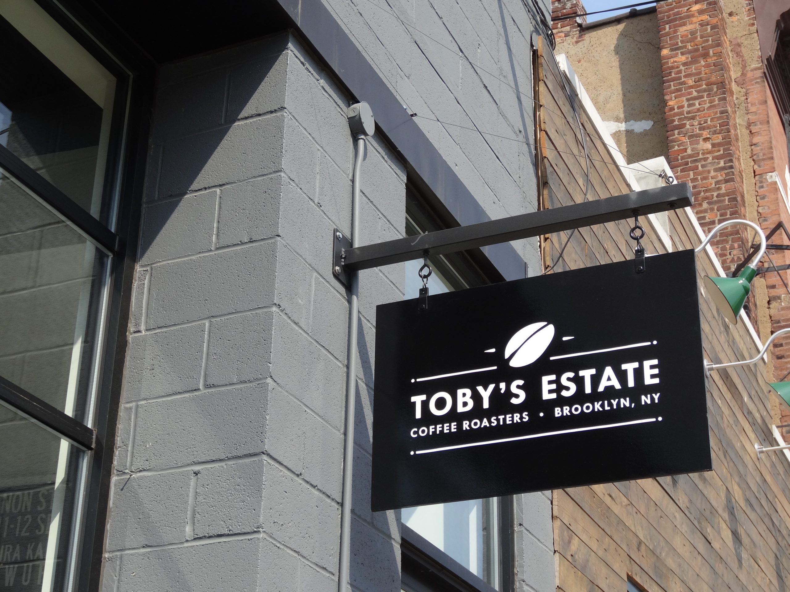
Blade and Projecting Signs Help Sidewalk Traffic
One of the biggest weaknesses of a wall-mounted sign is that it usually faces outward.
Pedestrians walking parallel to the storefront may not see it until they are almost directly in front of the business.
A projecting sign extends perpendicular to the building, making it easier to see from either direction along the sidewalk.

This can be particularly useful in:
- downtown retail districts
- pedestrian-heavy streets
- mixed-use neighborhoods
- rows of narrow storefronts
- areas where signs are mounted above awnings
A projecting sign may carry:
- the logo
- business name
- a simple symbol
- a recognizable brand mark
It should stay simple enough to understand from the side.
Window Graphics Can Turn Glass Into a Second Communication Layer
The main storefront sign identifies the business.
Windows can add context.
Retail storefront signs are often more effective when the glass is treated intentionally rather than left as an afterthought.
Window graphics can communicate:
- products
- services
- seasonal promotions
- sales
- hours
- brand imagery
- privacy
- temporary campaigns
But covering every window with messages can make the storefront feel closed and visually cluttered.
For businesses that benefit from showing the interior, such as boutiques, bakeries, restaurants, or showrooms, preserving views into the space may be more valuable than maximizing printed coverage.
The right balance depends on the business.
Door Graphics Help Customers Complete the Last Few Feet
Once someone decides to enter, the door should remove uncertainty.
Typical door information includes:
- business name or logo
- hours
- suite number
- entrance instructions
- accessibility information where applicable
- phone number
- appointment instructions
This information should not compete with the main storefront identification.
Door graphics are the final confirmation.
They tell the visitor:
Yes, this is the entrance.
Awnings Can Combine Architecture, Shade, and Identification
For some storefronts, an awning becomes part of the sign system.
A branded fabric awning may add:
- business identification
- color
- shade
- architectural character
- street-level visibility
Awnings work especially well for:
- restaurants
- cafes
- boutiques
- neighborhood retail
- service businesses
The design needs restraint.
Small text across an awning valance may be difficult to read from a distance. A business name, logo, or simple descriptor usually performs better.
Storefront Visibility Is More Than the Main Sign
A business may blame the sign when the real problem is the entire storefront.
Examples:
- The entrance is hidden.
- The windows are covered with unrelated notices.
- The business name is visible but no one knows what the company does.
- The sign is blocked by trees.
- The storefront is dark at night.
- A neighboring tenant’s sign dominates the facade.
- Temporary banners compete with permanent branding.
- The door looks like a service entrance.
- The sign sits too high for pedestrian traffic.
Improving walk-in traffic may require several small changes instead of one larger sign.
This is why a storefront audit can be useful.
Stand across the street or parking lot and look at the business as a stranger would.
Then walk toward it.
What do you notice first?
What becomes readable?
When can you identify the entrance?
Which messages compete with each other?
The answers can be different from what the business owner sees every day.
First Impressions Can Affect Whether People Walk In
A storefront does not need to look expensive.
It should look intentional.
People make fast judgments based on visible cues:
- Is the sign damaged?
- Are letters missing?
- Is the vinyl peeling?
- Is the brand current?
- Are there faded temporary notices?
- Does the business look open?
- Is the entrance clean and identifiable?
- Does the signage match the type of business?
These signals can influence whether a passerby feels comfortable entering.
A polished law office and a neighborhood ice cream shop should not have the same visual personality.
But both should look cared for.
Storefront Signage Should Match the Business Positioning
Signage shapes expectations.
Consider how different treatments may communicate different personalities.
Premium retail
May favor:
- restrained dimensional lettering
- high-quality metal finishes
- controlled lighting
- minimal window messaging
Family restaurant
May favor:
- warm colors
- clear illuminated identification
- menu visibility
- welcoming window graphics
Medical office
May prioritize:
- clarity
- professionalism
- easy entry identification
- suite information
- parking directions
Fitness studio
May need:
- strong street visibility
- bold branding
- window graphics
- class or membership messaging
Professional service office
May benefit from:
- dimensional signage
- building directory placement
- subtle storefront branding
- clear suite identification
The sign should support what the customer expects to find inside.
Promotions Should Support the Storefront, Not Overwhelm It
Temporary promotions can help attract attention.
Examples include:
- Grand Opening
- Now Open
- Seasonal Sale
- New Menu
- Open House
- Limited-Time Offer
The problem appears when temporary promotional graphics become the dominant permanent identity.
A storefront covered in competing sale signs can become difficult to understand.
Use promotional space deliberately.
One strong message is often more noticeable than six smaller ones.
Keep Permanent Branding and Temporary Campaigns Separate
A useful storefront system usually has a stable layer and a changeable layer.
Stable layer
- Main storefront sign
- Brand colors
- Door identification
- Permanent window branding
Changeable layer
- sale graphics
- seasonal promotions
- event messaging
- opening announcements
- new-product campaigns
When temporary campaigns have a planned location, the business can update promotions without making the storefront look improvised.
Multi-Tenant Properties Need Extra Coordination
Retail storefront signs in shopping centers and mixed-use properties have another challenge: neighboring signs.
The storefront must stand out while still following property standards.
Many centers have tenant sign criteria covering:
- sign dimensions
- letter height
- illumination
- colors
- mounting
- raceways
- logo treatment
- permitted sign locations
These rules help maintain consistency across the development.
They can also affect the design long before fabrication.
A concept that looks right for the brand may need modification to fit the landlord’s requirements.
The best time to discover that is before the sign is produced.
Local Sign Rules Can Affect the Storefront Design
Commercial exterior signs may be subject to municipal requirements related to:
- size
- placement
- illumination
- projection
- setbacks
- sign area
- electrical work
- zoning districts
Requirements vary by municipality and property.
A sign should not be treated as ready for production simply because the business owner approves the artwork.
Permit review, landlord approval, and site conditions can all affect the final design.
Do Not Wait Until Opening Week
Storefront signage is often connected to a business opening, renovation, or rebrand.
That creates a deadline.
Waiting too long can create problems involving:
- design revisions
- landlord approval
- permit timing
- fabrication
- electrical coordination
- installation access
- construction delays
- weather
Temporary signage can help bridge a short gap, but it should be a planned backup rather than the default opening-day strategy.
The storefront should be included in the opening timeline early.
Common Storefront Sign Mistakes That Reduce Visibility
Choosing a sign that is too small for the building
A logo may feel large in a proof but undersized when installed across a wide facade.
Using thin lettering at long viewing distances
Fine details disappear quickly from the road or parking lot.
Poor contrast
Brand colors that blend into the facade can make the sign difficult to read.
Adding too much text
A storefront is not a brochure.
Ignoring pedestrian approach
A front-facing sign may not help someone walking beside the building.
Ignoring nighttime conditions
Businesses open after dark should consider after-hours visibility.
Covering every window
More graphics do not always mean more attention.
Installing promotional signs without hierarchy
Temporary messaging can overpower the permanent brand.
Forgetting the entrance
People should not need to guess which door to use.
Designing without checking property rules
Landlord or municipal restrictions may force expensive revisions later.
Keeping damaged signage too long
A broken or faded storefront becomes part of the brand whether the business intends it or not.
How to Review Your Existing Storefront
A simple review can reveal whether signage is helping or hurting.
Step 1 — View it from the main approach
Stand where customers first see the business.
Can you identify the business quickly?
Step 2 — Move farther away
At what point does the sign become readable?
Does it remain recognizable even when the smaller text disappears?
Step 3 — Approach from both directions
This is especially important on pedestrian streets.
Can the business be identified from the side?
Step 4 — Visit after dark
If the business operates at night, review visibility under actual nighttime conditions.
Step 5 — Study the windows
Do they add useful information or create clutter?
Step 6 — Find the entrance
Is it obvious?
Step 7 — Compare with neighboring businesses
Does the sign get lost among larger or brighter signs?
Step 8 — Look for maintenance issues
Check:
- faded graphics
- peeling vinyl
- broken lights
- missing letters
- rust
- discoloration
- damaged panels
Sometimes maintenance creates a bigger improvement than replacement.
A Storefront Sign Should Help the Right Customer Notice You
The goal is not simply to make the storefront louder.
A sign should help the right audience recognize the business.
That distinction matters.
A high-end professional office may not benefit from the same visual treatment as a discount retailer.
A neighborhood cafe may want warmth and personality.
A warehouse showroom may prioritize large-scale identification for drivers.
A children’s business may benefit from brighter visual cues.
Visibility and branding need to work together.
The strongest storefront sign is not necessarily the biggest or brightest.
It is the one that is easy to see, easy to understand, appropriate for the property, and consistent with what the business wants customers to expect.
A Practical Storefront Sign Checklist
Before approving a new storefront sign, ask:
Visibility
- From where do customers approach?
- Can drivers see the sign?
- Can pedestrians see it from the side?
- Are trees, awnings, cars, or neighboring signs blocking it?
- Does it work at night if needed?
Message
- Is the business name immediately clear?
- Does the name explain what the business does?
- Is secondary information really necessary?
- Is the sign trying to say too much?
Design
- Is the text large enough?
- Is the contrast strong?
- Does the sign fit the building?
- Does the design remain readable at the actual installed size?
Storefront
- Is the entrance obvious?
- Do the windows support the brand?
- Are promotional graphics controlled?
- Are hours and door information easy to find?
Approvals
- Does the landlord need to approve the sign?
- Are there tenant sign criteria?
- Is a permit required?
- Are there illumination restrictions?
Long-term use
- Can the sign be maintained?
- Can lighting be serviced?
- Will temporary promotions be kept separate?
- Does the design still work if the business grows?
Storefront Signs Work Best as Part of the Whole Property
A storefront sign can attract attention, but the best results come when the rest of the customer experience supports it.
The business should be easy to identify.
The windows should communicate intentionally.
The entrance should be obvious.
Temporary promotions should not overpower permanent branding.
The sign should be readable from the places where customers actually encounter it.
And the design should fit both the building and the business.
That is how storefront signage contributes to walk-in traffic.
It does not force people through the door.
It removes reasons for them to keep walking.
Gogi Signs has been producing storefront and commercial signs for New Jersey businesses since 2005. Whether the project involves a new location, a retail rebrand, updated window graphics, illuminated identification, or a storefront that simply is not getting noticed, the right place to start is the property itself—how customers approach it, what they see, and what they need to understand before deciding to walk in.