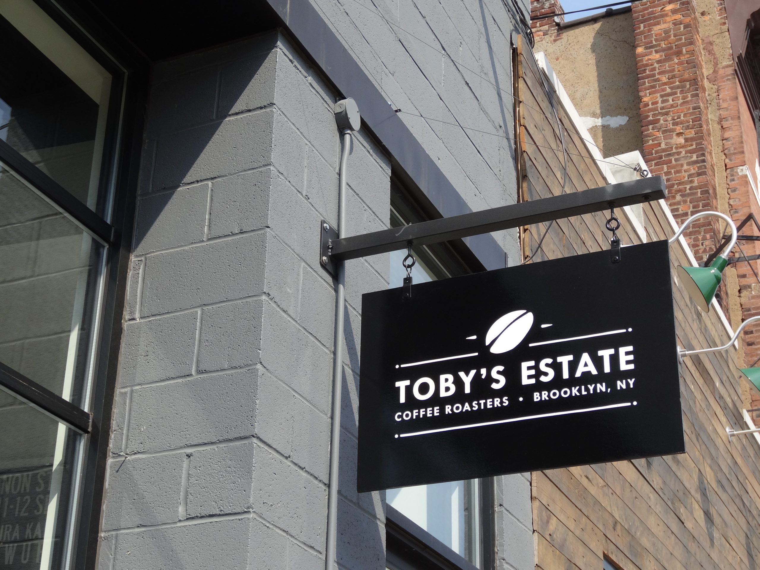
Color does not make a sign visible on its own. Contrast does, against the building and the light that falls on both.
There is no single best color for a business sign. A color that stands out on one building may disappear on another, a high contrast daytime combination may behave differently when illuminated, and brand colors that work well on a website may need adjustment in material, finish, spacing or background to remain recognizable outdoors.
Sign color visibility depends on relationships, not isolated swatches. Color affects detection, separation, legibility, mood and brand recognition, and it should be reviewed alongside sign typography, because stroke weight, spacing, letter size and contrast decide whether the palette remains readable.
Contrast Comes First
Contrast Is a Relationship
Sign visibility begins with separation between the message and its background. Dark letters on a light field and light letters on a dark field usually provide useful contrast, but the exact result depends on value, saturation, material, lighting and surroundings. Two different hues can still have similar lightness and become difficult to distinguish at distance.
View proposed combinations in grayscale as a quick check of value contrast. If letters and background become nearly the same gray, color difference alone will not protect readability for all viewers or conditions. Borders, shadows, outlines and negative space can improve separation, but they can also add clutter, so use them to solve a specific contrast problem rather than decorating every letter.
| Combination type | Typical result at distance | Why |
|---|---|---|
| Very dark on very light, or the reverse | Reads furthest | Large difference in lightness |
| Saturated color on white or black | Usually reads well | Strong value difference with brand character |
| Two saturated colors of similar lightness | Blurs, especially at dusk | Hue differs but value is close |
| Mid tone on mid tone | Weak in most conditions | Little separation in value or hue |
| Light copy on a busy photo background | Unreliable | Background changes under the letters |
Research for the United States Sign Council Foundation measured how text and background colors and lighting methods change the distance at which a sign can be read, by day and by night. The USSC Foundation study is the most useful single reference on the subject.

Distance Reduces Subtle Differences
Colors that appear distinct at arm’s length can blend at greater distance. Fine outlines, gradients, photographic textures and low contrast shadows lose usefulness as viewing distance grows, and reflections and atmospheric conditions reduce subtle separation further.
Protect the major color relationship first: critical copy against the field behind it. Reserve nuanced effects for close range applications such as interior displays or windows. Larger letters do not fully compensate for weak contrast, and strong contrast cannot rescue excessively thin strokes or crowded copy. Our guide to sign sizing by viewing distance covers the sizing side.
The Setting Changes the Color
The Building Becomes Part of the Palette
A sign is not viewed on the blank background used in a brand guide. Brick, stone, metal panels, glass, awnings, landscaping, sky and neighbouring signs all affect how color is perceived. On a crowded block, a Brooklyn storefront sign or a Bronx business sign in a color that stands out on a quiet street can disappear among its neighbours. A dark sign may stand out against pale masonry but disappear against tinted glass. White letters may read clearly on a dark wall and lose definition against a bright overcast sky when mounted above the roofline.
Photograph the proposed location during the main viewing periods, including seasonal conditions where trees change the background. In visually busy areas, the most fluorescent or saturated choice is not automatically the most noticeable. A simple, well separated color block may be easier to detect than another bright element competing with many others.

Day and Night Are Different Color Environments
Illuminated signs can shift in hue and contrast after dark. Face material, LEDs, cabinet depth, diffusion, return color, halo lighting and surrounding ambient light all influence the nighttime appearance. A dark daytime face may transmit a much brighter color, and white illumination can appear cool or warm depending on the light source and material.
Brightness needs balance. Excessive light can make strokes bloom and reduce edge definition, uneven illumination changes the apparent shape of letters, and a bright neighbour can make an otherwise adequate sign feel weak. Review day and night samples for businesses operating after dark. The Sign Research Foundation publishes research identifying contrast, glare, illumination and visual clutter as factors in real world sign visibility, and our guide to lit versus unlit signs compares the lighting options.

Surrounding Color Changes Over Time
The environment is not fixed. Landscaping grows, a neighbouring tenant installs a bright sign, the building is repainted, window displays introduce new colors, and snow creates a temporary light background around low signs. A sign may remain physically sound while becoming less distinct because the background changed.
Corrective options include trimming obstructions, adjusting external lighting, changing the sign background, adding controlled separation or relocating secondary information. Replacing the complete sign is not always necessary.
Turning Brand Colors Into Sign Colors
Brand Colors Need Production Translation
Digital brand values do not automatically specify paint, vinyl, print, acrylic or illuminated faces. Screens create color with light, while printed and fabricated materials reflect or transmit it. Gloss, texture, opacity, substrate color, ink, laminate and batch variation can all change the result.
Create production references for the applications the business actually uses, review physical samples under relevant lighting, and record approved paint systems, vinyl series, printed targets and illumination expectations. Exact matching across every material may be impossible. The goal is a controlled family that remains recognizable. For multi location programs, sample approval stops each vendor from interpreting a digital color independently, as our guide to multi location signage explains.
Materials and Finishes Change Perceived Color
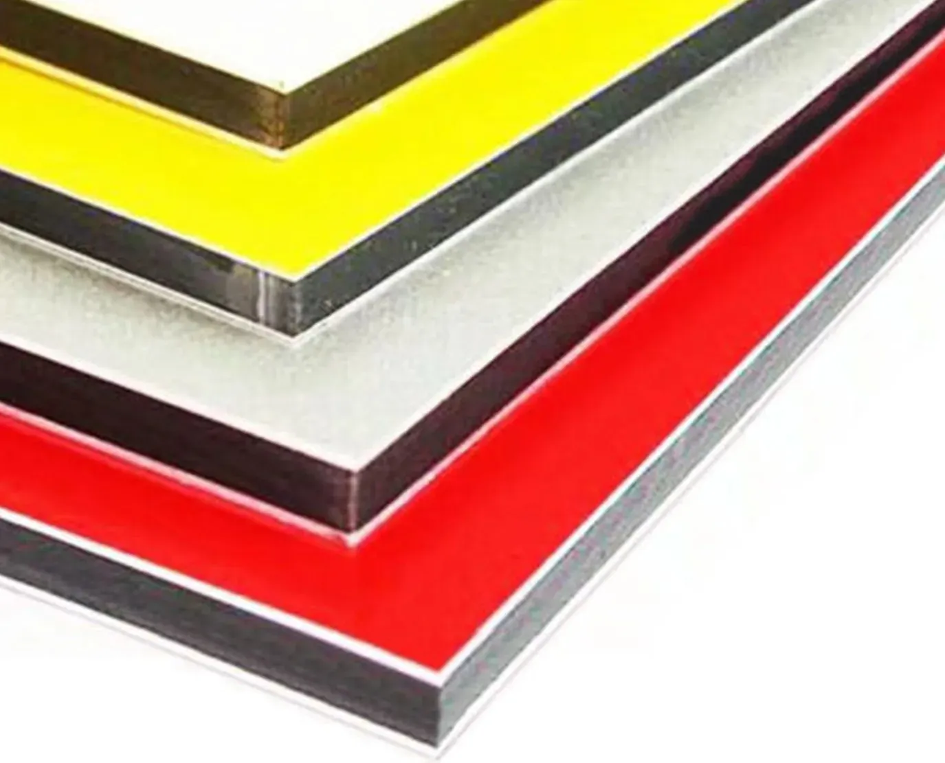
Glossy surfaces can appear more saturated but produce glare. Matte finishes reduce reflections while appearing slightly softer. Metallic materials change with viewing angle and light, and transparent or translucent materials interact with what sits behind them.
Exterior colors also weather differently with sun exposure, orientation, pollution, cleaning and material quality. A multi panel sign can become visibly inconsistent if one face is replaced years later with a fresh color, so keep production records and samples where future matching matters.
Color Should Support Message Hierarchy
Using many brand colors with equal intensity makes the primary message hard to find. Assign roles: one color for the business name, another for the background and a third for a small accent. Promotions or temporary notices should not overpower permanent identification unless that is an intentional campaign decision.
Color by Application
Vehicles
Fleet graphics are viewed against paint, windows, handles, seams, reflections, dirt and changing backgrounds. Choose a palette that separates from the vehicle color and preserves the company name across doors and body contours, and avoid placing critical copy where a dark window or handle divides the letterforms. A design that performs on a white van may need a different field or outline on a black truck. See our Vehicle Graphics range.
Windows
Glass does not provide a stable background. During the day, reflections may dominate. At night, a bright interior can reverse the apparent contrast, and merchandise, blinds, people and displays move behind the lettering. Solid background panels, window frosting, outlines or controlled clear space can stabilize the message. Do not place essential hours or entrance information in a color that works only under one lighting condition. See our printed window decals page.

Interior Navigation
Interior environments may use color for departments, floors, zones or paths. The system is most useful when it reduces decisions rather than adding a code visitors must memorize. Use color alongside text, numbers, arrows and icons, keep color meanings stable from directories through follow up signs, and provide a neutral fallback for urgent replacements.
Accessibility
People perceive color and contrast differently because of age, visual acuity, color vision differences, glare and lighting. Do not use color as the only way to communicate status or direction. Interior signs covered by the 2010 ADA Standards must have characters that contrast with their background and a non glare finish. Our guide to ADA sign requirements explains the rules.
Test Color in Context
- Use physical samples: in the proposed material and finish, not an emailed rendering.
- Place them on the building: near the installation surface, in daylight and artificial light.
- Mock up the whole site: to assess surrounding colors and visual competition.
- Check after dark: for any illuminated sign, with a representative lit sample.
- Check in grayscale: to confirm value contrast.
- Ask fresh eyes: what they notice first and whether they can read the message from the intended distance.
Keep an approved physical sample when future matching matters. Digital files and photographs do not record finish, translucency or illumination accurately enough to serve as the only reference years later.
Common Questions About Sign Color
What color combination is most readable on a sign?
The one with the greatest light to dark contrast against its actual background, which is usually very light copy on a very dark field or the reverse. Two colors can be vividly different in hue and still blur at distance if their lightness is similar.
Will my brand colors reproduce exactly on a sign?
Rarely without translation. A color specified for print or screen has to be matched in vinyl, paint, acrylic or illuminated film, and each has a different range and surface behaviour. Ask for a physical sample in the actual material rather than approving a color on a monitor.
Why does our sign look different at night?
Because illumination changes the relationship. A face lit sign reads as bright copy on a dark surround after dark, which can invert the daytime contrast. A color chosen only in daylight can lose most of its separation once the lights are on.
Does finish really change the color?
Yes. Gloss, satin and matte versions of the same color read differently because of how each handles reflected light, and a glossy face can wash out entirely at certain sun angles. Finish is part of the color decision, not a separate one.
Is a high contrast sign automatically accessible?
It is a good start but not the whole requirement. Interior identification signage has specific contrast and non glare finish requirements, and relying on hue difference alone can fail readers with color vision deficiency. Design the contrast in lightness, not only in color.
Color Proofed in the Real Material
Gogi Signs has worked with New Jersey businesses since 2005, and we produce physical color samples in the material your sign will actually be made from, then check them on the building in daylight and after dark. It is a small step that prevents the most expensive kind of reprint.
Request a free quote, or see our custom sign design page for how we proof color.