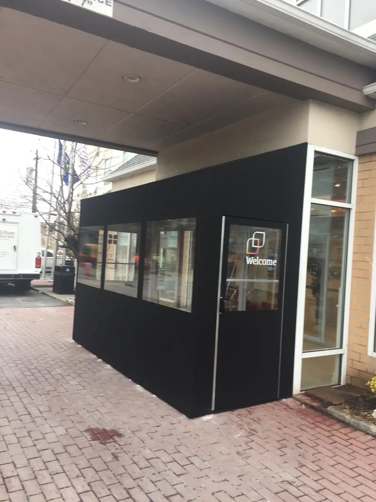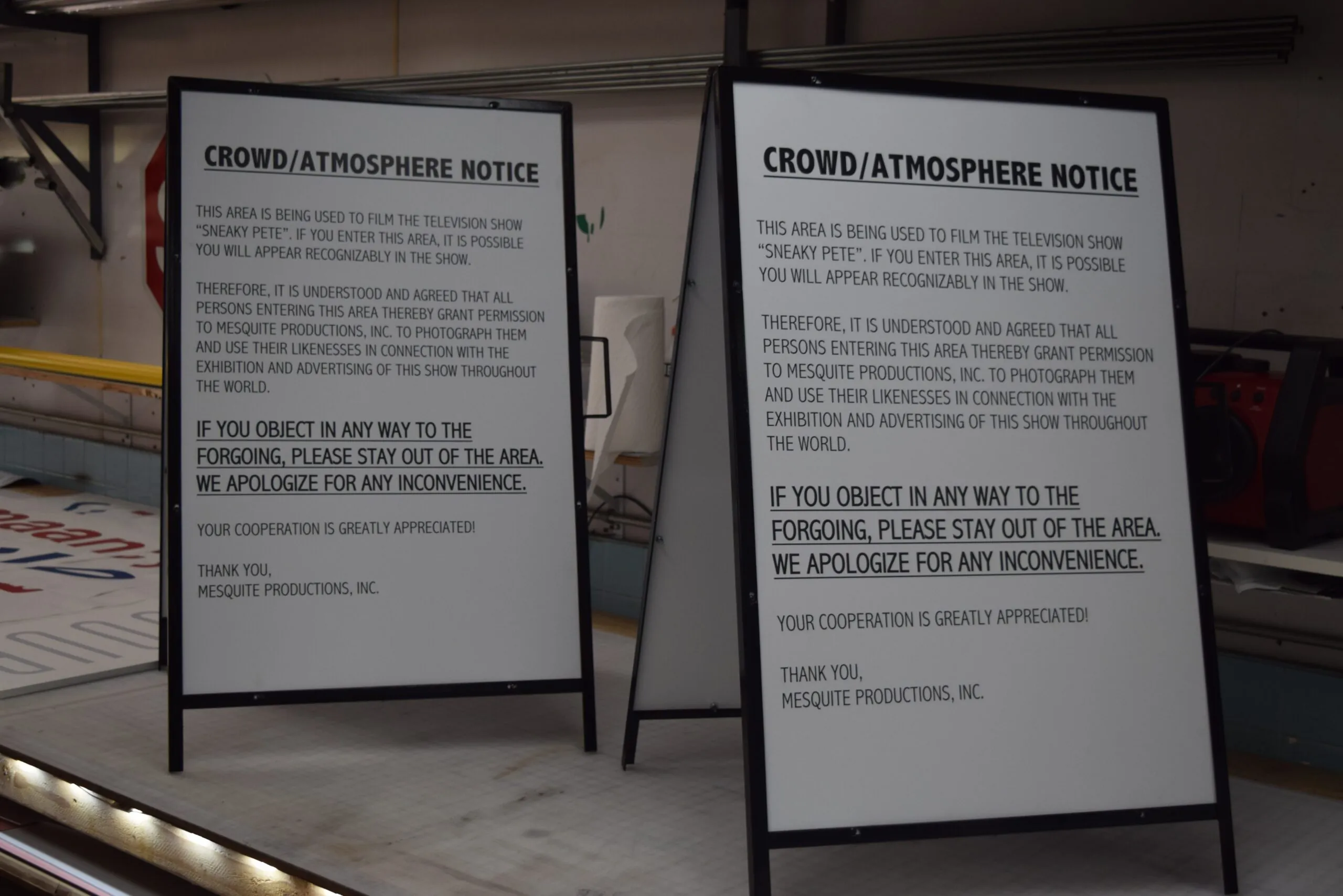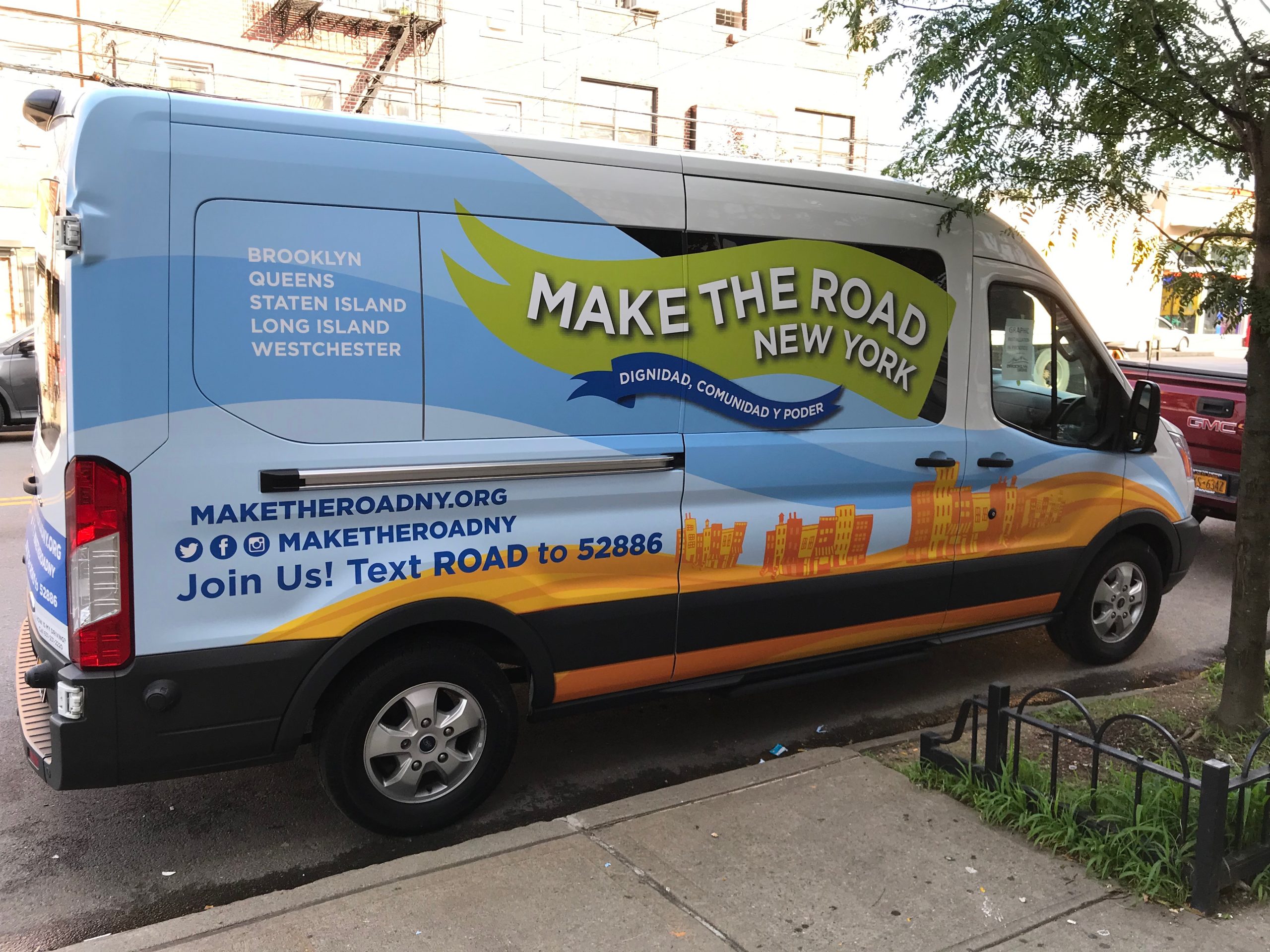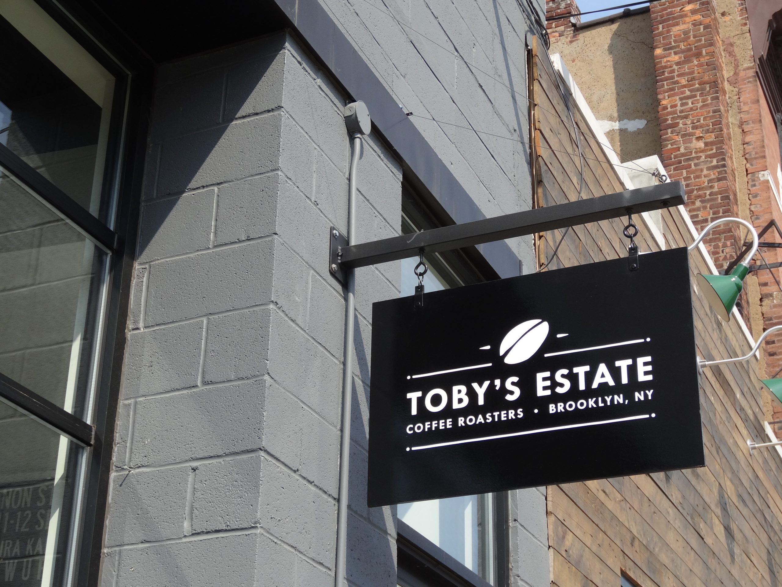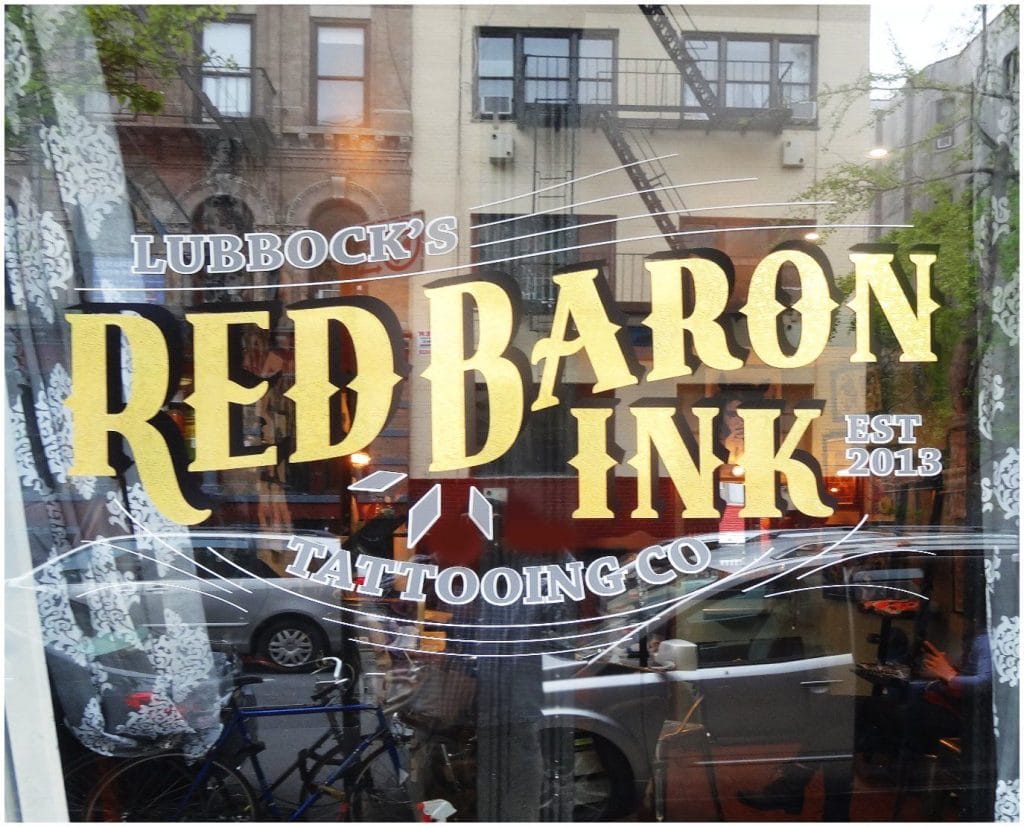
The main building sign helps a customer locate a business. The entrance tells them what it will be like to enter.
That moment is easy to underestimate. A customer may have already reviewed the company online, called ahead, or scheduled an appointment. Yet a poorly marked door, outdated hours, crowded window, or confusing access instruction can make the business feel less prepared than it appeared from a distance.
Entrance signage is where identification becomes hospitality. It should remove hesitation and make the next action obvious.

The Entrance Has a Different Job From the Main Sign
Exterior identification and entrance communication are related, but they are not interchangeable.
A building sign is often designed to be seen from farther away. It helps drivers and pedestrians recognize the location. At the door, customers need closer-range information: which entrance to use, when the business is open, whether an appointment is required, where deliveries should go, and what accessibility options are available.
When one sign is expected to perform both jobs, important details can end up too small to read from the street or too far from the entrance to help someone standing at the door.
The better approach is a sequence. The building sign leads people to the correct frontage. Entrance signs complete the arrival. Our guide to storefront signs that encourage walk-in traffic examines the earlier decision to notice and approach the storefront.
Customers Notice Friction at the Threshold
People pause when an entrance is unclear. They look for a handle, check neighboring doors, study taped notices, or return to their phone for instructions.
That pause may seem minor, but it changes the tone of the visit. It is especially noticeable at medical offices, professional services, schools, apartment buildings, and multi-tenant properties where visitors may already be unsure of the process.
Clear entrance communication should answer the immediate questions without making the customer sort through unrelated messages. The business name, hours, access instructions, and necessary notices need an obvious order.

A door covered with promotions, policy sheets, delivery stickers, and old hours forces every message to compete. Even accurate information becomes harder to use.
Condition Communicates Care
Customers do not separate the condition of a sign from the condition of the business behind it.
Peeling vinyl, mismatched replacement hours, burned-out lighting, cracked panels, and weathered temporary notices suggest that the entrance is not regularly reviewed. That impression may be unfair to the quality of the company’s work, but it is still created before the customer has other evidence.
Maintenance does not require an elaborate entrance. A clean door graphic, current hours, readable identification, and a clear path can appear more professional than a complicated display that has not been kept current.

Seasonal messages should also have a removal plan. Holiday hours and promotional decals lose credibility when they remain long after the event has passed.
Windows Need Restraint
Storefront windows are valuable communication space, but they can quickly become crowded.
Window graphics may provide privacy, display services, support a campaign, or strengthen the brand. They may also affect how much of the interior is visible and how easily customers can identify the door.
The U.S. Small Business Administration’s guidance on store windows recommends connecting displays to the brand while avoiding excessive visual crowding. The same principle applies beyond retail. A window should have a clear purpose rather than becoming the default location for every message.
Before adding another graphic, consider what already competes for attention: reflections, merchandise, interior lighting, neighboring storefronts, street furniture, and temporary notices. Sometimes removing an outdated message improves the entrance more than adding a new one.
The Experience Changes After Dark
An entrance that works during business hours may become difficult to interpret at night.
Exterior lighting can create glare on glass. Interior lights may make vinyl lettering disappear against a bright background. The building sign may be illuminated while the actual door remains in shadow. In a shared complex, several entrances may look similar after dark.
Businesses that operate early, late, or by appointment should review the approach at the times customers actually arrive. Confirm that the business name, suite number, door, path, and hours remain visible. The solution may involve illumination, reflective material, contrast changes, or simply moving information away from a visually difficult area.
Accessibility Is Part of the Welcome
The primary entrance should not leave visitors guessing whether they can use it.
If an accessible entrance is located elsewhere, directional information should appear before a visitor reaches a barrier. Door controls, intercoms, call instructions, and accessible routes need to be visible and understandable from the position where someone will use them.
Accessibility requirements can involve more than graphics and should be reviewed against the applicable building conditions and regulations. From an experience standpoint, the principle is straightforward: necessary information should appear before the customer needs it, not after they discover a problem.

Review the Entrance as a First-Time Visitor
Staff members quickly learn which door sticks, where the intercom is located, and which notices still apply. A first-time customer has none of that knowledge.
Approach the entrance from the parking lot, sidewalk, and any alternate route visitors commonly use. Check whether the correct door is distinguishable and whether the information appears in a sensible reading order. Remove anything expired, duplicated, or contradicted elsewhere.
Ask front-desk staff what visitors repeatedly misunderstand. Their answers often identify the most useful signage changes.
The First Impression Begins Before the Door
The entrance should be reviewed as part of an approach, not as a single surface. A customer may enter the property from a road, parking garage, sidewalk, lobby, or shared corridor. By the time they reach the door, they may already have decided which driveway to use, where to park, and which building wing to approach.
If those earlier cues are weak, the door inherits all the confusion. Businesses sometimes respond by adding more information to the glass when the real problem belongs at the parking entrance or building directory.
Map the route backward from the door. Identify the last location at which a customer can comfortably change direction. That is where the preceding sign needs to work. Entrance signage should confirm the destination rather than rescue a route that has already failed.
The sequence also establishes message priority. A person fifty feet away needs the business name and a visible entrance. A person standing at the door can read hours, appointment instructions, and access details. Giving each viewing position the information it can support keeps the entrance from becoming a notice board.
Different Businesses Need Different Kinds of Welcome
An effective entrance should reflect how the business receives people.
A retail store may benefit from openness, product visibility, and a clear invitation to enter. A medical practice may need privacy while still making check-in obvious. A warehouse office may need to separate visitors from drivers and loading traffic. A school or controlled facility may need to communicate security procedures before someone reaches a locked door.
“Approachable” does not always mean transparent glass and an open door. It can mean a clearly labeled intercom, a visible suite number, and precise instructions that help a visitor understand the process.
Before designing the entrance, list the main visitor groups and what each should do. Customers, employees, deliveries, service technicians, and applicants may use different doors. If everyone is directed to the same point, the signs should support the operational plan rather than create congestion at reception.
Shared Buildings Require Clear Ownership
In a multi-tenant property, several parties may control different parts of the arrival. The landlord manages the monument sign and common directory. The tenant controls its door graphics. A property manager maintains parking and building identification. A security team controls access instructions.
If those parties use different names or update schedules, the customer experiences the gaps. A new tenant identity should be carried through the roadside panel, building directory, floor directory, suite sign, and online listing in a coordinated sequence. Updating only the door leaves the visitor navigating under the former name until the final step.
Confirm who is responsible for each sign and how changes are requested. This is particularly important for temporary notices. Without ownership and removal dates, expired instructions remain visible because every party assumes someone else will handle them.
Weather, Lighting, and Daily Use Change the Entrance
The frontage seen on a calm afternoon may not represent the customer’s normal experience. Snow can cover low signs or narrow a route. Rain and glare reduce contrast on glass. Door mats, planters, sidewalk displays, and seasonal decorations move into positions that were clear during the original survey.
Privacy film and perforated graphics also need judgment. They can make an interior more comfortable and provide branding space, but heavy coverage may obscure the door or make an occupied business appear closed. Mockups should show the entire frontage, including handles, mullions, interior lighting, and adjacent tenants.
After installation, review the entrance during the busiest arrival periods and after dark. The objective is not merely to confirm that each sign exists. It is to verify that people can still recognize the door and understand the process under actual conditions.
Test the Entrance With Someone New
Owners and employees unconsciously fill in missing cues because they already know the property. A first-time visitor cannot.
Give someone unfamiliar with the site only the instructions a customer normally receives. Observe where they slow down, change direction, or reach for their phone. Ask what they believe each entrance is for and which information they noticed first.
Document the review with photographs from the street, parking area, sidewalk, and door. Ask front-desk staff which questions they answer repeatedly and whether delivery drivers use the intended entrance. These observations identify specific problems more reliably than asking whether the entrance “looks good.”
Make the First Step Easy
A strong first impression does not require the entrance to tell the company’s entire story. It needs to make the first step clear.
The customer should be able to recognize the business, locate the correct door, understand how to enter, and see that the information is current. When those basics are handled well, the entrance supports the brand without calling attention to the effort behind it.
Gogi Signs has helped New Jersey businesses plan storefront, door, window, and interior graphics since 2005. We have found that entrance improvements are often less about adding more material and more about deciding which messages genuinely belong at the threshold.