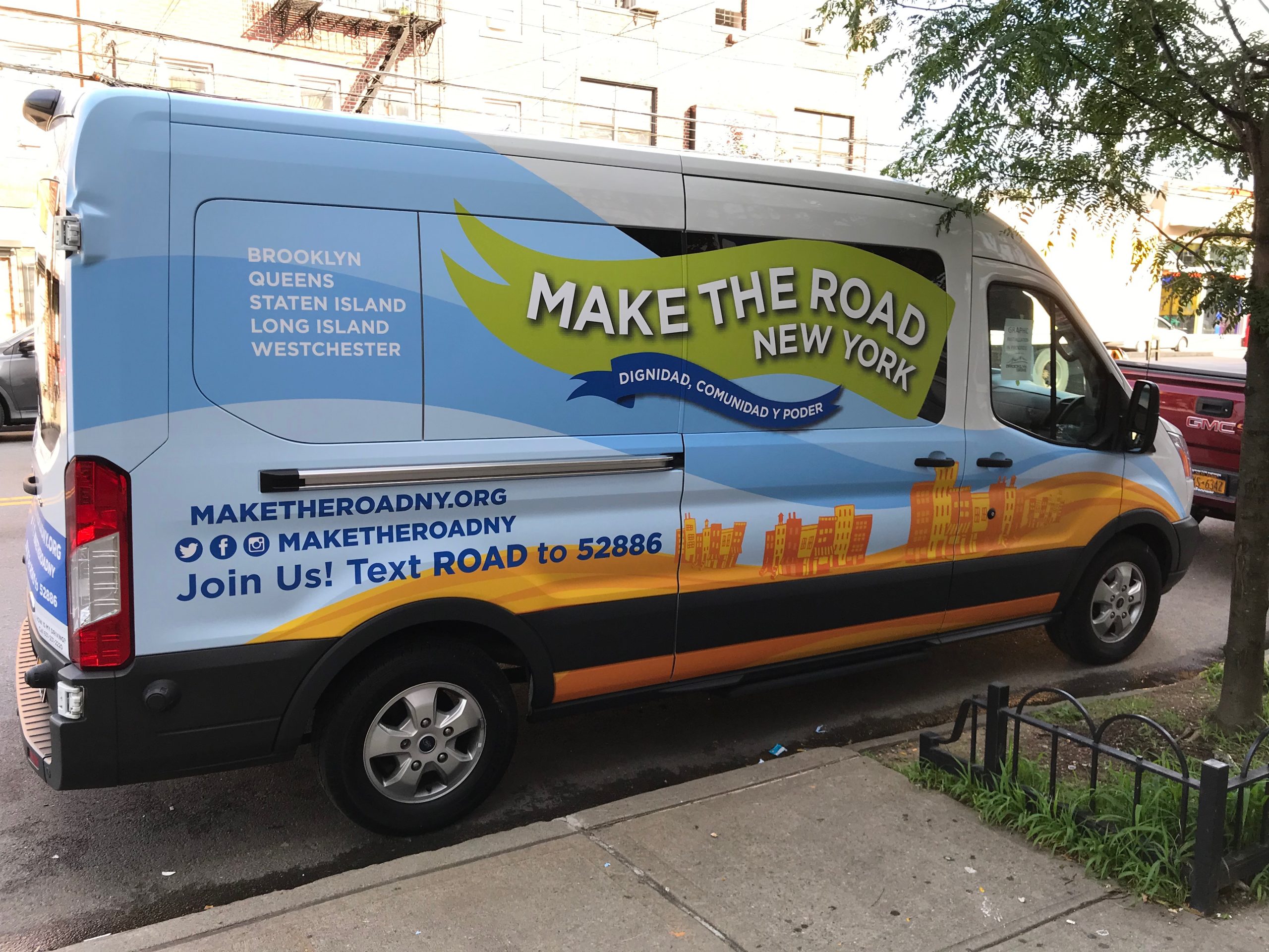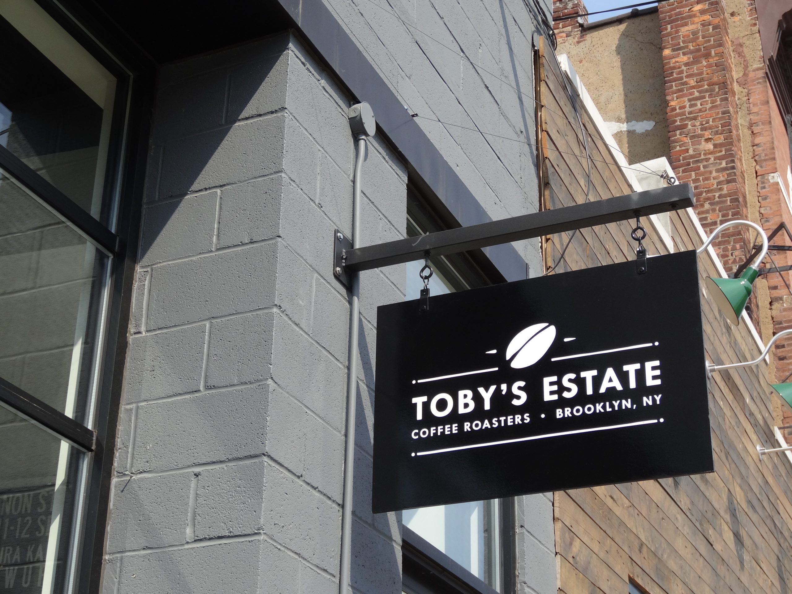
The right letter height is not a matter of taste. It comes from how far away people are when they need to read the sign, and how fast they are moving.
Every sign is designed for a viewing distance, whether or not anyone says so. A highway pylon must be read from hundreds of feet away by someone driving at speed. A storefront sign is read from across the street. A room sign is read from a few feet away by someone standing still. Use the same letter size for all three and at least two of them will fail.
The good news is that the relationship between distance and letter height has been studied for decades, and it can be worked out with simple arithmetic. This guide explains the method, gives a table of letter heights and shows the adjustments that matter on real streets and in real buildings.
The Legibility Index in Plain Terms
Sign researchers describe legibility with a number called the legibility index: the distance, in feet, from which a letter can be read for every inch of its height. The United States Sign Council’s guideline standards recommend designing to a legibility index of about 30, meaning one inch of letter height for every 30 feet of viewing distance.
The index changes with the sign. Bright, high contrast, well spaced letters read further, while dim, low contrast or decorative letters read less far. The USSC tables run from the low 20s to the high 30s depending on typeface, color and lighting.
Letter Height by Viewing Distance
The table below divides each distance by a legibility index of 30, then rounds up to a practical letter height. It assumes mixed case letters, good contrast and an uncluttered view.
| Viewing distance | Typical situation | Minimum letter height at index 30 |
|---|---|---|
| 30 ft | Sidewalk, across a narrow entry | 1 in |
| 60 ft | Across a city street | 2 in |
| 100 ft | Across a wide road or a small parking lot | 4 in |
| 200 ft | From the far side of a parking lot | 7 in |
| 300 ft | From a four lane road | 10 in |
| 500 ft | Approach on a suburban highway | 17 in |
| 800 ft | Approach on a fast arterial road | 27 in |
These are minimums for a single line of text. A sign with several lines, a busy background or a long name needs more.

Start From Where People Need to Read It
The useful viewing distance is not where the sign first becomes visible. It is where a person still has time to act on it.
For Drivers
A car at 30 mph covers 44 feet every second, and at 45 mph it covers 66 feet. If a driver needs several seconds to notice the sign, read it, check the mirrors and turn in, the sign must be readable well before the entrance. That is the everyday reality for Freehold business signs on Route 9 or Union County signs along Route 22. At 45 mph, every second of reading and reaction time adds 66 feet to the distance the letters must work at. USSC guidance builds this into a viewer reaction distance. In its own worked example, a reaction distance of 531 feet divided by an index of 31 gives a letter height of about 17 inches.
For Pedestrians
People on foot move slowly, roughly three and a half feet per second, which is the walking speed used in traffic signal timing under the Manual on Uniform Traffic Control Devices. They are close to the building, but they look along the street rather than at the facade. That is why projecting blade signs and window graphics work so well for walking customers: they face the direction people are looking.
Inside Buildings
Interior signs are read from a few feet to across a lobby. Directories, suite signs and wayfinding panels need letter heights sized to the corridor or atrium, not to the street.
Adjust for the Real Conditions
The table assumes ideal conditions. Real streets need adjustments.
- Street clutter: USSC guidance reduces the expected legibility index by about a sixth in moderately busy surroundings and by about a third in very busy ones. On a crowded commercial strip, a 10 inch letter may need to be 12 to 15 inches.
- All capitals: summaries of USSC research suggest all capital lettering needs to be about 15% taller than mixed case to be read at the same distance.
- Viewing angle: a wall sign seen at a sharp angle from the road reads as if it were narrower. Research on parallel mounted on premise signs addresses how angle increases the letter height needed.
- Night conditions: an unlit sign on a dark street loses most of its distance after dusk. Lighting, or external illumination, restores it.
- Contrast and typeface: low contrast colors and thin or ornate typefaces lower the index. Our guide on how color impacts sign visibility explains the effect of color.

Letter Height Is Not Sign Size
Once the letter height is set, the sign needs space around the letters. Text packed edge to edge is harder to read than the same letters with clear space around them. A commonly cited USSC guideline is to keep copy to around 40% of the sign face, leaving the rest as background, though every sign is a judgement. Our guide on choosing the right size for your business sign explains how letter height becomes overall sign size, and how the town’s limits fit in.
Interior Signs and Accessible Text
Inside a building, the 2010 ADA Standards set minimum heights for visual characters based on how high the sign is mounted and how far away it is read. For signs mounted between 40 and 70 inches above the floor and read from less than six feet, the minimum character height is 5/8 inch, rising by 1/8 inch for every foot of viewing distance beyond that. Overhead signs mounted higher need larger characters. Tactile characters on room signs follow separate rules for raised letters and braille.
See our ADA Signs and Wayfinding Signs pages for interior formats, and our guide to ADA sign requirements for the full rules.

Matching Sign Types to Distances
| Distance band | Who is reading | Sign types that suit it |
|---|---|---|
| Under 20 ft | Visitors inside, people at the door | Room signs, door vinyl, directories, menu boards |
| 20 to 100 ft | Pedestrians, slow traffic, parking lots | Blade signs, window graphics, awnings, monument signs |
| 100 to 300 ft | Drivers on local roads | Channel letters, light boxes, monument and pylon signs |
| Over 300 ft | Drivers on highways and arterials | Large channel letters, pylon signs, building top identification |
See our Channel Letters and Blade Signs pages for the two most common storefront choices.
How to Work Out Your Letter Height
- Find the decision point: where must a customer read the sign to act on it?
- Measure the distance: from that point to the sign, in feet.
- Divide by the legibility index: use 30 as a starting point.
- Adjust for conditions: add height for clutter, all capitals, angle and lower contrast.
- Check against the rules: confirm the resulting sign fits the town’s size limits.
- Test it: view a printed mockup or a scaled photo montage from the real distance.
Common Questions About Sign Viewing Distance
How tall should letters be to read from 100 feet?
At least about 4 inches for clear, mixed case letters with good contrast, based on a legibility index of 30. Busy surroundings, all capitals or lower contrast push that higher.
What is the 30 feet per inch rule?
It is a working guideline from sign legibility research: each inch of letter height can be read from about 30 feet away in good conditions. It is a starting point, adjusted for speed, clutter, contrast and typeface.
Do drivers need bigger letters than pedestrians?
Yes. Drivers are further away and moving faster, so they need to read the sign earlier. At 45 mph a car covers 66 feet a second, so each second of reading time adds distance the letters must work at.
Does a lit sign read from further away?
At night, a lit sign reads much further than an unlit one on a dark street. During the day, lighting makes little difference, and contrast and size do the work.
What if the town will not allow letters as big as I need?
Improve legibility within the limit through stronger contrast, a clearer typeface, fewer words and better placement. A blade sign or monument sign can also reach customers that a wall sign cannot.
How big should interior sign text be?
It depends on mounting height and viewing distance. Under the 2010 ADA Standards, signs mounted at eye level and read from close range need characters at least 5/8 inch high, with larger text for longer distances and overhead signs.
Size Your Sign for the Real Street
Gogi Signs works out letter height from the actual viewing distance, speed and surroundings at your location, then checks it against the town’s limits before design is final. We can show the sign at scale on a photo of your building so you can judge it from the street.
Request a free quote with a photo taken from where your customers approach, or see our site survey service page.