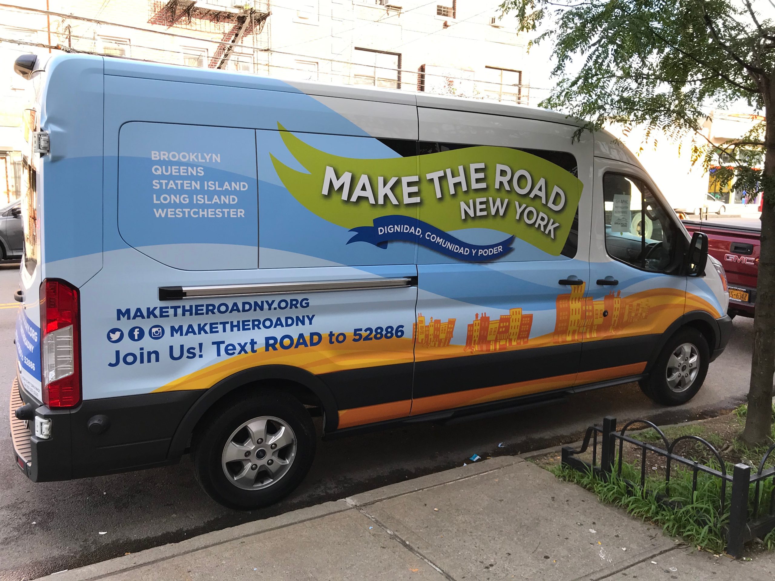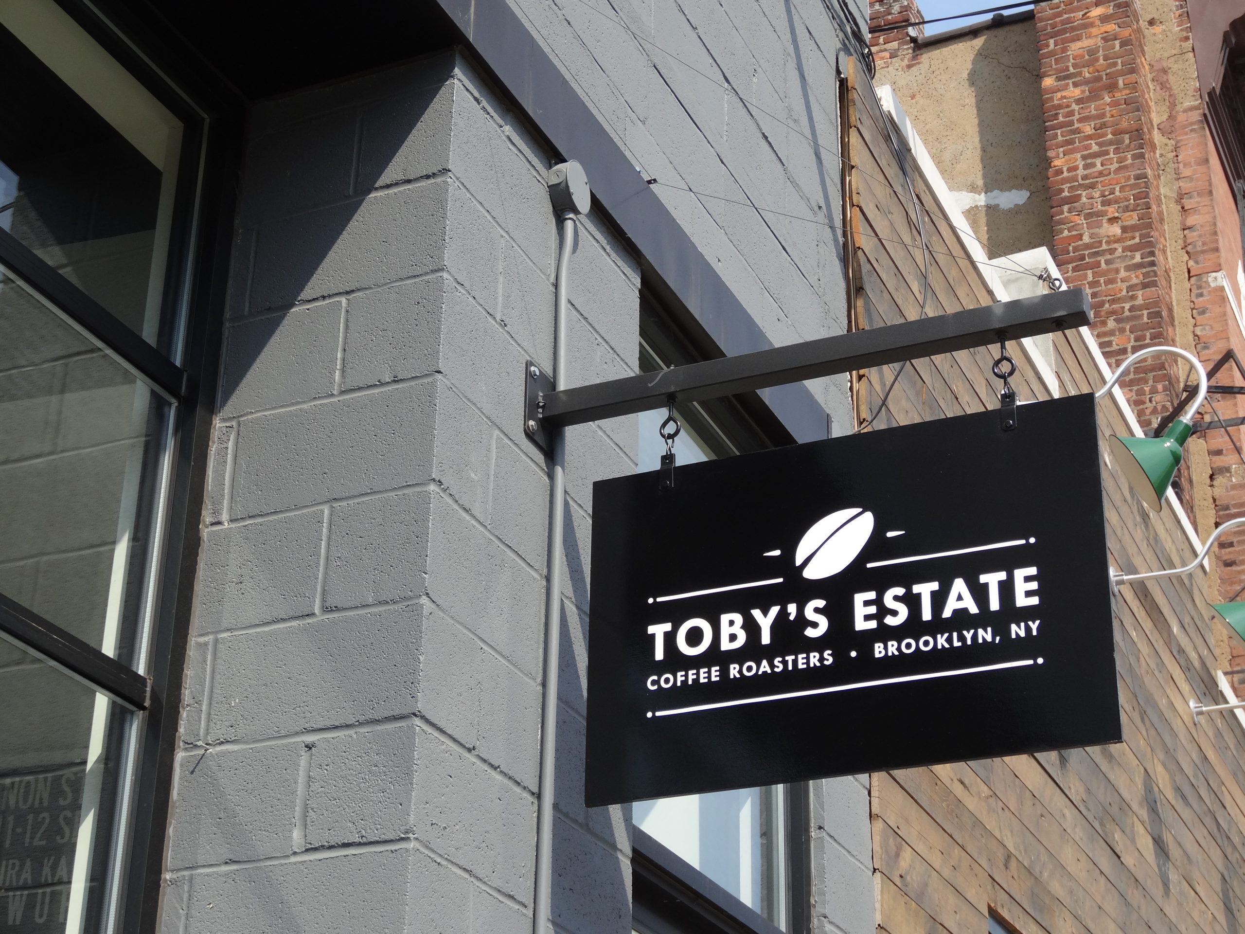
A sign that looks good on a monitor can still fail on the street. Most failures come from the same handful of design mistakes.
Most sign design mistakes are not about taste. They are about physics and attention. A driver passing a storefront has a few seconds to notice a sign, read it and decide what to do, and a pedestrian is distracted by everything else on the street. A design that ignores those conditions can look polished in a proof and still go unread.
The good news is that the common mistakes are well understood. Research on sign legibility, much of it carried out for the United States Sign Council and Penn State’s Pennsylvania Transportation Institute, gives clear guidance on letter size, contrast and clutter.
Here are the ten mistakes that most often reduce a sign’s effectiveness, and how to avoid each one.
The Ten Mistakes at a Glance
| Mistake | What happens on the street | The fix |
|---|---|---|
| Too much text | Nothing gets read | Name plus one idea on the main sign |
| Letters too small | Readable only when it is too late | Size letters to the viewing distance |
| Weak contrast | Letters blend into the background | Strong light and dark difference |
| Hard to read typeface | Thin or ornate letters break up at distance | Open, sturdy letterforms |
| Tight spacing | Letters merge, especially when lit | Generous letter and line spacing |
| Ignoring the surroundings | The sign disappears into clutter | Design for the real street |
| Forgetting the night view | The sign changes or vanishes after dark | Check the lit version before approval |
| Poor placement | Blocked by trees, awnings or neighbours | Survey sightlines before design |
| Ignoring the rules | Rejected permit or forced redesign | Design to the code and lease first |
| Inconsistent branding | Signs look like different businesses | One standard for every sign |
1. Putting Too Much on the Sign
The most common mistake is trying to say everything: the name, a tagline, a list of services, a phone number and a website. Every extra word competes with the name and makes each letter smaller within the same sign area. The main sign’s job is to identify the business. Services, hours and contact details belong on vinyl window decals, doors and vehicle wraps, where people read them up close.
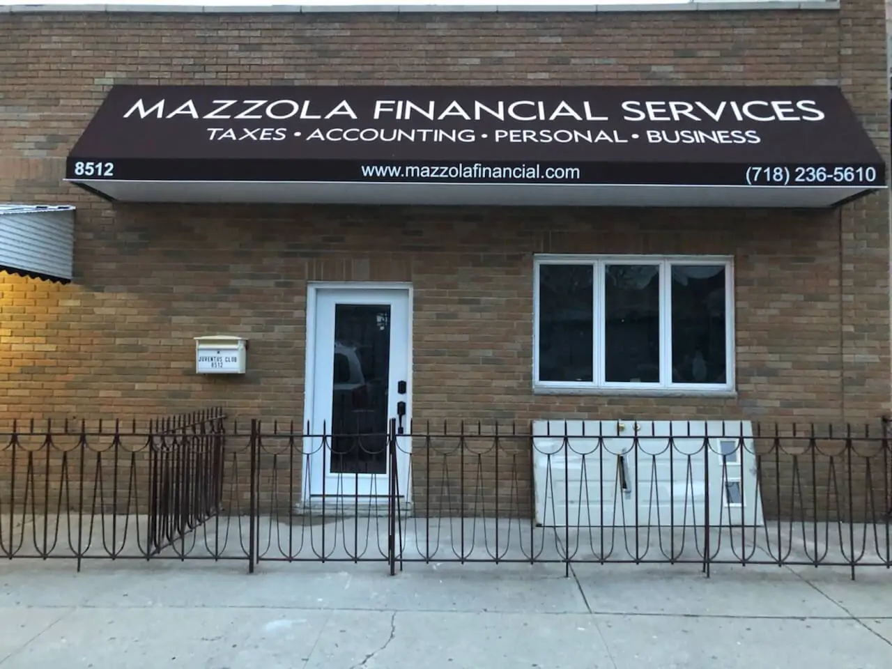
Some towns go further. Bridgewater, for example, does not permit telephone numbers on permanent signs under § 126-162E of its code.
2. Letters Too Small for the Distance
A sign that can only be read once a driver is level with it has failed, because there is no time left to turn in. The USSC relates letter height to the distance at which the sign must be read, and a common working figure is about one inch of letter height for every 30 feet of viewing distance in good conditions. Our guide to letter height and viewing distance explains how to calculate it.
All capitals need extra height. Summaries of USSC research suggest letters set in all capitals need to be roughly 15% taller than mixed case to be read at the same distance.
3. Weak Contrast
Contrast between letters and background matters more than the colors chosen. Dark letters on a light ground, or light letters on a dark ground, read furthest. Mid tones against mid tones, such as red on green or blue on black, blur together, especially at dusk. The USSC Foundation’s color and illumination study measured how different color pairs and lighting change legibility distance. Our guide on how color impacts sign visibility turns that into practical choices.

4. A Typeface That Breaks Up at Distance
Thin strokes, tight script, heavily condensed letters and decorative display faces may look distinctive close up but lose detail as distance grows. Sturdy, open letterforms with clear differences between characters read further. If the brand typeface is delicate, the designer can often adjust stroke weight or spacing for the sign version without changing the identity. Our guide to typography tips for readable business signs covers this in detail.
5. Letters Crowded Together
Letter spacing that looks elegant in print often closes up at a distance. Illumination makes it worse, because bright letters appear to spread into one another at night. Generous spacing between letters and between lines keeps words distinct, and it matters most for lit signs and condensed typefaces.
6. Ignoring the Surroundings
A sign is never seen alone. It sits among neighbouring signs, traffic lights, trees, windows and street furniture. USSC guidance treats this visual complexity as a real factor, reducing the expected legibility by about a sixth on a moderately busy street and by about a third on a very busy one. On a crowded commercial street, such as Bergenline Avenue in Union City or Main Street in Paterson, a sign needs more size, contrast or simplicity than the same sign on a quiet road. Our Union City sign company and Paterson sign services pages cover those streets.
Look at the actual street before approving a design. A proof shown on a photo of the building, with its neighbours in frame, reveals clutter problems that a plain artboard hides.
7. Forgetting the Night View
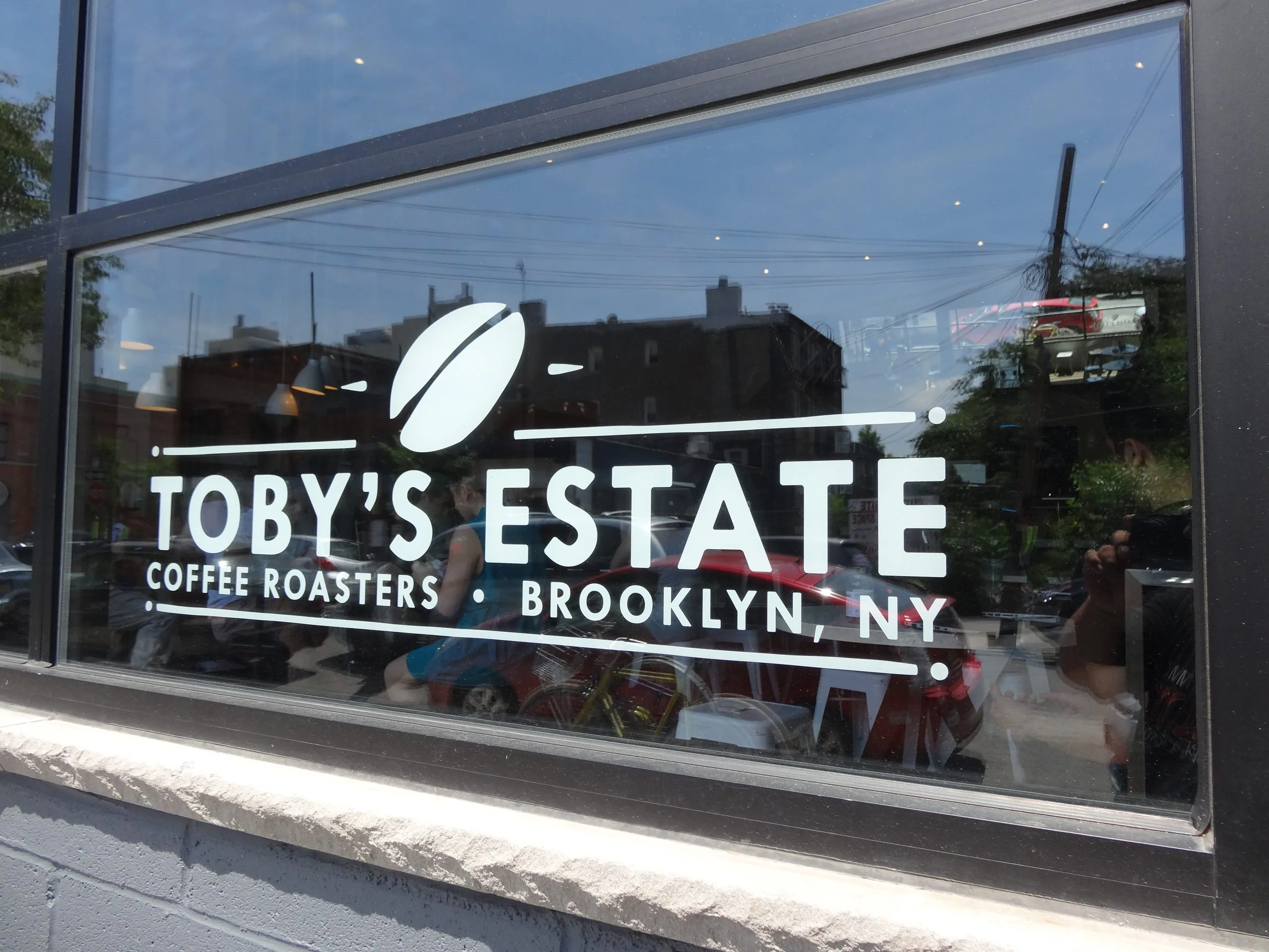
A design approved by daylight can change completely after dark. Face lit channel letter signs glow in their face color, halo lit letters show a silhouette against a glowing wall, and an unlit sign may vanish entirely if the street is dark. Colors also shift when lit from behind. Ask to see a night rendering or a lit sample before approving any illuminated sign. Our guide to illuminated sign options explains the options.
8. Poor Placement
A well designed sign in the wrong place still fails. Trees that grow in front of it, awnings that hide it from the sidewalk, columns that block the approach view and neighbours’ projecting signs all cut visibility. Check the sightlines from the directions customers actually come from, at their speed, before the position is fixed. Our guide to exterior sign placement best practices covers the details.
9. Designing Before Checking the Rules
Designing first and checking the town’s ordinance later is the most expensive mistake on this list, because it can mean a rejected permit, a redesign or a variance hearing. The same applies to the landlord’s sign criteria. Start every design from the limits on size, height, projection and lighting. Our guide to local sign regulations shows where to find them.
10. Inconsistent Branding Across Signs
When the storefront, the pylon panel, the door vinyl and the vehicle each use slightly different colors, logos or typefaces, the business looks less established. A simple sign standard, with approved colors for each material, the logo versions allowed and minimum sizes, keeps every sign looking like part of the same brand. Our guide to how consistent signage builds customer trust explains why it matters.
A Quick Design Check Before Approval
- Read it in three seconds: can the name be read at a glance on the proof?
- Check the size: is the letter height right for the real viewing distance?
- Squint at it: if the letters disappear when you squint, the contrast is too weak.
- View it on the building: is it shown at scale on a photo with the neighbours?
- See it at night: if it is lit, what does it look like after dark?
- Check the rules: does it fit the ordinance and the lease?
Common Questions About Sign Design Mistakes
What is the most common sign design mistake?
Putting too much on the sign. Extra words make every letter smaller and compete with the business name, so the sign takes longer to read and is remembered less.
How big should the letters on my sign be?
It depends on how far away people are when they need to read it. A widely used guideline is about one inch of letter height per 30 feet of viewing distance, increased for all capitals, busy streets and lower contrast.
Are all capital letters harder to read?
At the same height, yes. Mixed case words have more distinctive shapes, and research summaries suggest all capitals need to be about 15% taller to be read at the same distance.
What colors are easiest to read on a sign?
High contrast pairs, such as white on dark blue or black on yellow, read furthest. What matters most is the difference in lightness between the letters and the background.
Should my phone number be on my sign?
Usually not on the main sign. It takes space from the name and is rarely remembered from a passing car, and some towns do not allow phone numbers on permanent signs. Put it on doors, windows and vehicles instead.
How can I check a design before it is built?
Ask for a proof shown at scale on a photo of your building, a night rendering if it is lit and confirmation that it meets the town’s rules. Then try reading it in three seconds from across the room.
Get a Design That Works on the Street
Gogi Signs designs signs for the street they will stand on, sized for the real viewing distance, checked against the town’s rules and shown on your building by day and night before anything is built.
See our Sign Design page, or request a free quote and send us a photo of your storefront.