Size is a performance decision, not an aesthetic one. It starts from the furthest point a customer must read the sign.
A sign can fit the available wall and still be too small for the job. It can also be made larger without becoming easier to understand. Getting business sign size right means working from what people need to read, where they first see it, how fast they are moving, the angle of approach, available contrast, surrounding visual noise and how the sign relates to the building.
Size should therefore be evaluated as part of a viewing situation, not selected from facade dimensions alone. Letterform choice is part of the same calculation, and our guide to typography for readable business signs covers spacing, weight and capitalization in more detail.
Start From the Viewing Task
Define the Critical Viewing Point
Start by identifying where the sign needs to work. For a roadside business, the critical point may be the distance at which a driver must recognize the name and safely decide to turn. For a pedestrian storefront, it may be the opposite sidewalk or the oblique angle from which people approach. For an interior directory, it may be the point where visitors pause after entering.
Measure or estimate:
- Viewing distance
- Travel speed
- Approach direction and angle
- Time available to read
- Elevation of the sign
- Obstructions and competing messages
- Day and nighttime conditions
Photographs from those positions are more informative than a straight on elevation alone. A sign that appears prominent when viewed squarely may be compressed by perspective from the actual approach.
Speed Reduces Reading Time
A driver sees and processes a sign differently from a pedestrian standing still. At higher speeds, the sign must be detected, recognized, read and acted on within a shorter period, while traffic, turns, lane changes and other signs compete for attention. A car at 45 mph covers 66 feet every second, so the useful viewing window may be much smaller than the full distance from which the sign is technically visible.
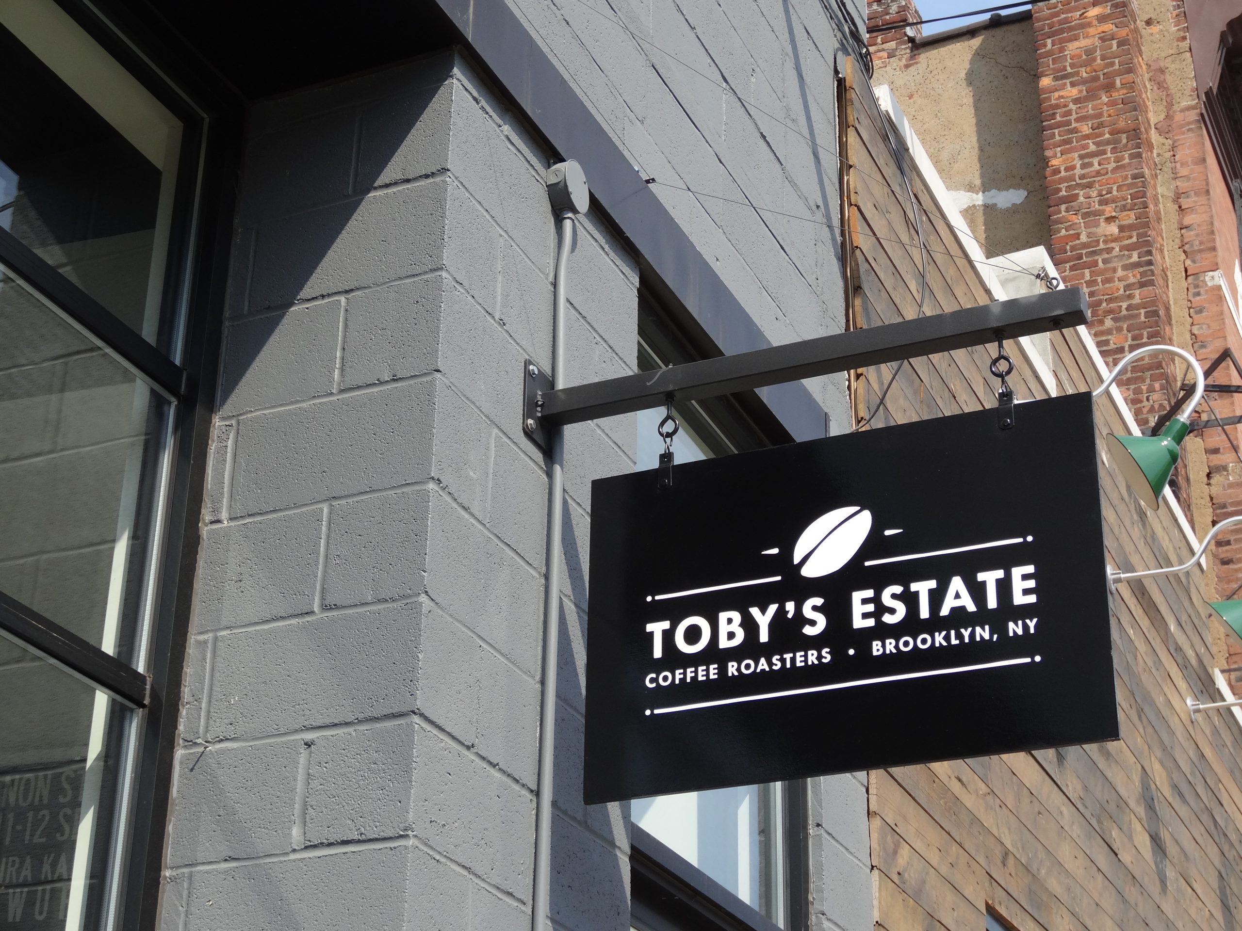
Do not assume a driver is looking directly at the sign from the first possible moment. Observe where it emerges from behind buildings, trees, parked vehicles or road geometry. Pedestrian signs can support more detail, but angle and storefront rhythm matter, which is why blade or projecting signs often work better along a sidewalk than a larger wall sign. See our custom blade signs page.
Letter Height Comes First
Letter Height and Sign Size Are Not the Same
Customers read the copy, not the outside dimensions of the cabinet or panel. A large sign with a small logo and generous blank area may be harder to read than a smaller sign with appropriately scaled letters. Borders, symbols, taglines and decorative shapes consume area without necessarily increasing the size of the identifying text.
Evaluate the height and width of the critical letters, then stroke thickness, internal spaces, letter spacing and contrast. A thin or highly decorative typeface may require greater size than a simpler form under the same conditions.
The United States Sign Council’s guideline standards recommend about one inch of letter height for every 30 feet of viewing distance as a starting point, and research reviews from the Sign Research Foundation stress that font, color, illumination, message complexity, distance and speed all interact. A universal ratio should never replace testing against the actual site.
| Viewing distance | Starting letter height at 30 ft per inch |
|---|---|
| 60 ft | 2 in |
| 100 ft | 4 in |
| 200 ft | 7 in |
| 300 ft | 10 in |
| 500 ft | 17 in |
Our guide to designing signs for different viewing distances explains the adjustments for clutter, capitals and angle.

Message Length Changes the Required Area
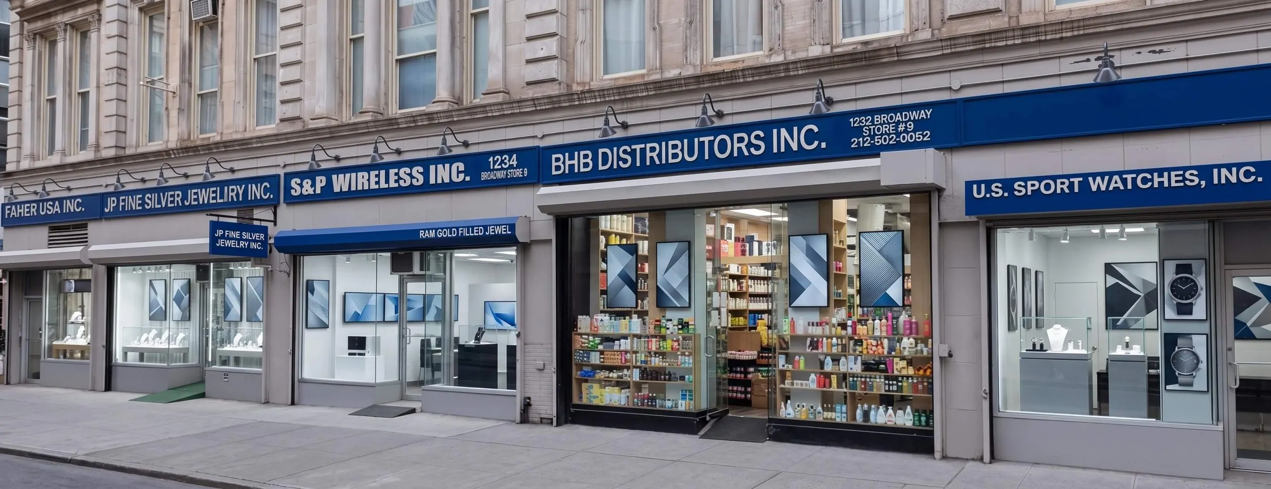
Long business names and service descriptions need more horizontal space or smaller letters, and reducing letter height to preserve every word can make the entire sign fail. Decide which information is essential at the critical viewing point. The business name may be enough on the main identifier, with a short descriptor when the name does not explain the business. Phone numbers, websites, complete service lists and promotions usually belong on closer range signs.
Abbreviations should be used only when customers understand them. For tenant panels and directories, standards should set a maximum copy area and an approved way to handle long names rather than shrinking each one independently.
What Limits the Size
Placement Can Matter More Than Added Size
A poorly positioned sign does not always need to be larger. Moving it away from visual clutter, increasing separation from the roofline, selecting a clearer elevation, trimming landscaping or adding an earlier identification point may improve performance more efficiently.
Low monument signs can disappear behind vehicles. High wall signs may be hidden by a canopy from close range. A second sign on another permitted elevation may serve an approach the primary sign cannot reach. Our guide to exterior sign placement best practices covers sightlines and clearances.
Architecture Sets Proportional Limits
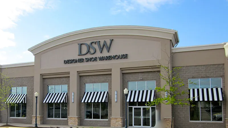
A sign should be legible without looking disconnected from the building. Sign bands, columns, windows, cornices, canopies and facade modules create natural boundaries. Filling every available inch can make the sign feel crowded, while an undersized identity may appear temporary or uncertain. Review proportion through scaled elevations and site photo mockups that include neighbouring signs and the full building.

Regulations and Leases May Control Size
Sign area, letter height, projection, quantity, placement and illumination can be limited by municipal ordinances, landlord criteria or planned development standards. The maximum permitted size is not automatically the recommended size, and the ideal marketing size may not be approvable. New Jersey towns calculate the allowance very differently:
| Town | Wall sign allowance |
|---|---|
| Bridgewater | All building signs together up to 5% of the street facade, never more than 100 sq ft |
| Old Bridge | One storefront facia sign up to 15% of the storefront facade |
| Marlboro | Wall signs up to 10% of each side fronting a street |
| West New York | 2 sq ft per foot of frontage, up to 40 sq ft for a single tenant |
Larger cities set their own limits again, so business signs in Jersey City, Newark storefront signs and signs in Hoboken each follow local rules, and some blocks fall under redevelopment plans with separate sign standards. Confirm how sign area is calculated, which wall it relates to and whether logos, borders or supporting panels count. Bridgewater’s rules are in § 126-195 and Old Bridge’s in § 250-52. Business.NJ.gov also advises businesses to understand zoning restrictions during location due diligence, and a lease should confirm sign rights before a tenant depends on a particular elevation.
Do not shrink a completed design proportionally after a rejection. Redesign for the approved area and protect the critical identifying elements.
Illumination and Interior Signs
Illumination Affects Visibility, Not Just Size
An illuminated sign may be visible from farther away, but brightness does not correct small or crowded copy. Channel letter returns, face colors, halo spacing, cabinet depth and lighting uniformity affect the perceived letterform at night. Excessive brightness can cause blooming that makes letters appear less distinct, while weak or uneven illumination can make part of the name disappear. Review daytime and nighttime renderings and, when possible, physical samples.
Interior Sign Size Follows a Different Logic
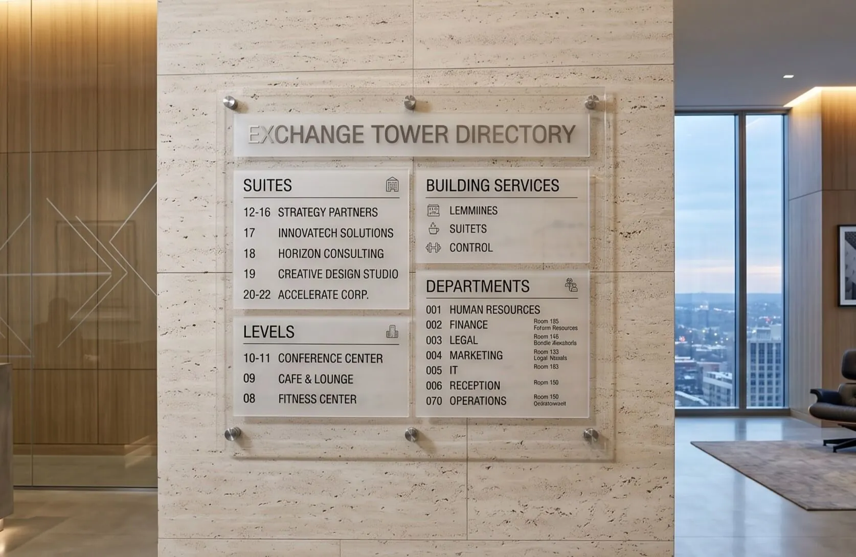
Interior signs are viewed closer and at slower speeds, but they may serve a wider range of users and information needs. Directory signs need enough letter size and spacing to scan without crowding. Directional signs should be visible before the decision point. Room signs are subject to accessibility rules, and our guide to ADA sign requirements sets out the character sizes. Size the interior system consistently, because random variations make visitors unsure which signs carry official directions.
Test at Scale Before Fabrication
- Print the critical lettering at full size: and view it from the expected distance.
- Mark the footprint on the wall: with removable tape where the property permits.
- Simulate the approach: use site photographs to show obstructions and angles.
- Test in the right light: daytime, dusk and night if the business trades after dark.
- Ask a stranger: what they can identify first and how long it takes.
- Judge from the customer’s position: not from beneath the sign where installation happens.
Plan for Future Changes
A sign sized perfectly for one short tenant name may fail when information changes. Directories, monument panels, room systems and multi location templates should account for reasonable variation, with maximum copy lengths and alternate layouts. Rebrands can also change proportions, since a wider logo or added descriptor may not fit an existing cabinet or raceway.
Common Sign Sizing Mistakes
- Sizing the sign from the closest possible view, beneath the proposed location.
- Filling the maximum permitted area without protecting margins or architectural proportion.
- Reducing all copy until a long service list fits, leaving the name too small.
- Letting decorative borders, oversized logos and taglines consume the area meant for the name.
- Copying dimensions from an unrelated property with a different street and setback.
- Ordering replacement faces from old dimensions without checking what has changed.
Safety and approvals still set the boundary. A desire for greater visibility should never lead to a sign that obstructs sight lines, projects beyond allowed limits, overloads a structure or distracts from traffic control information.
Common Questions About Business Sign Size
How do I work out the letter height I need?
Start from the furthest point at which the sign must be readable, not from the size of the available space. Letter height follows viewing distance, about one inch per 30 feet as a starting point, and the overall sign size then follows from the letter height plus the copy length and the layout.
Does a bigger sign always read better?
No. Past a point, extra area adds cost and bulk without adding legibility, and an oversized sign can read as cluttered against a small facade. Contrast, letterform, spacing and placement often buy more readability than extra size does.
How does traffic speed change the answer?
Faster traffic means less reading time, so the message has to be shorter as well as larger. A sign on a 45 mph road and the same sign on a walkable street are different design problems even at identical dimensions.
What if the size I need is not allowed?
Then the sign type or placement usually has to change rather than the message being shrunk. Moving to a projecting sign, a different elevation or a better lit construction can recover legibility that cutting letter height would have destroyed.
Can I check the size before committing to fabrication?
Yes, and you should. A full size paper or vinyl mockup on the building, viewed from the actual approach, costs very little and catches proportion and legibility problems while they are still free to fix.
Sized From the Street, Not From the Wall
Gogi Signs has helped New Jersey businesses design, fabricate and install commercial signs since 2005. We measure the approach and the viewing distances during the site survey and mock up letter height at full size before anything is fabricated, so if the size the site needs is not the size the code allows, we find that out with you at the survey.
Request a free quote, or see our sign site survey page for what we measure.