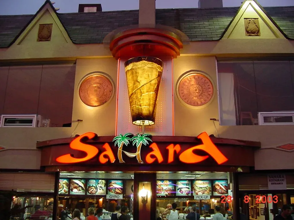
A typeface that looks refined on a business card can fall apart forty feet away. Sign typography is judged at distance, at speed and after dark.
Sign typography works under conditions print never faces. The reader is far away, often moving, sometimes looking through a windshield at dusk, and has a second or two to take in the words. Choices that are purely stylistic on a menu or a website become practical on a sign, because they decide how far away it can be read.
None of this means signs must be dull. It means the brand’s typeface, and the way it is set, need to be checked against distance, light and material before the design is approved.
These nine tips cover the decisions that matter most, with notes on where research and code requirements back them up.
Typography Tips at a Glance
1. Choose an Open, Sturdy Typeface
The most legible sign typefaces have open shapes, generous counters, the enclosed spaces in letters like a, e and o, and clear differences between similar characters. Many simple sans serif faces meet that description, and so do sturdy slab and bracketed serifs. Research carried out for the United States Sign Council compared two typefaces commonly used on business signs, a Helvetica style sans serif and a Clarendon style serif, under different colors and lighting, and both performed well when properly set. The USSC Foundation’s study shows how much the color and lighting matter alongside the face itself.
What tends to fail at distance are thin hairline strokes, highly decorative display faces and fonts where letters like I, l and 1 look identical.

2. Prefer Mixed Case for Words
Words set in upper and lower case have distinctive outlines, with ascenders and descenders that help the eye recognise them. All capital words form uniform blocks. Summaries of USSC research suggest all capital lettering needs to be about 15% taller than mixed case to be read at the same distance.
Capitals still have their place: short words, single letter initials and brand names that are always written that way. Just allow the extra height.
3. Get the Stroke Weight Right
Light weights look elegant up close and disappear at distance, especially against a busy background. Very heavy weights fill in their own counters, and when lit they can glow together into a blur. A regular to bold weight usually reads best. For illuminated channel letters, stroke width also has a practical limit, because the letter needs enough internal space to fit and spread the lighting evenly.
4. Give Letters Room
Letter spacing that looks right in print often needs opening up on a sign. At distance, letters that nearly touch merge into shapes, and on lit signs the glow of each letter spreads toward the next. Slightly wider tracking, and more space between lines, keeps words distinct. Leave clear space around the text too, so the words are not squeezed against the edge of the sign or cabinet.
5. Avoid Heavily Condensed Faces
Condensed typefaces fit long names into narrow spaces, but squeezing letters reduces how far they can be read. Research on character aspect ratio and legibility published in the Interdisciplinary Journal of Signage and Wayfinding examines how narrowing characters affects legibility. If a name is too long for the sign band, it is usually better to reduce the words, use two lines or choose a different sign type than to condense the type heavily.
6. Use Scripts Carefully
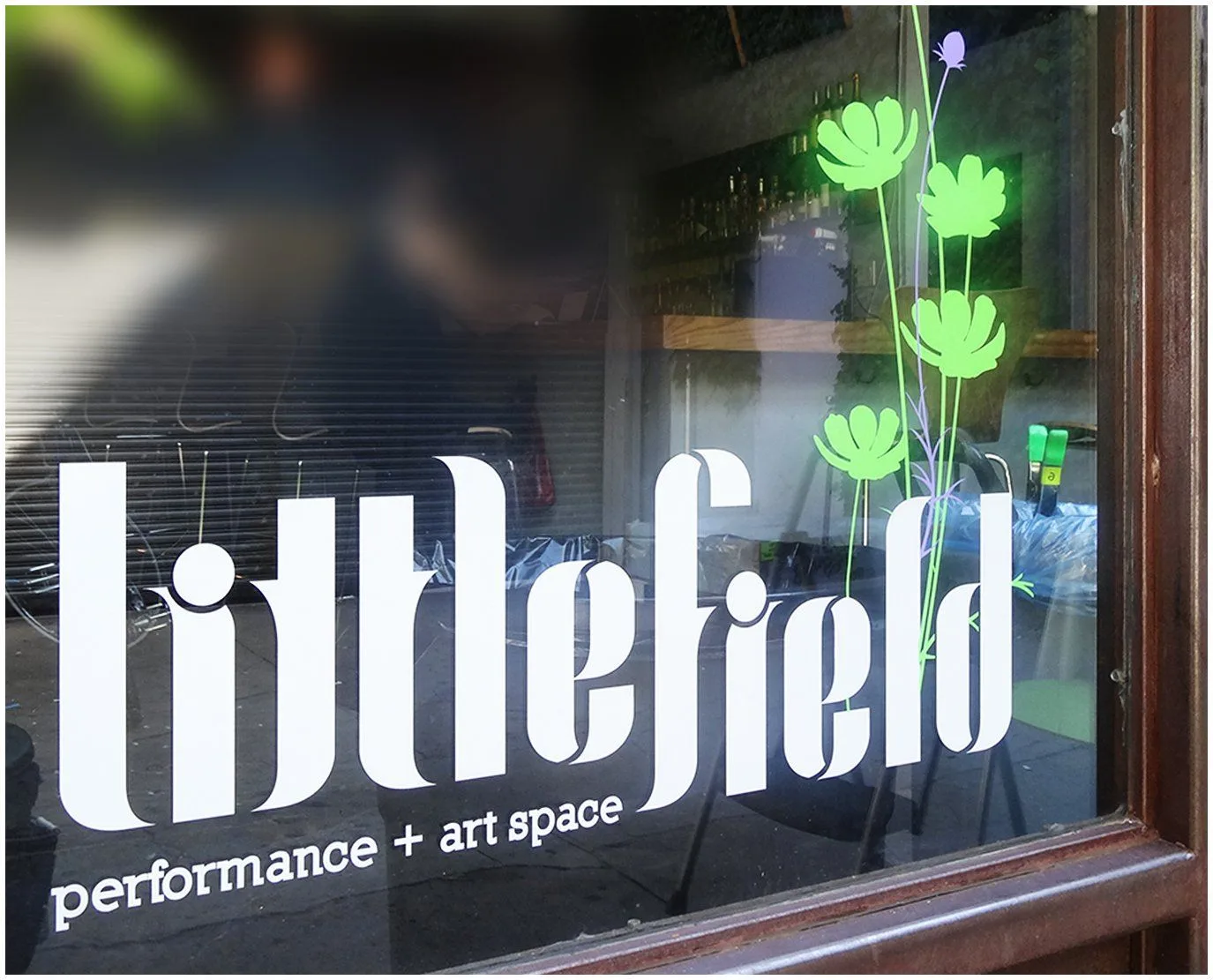
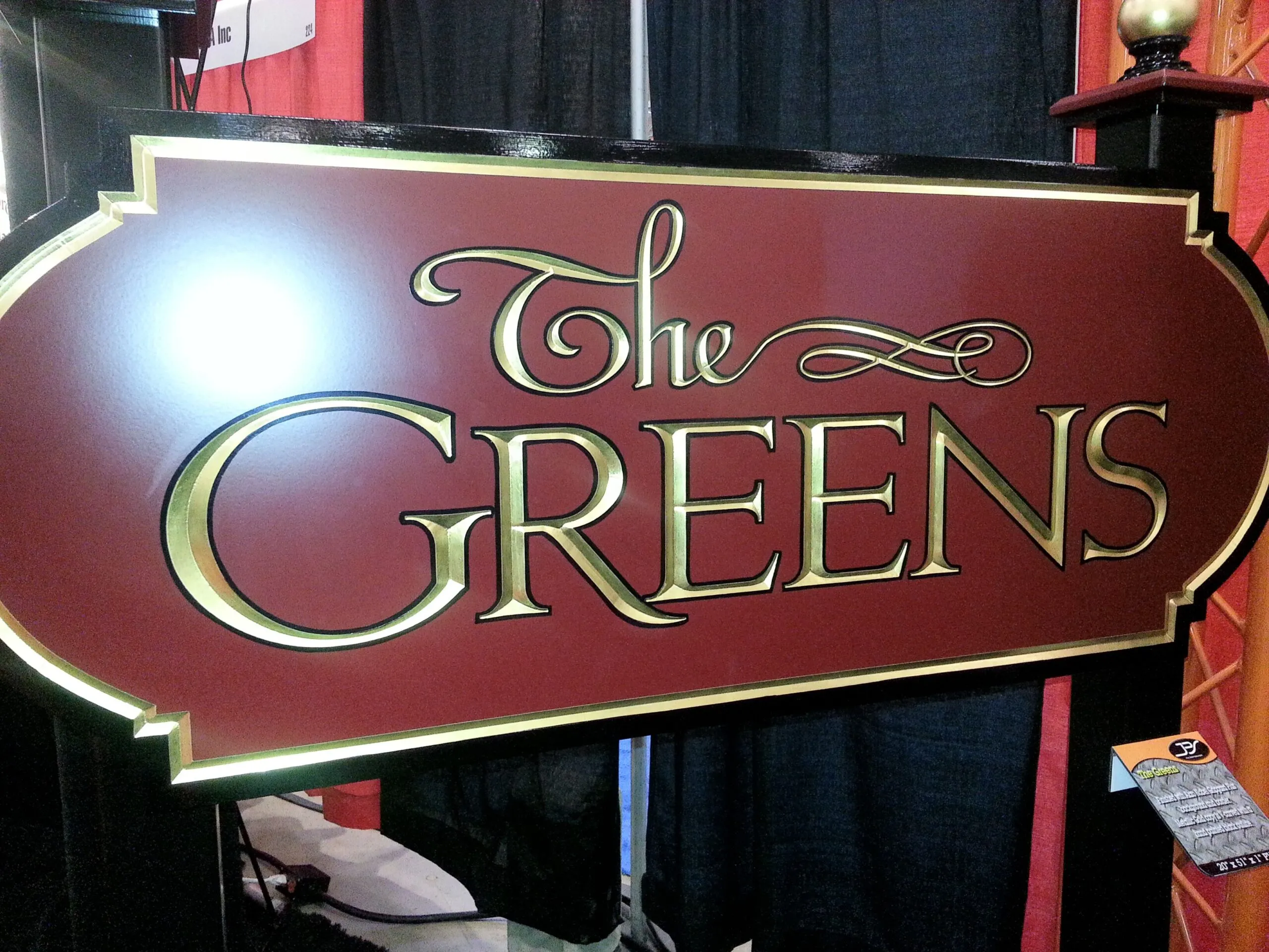
Script and handwritten typefaces carry personality, and many strong brands use them. They are also the hardest to read at distance, especially when connected strokes are thin or letters overlap. If the logo is a script, keep it large, make sure the strokes are substantial enough for the chosen construction, and consider a secondary line in a clear typeface for what the business does. Hand painted and carved signs are often the best way to render scripts well, because the craftsperson can adjust each stroke for the material.
7. Build a Clear Hierarchy
A sign should have one dominant element, usually the business name, and at most one or two secondary lines. Make the difference in size obvious, not subtle. Limit the sign to one or two typefaces, and use weight and size rather than more fonts to separate levels. Everything that is not essential on the main sign can move to windows, doors and printed materials. Our guide to common sign design mistakes covers what happens when hierarchy is missing.
8. Make Numbers Legible
Address numbers are typography too, and they have a code requirement. The International Building Code, which New Jersey adopts through its Uniform Construction Code, requires new and existing buildings to display address identification that is legible from the street, with numbers at least 4 inches high, a minimum stroke of 1/2 inch and a color that contrasts with the background. Emergency services rely on them, so treat address numbers as part of the sign plan rather than an afterthought.
Choose numerals with clearly different shapes for 1 and 7, 3 and 8, and 6 and 9, and avoid old style figures that drop below the line.
9. Follow the Rules for Accessible Signs
Interior signs that identify rooms and spaces must meet the 2010 ADA Standards. Tactile characters on room signs must be raised, uppercase and sans serif, within set height limits, with braille below. Visual characters on other directional and informational signs must use conventional letterforms, without italic, oblique, script or highly decorative styles, and meet minimum heights based on viewing distance. Our guide to ADA sign requirements sets out the details, and our ADA Signs page shows compliant formats.
Typography Choices Compared
| Choice | Reads further when | Reads less far when |
|---|---|---|
| Typeface | Open shapes, clear counters, distinct characters | Hairline strokes, ornate details, ambiguous characters |
| Case | Mixed case for names and words | All capitals at the same height |
| Weight | Regular to bold | Light, or extra black that fills in |
| Spacing | Slightly open letter and line spacing | Tight tracking, especially on lit signs |
| Width | Normal proportions | Heavily condensed |
| Color | Strong light and dark contrast | Similar tones, busy backgrounds |
A Typography Check for Any Sign
- Set the name first: biggest, clearest, in the brand’s most legible form.
- Check the face at distance: print a sample at full size and view it from the real distance.
- Compare case options: if using capitals, allow about 15% more height.
- Open the spacing: especially for lit letters and condensed faces.
- Cut the words: move secondary information to windows and doors.
- Check the codes: address numbers and accessible signs have their own requirements.
Our guide to designing signs for different viewing distances explains how to size the letters once the typography is set.
Common Questions About Sign Typography
What is the most readable font for a business sign?
There is no single best font. Open, sturdy typefaces with clear counters and distinct characters read best, which includes many plain sans serif faces and solid slab or bracketed serifs. Thin, ornate and heavily condensed fonts read least far.
Should my sign be in all capitals?
Mixed case is usually more legible at the same height. If the brand uses capitals, make the letters about 15% taller to compensate.
Can I use my script logo on my sign?
Yes, if it is large enough and the strokes are substantial for the construction. Many businesses pair a script logo with a clear secondary line so passers by can read what the business does.
How many fonts should a sign use?
One or two. Use size and weight to create hierarchy rather than adding more typefaces, which makes a sign look busy and slows reading.
What size should address numbers be?
The International Building Code requires address numbers at least 4 inches high with a 1/2 inch stroke, contrasting with the background and legible from the street. Larger numbers are better for buildings set back from the road.
Do ADA signs require a specific font?
Not a named font, but specific characteristics. Tactile characters must be uppercase sans serif, and visual characters must use conventional forms without italic, script or highly decorative styles.
Make Your Sign Easy to Read
Gogi Signs designers test typography at full size and real distance before a design is approved, adjusting weight, spacing and size so the brand reads clearly from the street, by day and after dark.
See our business sign design page, or request a free quote with your logo and a photo of the building.