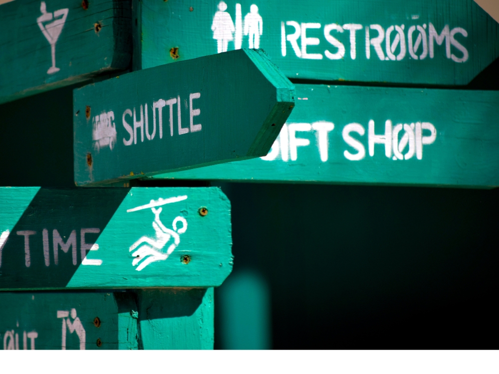
Wayfinding problems are often discovered too late.
The building is open. Furniture is installed. Customers are already arriving. Then staff begin hearing the same questions over and over:
Where do I park?
Which entrance should I use?
Where is reception?
How do I get to the second floor?
Which hallway leads to my appointment?
At that point, businesses usually begin adding directional signs one by one.
A sign goes near the elevator. Another appears beside a hallway. A temporary arrow is taped to a door. A directory gets updated.
The property slowly accumulates signs, but it still may not have a true wayfinding system.
Good wayfinding signage design works better when it is planned before confusion appears.
That means looking at the property from the customer’s point of view while the building, renovation, tenant fit-out, or sign package is still being planned.
At Gogi Signs, we have worked with New Jersey businesses since 2005. One thing we consistently see is that wayfinding becomes much easier when it is treated as part of the customer experience rather than as a collection of directional signs.
The goal is not to place more signs.
It is to reduce uncertainty.
Wayfinding Begins Before the Customer Enters the Building
Many businesses think of wayfinding as an interior issue.
In reality, the customer’s navigation experience often begins at the street.
A visitor may need to:
- recognize the property
- choose the correct driveway
- identify visitor parking
- find the correct building
- locate the main entrance
- enter the correct suite
- find reception
- reach a department or room
If the first three steps are confusing, strong interior signs cannot fully recover the experience.
This is why wayfinding signage should be planned from the outside in.

A useful customer journey might begin with a monument sign, continue with parking and directional signs, confirm the correct entrance, and then transition into interior directories and room identification.
For larger facilities, this broader system approach is covered in Creating a Signage System for Large Buildings.
The Best Wayfinding Plans Begin With Movement, Not Walls
A floor plan shows architecture.
It does not always show how people behave.
Visitors may enter through a door that was originally considered secondary because it is closer to parking. Employees may direct clients through a shortcut. A hallway may technically connect two areas but feel closed because of furniture, lighting, or security doors.
The most useful wayfinding planning combines drawings with real movement.
Before designing signs, map:
- where customers arrive
- where they pause
- where they make decisions
- where they change direction
- where they reach the final destination
Those moments are more important than the empty wall areas available for signs.
Decision Points Should Shape the Sign Plan
A decision point is any location where a customer must choose what to do next.
Examples include entering a parking lot, choosing between two entrances, reaching an elevator bank, leaving an elevator, arriving at a hallway intersection, or choosing between several departments.
Directional information should appear before or at that decision.
This is one of the simplest principles in good wayfinding signage design.
If a customer reaches an intersection and the directional sign is mounted 30 feet beyond it, the information arrives too late.
If the sign is visible before the intersection, the customer can make the correct choice without stopping.

Gogi Signs Insight
When reviewing a property, we often pay close attention to where people naturally slow down or look around. Those moments usually reveal a decision point. If visitors regularly pause in the same place, the property may be asking them to make a choice without giving enough information.
Build the Wayfinding System in Layers
A customer rarely needs every piece of information at once.
The strongest systems give people just enough information to make the next decision.
A useful way to structure a commercial wayfinding plan is in layers.
Arrival
The customer needs to know whether they are at the correct property, where to enter, and where to park.
Signs may include monument signs, building identification, parking signs, driveway directions, and visitor parking identification.
Entry
The customer needs to know whether this is the correct entrance and where reception, elevators, or directories are located.
Navigation
The customer needs to know which direction to travel and which corridor, department, suite range, or floor comes next.
Confirmation
The customer needs a final sign that confirms arrival.
This layered approach helps avoid overloaded signs.

Do Not Ask One Sign to Explain the Entire Property
A common wayfinding mistake is trying to solve too much with one directory.
A lobby sign may list every tenant, suite, department, floor, room, and service.
The result is technically complete but difficult to scan.
A better system separates information.
For example, the lobby directory might direct a customer to Floor 3.
The elevator lobby on Floor 3 may show:
- Suites 300–320 →
- Suites 321–340 ←
A later hallway sign may identify the specific suite.
This gives the customer information in stages.
Destination Names Need to Be Consistent
Wayfinding fails quickly when the same place has several names.
Suppose the website tells customers to visit the Service Center.
The parking sign says Customer Support.
The directory says Client Services.
Employees call it Front Office.
All four may refer to the same location.
The problem is not the sign design.
It is the language.
Before producing directional signs, standardize building names, entrance names, department names, floor names, room names, suite numbers, and parking zones.
Every sign should use the same vocabulary.
Room and Suite Numbering Can Support Navigation
A logical numbering system makes wayfinding much easier.
For example:
- 100-level rooms on Floor 1
- 200-level rooms on Floor 2
- 300-level rooms on Floor 3
Within each floor, numbers can follow a predictable sequence.
When room numbering is random, directional signage has to work much harder.
Customers cannot infer that Suite 310 is likely near Suite 312 if the building layout has no obvious pattern.
If a property is being renovated or reconfigured, room numbering should be reviewed before new signs are produced.
Wayfinding Signage Design Should Favor Readability
Directional signs are not the place for decorative complexity.
Customers often read them while moving.
That changes how the signs should be designed.
Important factors include letter size, viewing distance, contrast, typography, spacing, arrow placement, and amount of information.
A highly stylized typeface may work for a logo but perform poorly on a directional sign.
The wayfinding system can still reflect the brand through color, material, shapes, and supporting typography.
Readability should remain the priority.

Arrows Need a Consistent System
Arrows are small but extremely important.
A property should not use several unrelated arrow styles.
The direction should also be visually tied to the destination.
For example:
→ Reception
→ Conference Center
→ Elevators
is easy to scan when the arrows and text align consistently.
Avoid placing arrows randomly before some destinations and after others.
Consistency helps customers interpret signs more quickly.
Color Can Help Organize a Property
Color can be useful in larger properties with multiple wings, several floors, parking zones, departments, or buildings.
For example:
- Blue — Building A
- Green — Building B
- Orange — Conference Center
This can help customers recognize areas more quickly.
But color should support the information rather than replace it.
A visitor should not need to remember that “orange means Building C” without a written label.
Color also needs enough contrast for readability.
Icons Work Best When Their Meaning Is Familiar
Icons can reduce reading time for common destinations such as restrooms, elevators, stairs, parking, information, accessibility, and food.
But not every destination needs an icon.
An abstract symbol for “Accounting” may create more confusion than simply using the word.
Use symbols when they are widely recognizable or when the property establishes the meaning clearly.
Custom Wayfinding Signs Should Match the Property
A medical office, warehouse, school, office building, and luxury apartment property should not all use the same directional sign style.
The wayfinding system should fit the architecture, interior finishes, audience, brand, maintenance conditions, and sign update frequency.
Possible materials may include acrylic, aluminum, dimensional components, printed panels, vinyl graphics, modular sign systems, and changeable directories.
The best material is not always the most decorative one.
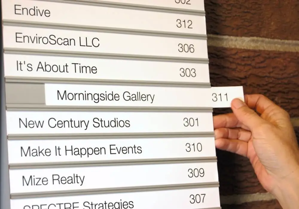
A tenant directory that changes often may benefit from a modular design.
A permanent floor identifier may use a more fixed construction.
The sign’s expected life should influence how it is built.
Wayfinding Needs to Work for Different Audiences
Not everyone arrives with the same information.
A client may know the company name.
A delivery driver may know the loading dock.
A patient may know a doctor’s name.
A contractor may know a room number.
A new employee may know only the department.
The wayfinding system should consider the main audiences using the property.
This does not mean creating separate signs for every person.
It means organizing destinations around the information people are most likely to know.
Accessibility Should Be Part of the Planning Process
Accessibility signage should not be treated as an unrelated add-on.
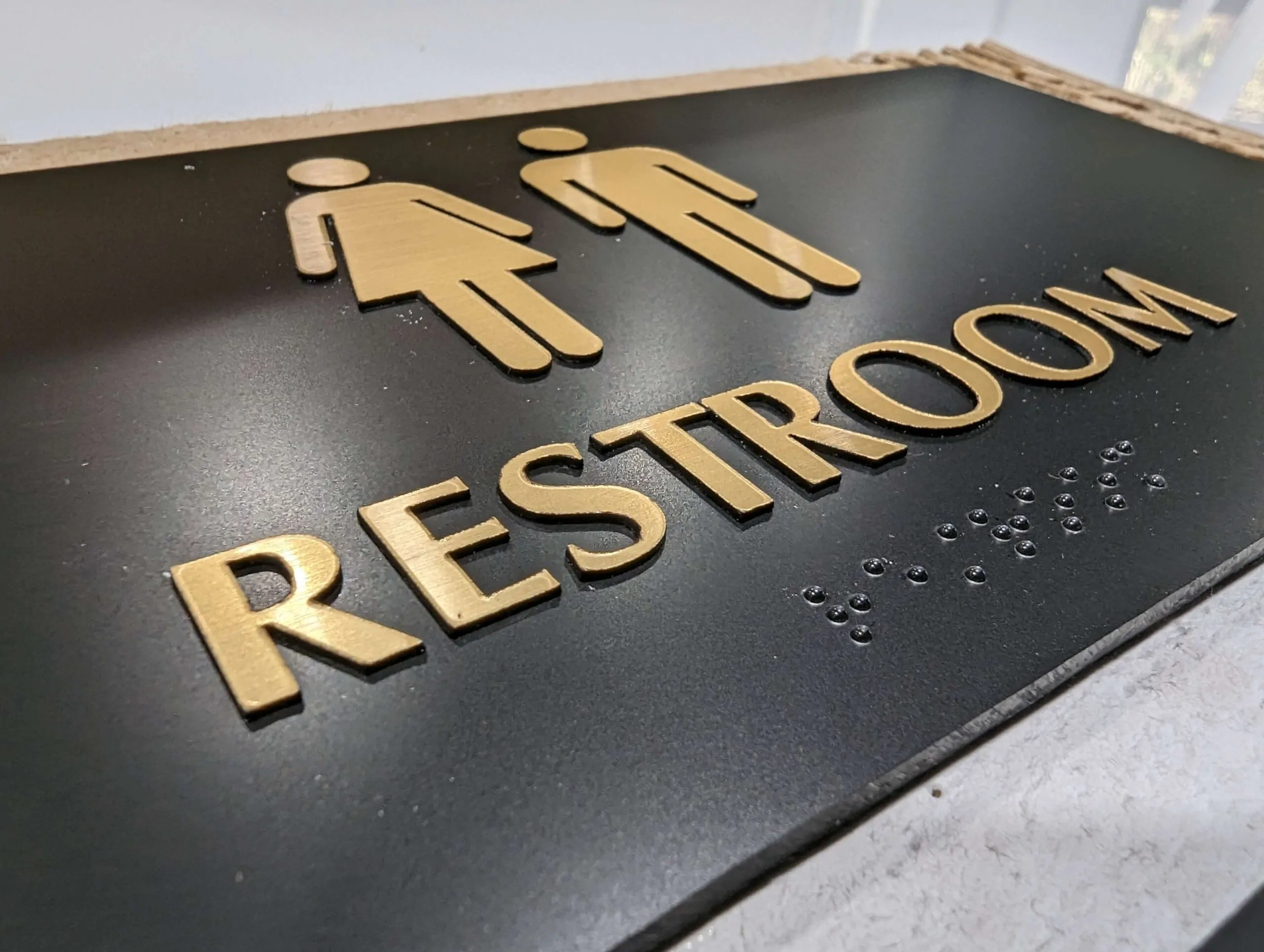
Depending on the application, permanent-room signs and other signs may need to meet specific requirements related to tactile characters, Braille, contrast, mounting, character sizing, and non-glare finish.
Directional and informational signs should also be designed with readable contrast and clear placement.
Planning accessibility early makes it easier to create one consistent sign family rather than adding required signs later that look disconnected from everything else.
Test the Route Before Finalizing the Sign Package
One of the best ways to evaluate wayfinding is to give someone a destination and watch them move through the property.
Choose someone who is unfamiliar with the building.
For example:
Find Suite 420 from the visitor parking lot.
Do not give directions.
Watch where they pause, turn the wrong way, search for information, walk past a sign, or misunderstand a destination name.
This type of test can reveal problems that staff members no longer notice.
Employees know the property too well to experience it like a first-time visitor.
Plan for the Return Journey
Getting customers to the destination is only half of wayfinding.
They also need to leave.
After an appointment, meeting, or service visit, customers may need to find the main lobby, exit, parking garage, elevators, rideshare pickup, or another building.
A route that felt obvious in one direction may look completely different on the way back.
Directional signs should be reviewed from both directions.
Plan for Changes Before They Happen
Commercial properties change.
Tenants move.
Departments expand.
Entrances close temporarily.
Parking areas change.
Rooms are renamed.
A wayfinding system should allow reasonable updates.
For frequently changing information, consider replaceable inserts, modular directories, changeable tenant panels, and removable graphics.
Permanent information can use more fixed construction.
The key is to separate what will remain stable from what is likely to change.
Common Wayfinding Problems Are Usually Planning Problems
Many wayfinding failures are not caused by poor fabrication.
They happen because the sign system was never planned as a whole.
Common problems include:
- signs added only after complaints
- directional signs placed after the turn
- too much information on one sign
- inconsistent destination names
- room numbering with no clear logic
- no confirmation after elevators or stairs
- weak exterior arrival signs
- outdated directories
- poor contrast
- no plan for updates
Each of these is easier to address during planning than after installation.
A Practical Wayfinding Planning Checklist
Before approving a wayfinding signage package, review the full route.
Arrival
- Can visitors identify the property?
- Are parking and entrances clear?
- Are building names consistent?
Entry
- Is the main entrance obvious?
- Can visitors find reception or a directory?
- Are elevator and stair directions visible?
Navigation
- Are signs placed at decision points?
- Is information broken into manageable stages?
- Are destination names consistent?
Design
- Is text readable?
- Are arrows consistent?
- Is contrast strong?
- Are colors and icons used logically?
Final destination
- Are rooms, suites, and departments clearly identified?
- Do permanent-room signs meet applicable accessibility requirements?
Long-term use
- Can directories be updated?
- Can new tenants or departments be added?
- Has the return journey been reviewed?
Wayfinding Works Best When It Is Planned Before Confusion Begins
Good wayfinding is not about covering a building with arrows.
It is about understanding how customers move through the property and giving them the right information at the right time.
That process starts with arrival.
It continues through entrances, directories, elevators, hallways, departments, and rooms.
It ends only when the customer reaches the destination and can find the way back out.
Businesses that plan this early have more control over sign placement, naming, room numbering, accessibility, materials, branding, and future updates.
They also avoid the patchwork effect that happens when directional signs are added one problem at a time.
Gogi Signs has been producing commercial and custom wayfinding signs for New Jersey businesses since 2005. Whether the project involves an office, medical building, retail property, school, warehouse, or multi-tenant facility, the strongest wayfinding plan begins by following the customer journey from the first turn into the property to the final door.