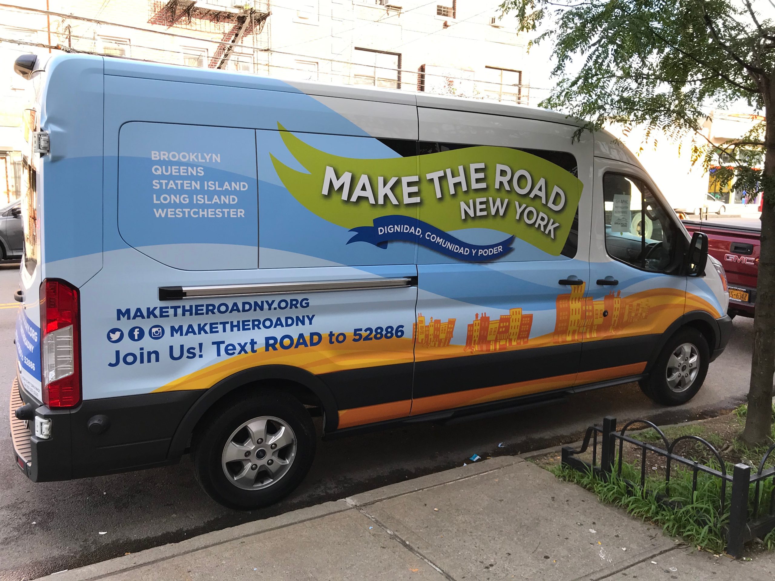
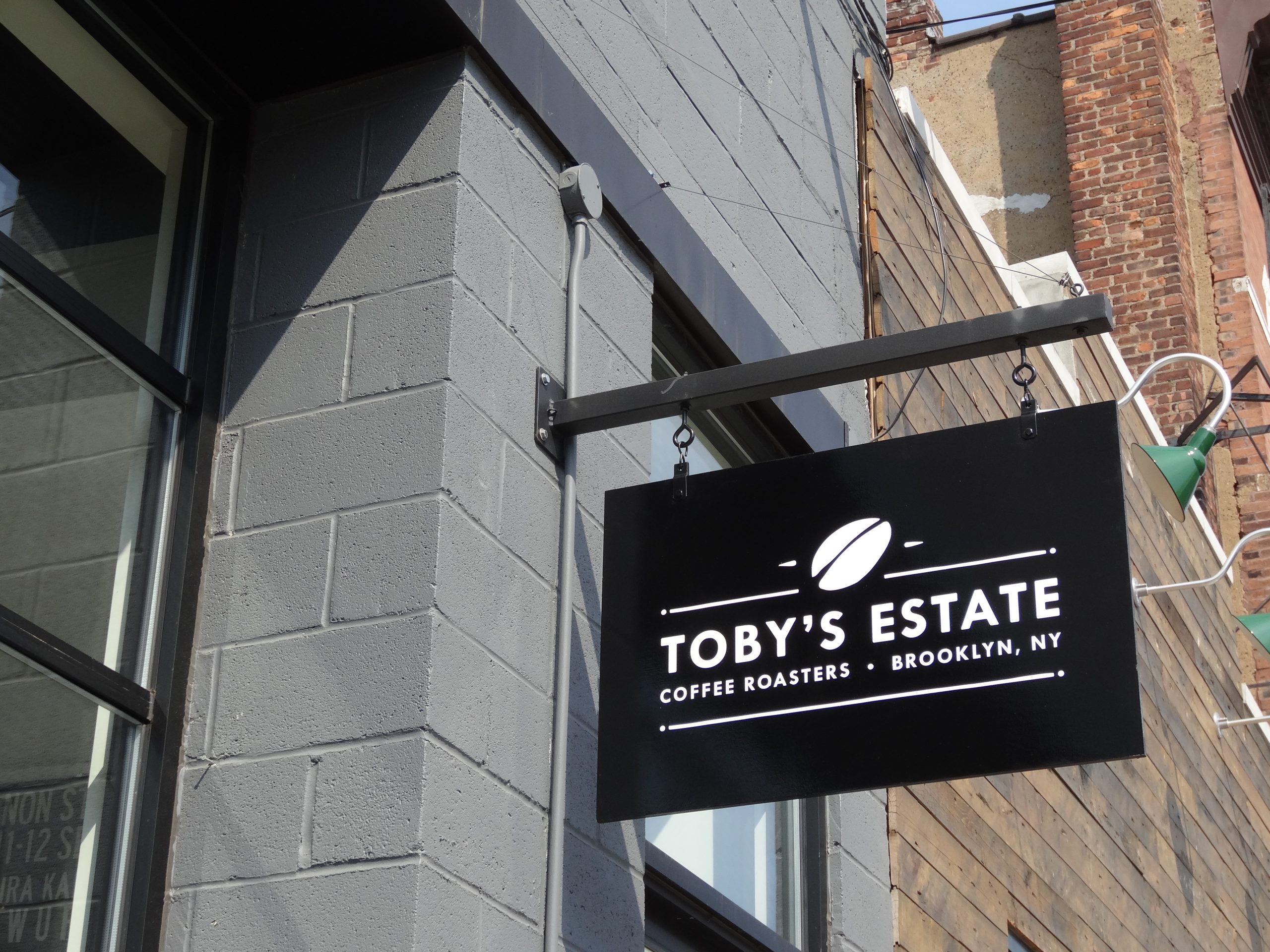
Historic review does not require a sign to look old. It looks harder at scale, placement, materials, lighting and how the sign is fixed.
Historic district signs have two jobs. A sign has to identify a business that operates today, and it has to sit on a building whose character is the reason the district is protected. The review process exists to balance those two jobs, and most of the friction comes from treating the building as a blank wall that happens to need a logo.
Historic review does not mean the sign must look old. It means scale, placement, materials, lighting and attachment get closer scrutiny than they would on a strip mall facade, and the approval path usually has an extra step.
Historic Sign Review at a Glance
| Situation | What it usually means for a sign |
|---|---|
| Locally designated landmark or district | Commission or staff review and a certificate of appropriateness before the permit |
| State or National Register listing only | Recognition of significance, not usually control over a private storefront sign |
| Zoning overlay or design district | Design standards on top of the base zone’s limits |
| Near a designated landmark | Some codes restrict certain sign types within a set distance |
Confirm What Kind of Review Applies
“Historic” covers several different legal situations, and they do not carry the same obligations.
Local Designation
In New Jersey, municipalities can create historic preservation commissions and designate local landmarks and districts under the Municipal Land Use Law. Local designation is what normally triggers sign review: the commission or its staff checks exterior changes, including signs, against the town’s design standards before a permit is issued. Locally designated districts are common in New Jersey’s older cities, from Paulus Hook and Van Vorst Park in Jersey City to the Great Falls Historic District in Paterson and the historic districts of Princeton, so a storefront in those neighborhoods should expect review. Our Jersey City sign company, Paterson sign services and Princeton storefront signs pages cover those cities.
State and National Register Listing
Listing on the New Jersey or National Register of Historic Places recognises significance, but on its own it does not usually control what a private owner puts on a storefront. It matters mainly when public funding, permits or tax credits bring a project into state or federal review. The New Jersey Historic Preservation Office explains the difference between listing and local regulation.
Overlays and Design Districts
Some towns regulate character through zoning overlays rather than a commission. Camden has both a Historic Overlay zone and a separate Historic Conservation Overlay zone, plus dedicated rehabilitation guidelines for the Fairview Village historic district, and signs in those overlays face design review on top of the base zone’s limits. Atlantic City’s sign ordinance bars ground, pole, roof and projecting signs within 50 feet of a designated landmark’s lot line where they would be visible from it, under § 163-71.
The first call is to the zoning or planning office: is the property locally designated, inside a district or overlay, or subject to design guidelines, and does the sign need a certificate of appropriateness, a commission hearing or staff approval? Ask in writing and keep the answer.
Design for the Building
Survey the Storefront Before Choosing a Sign
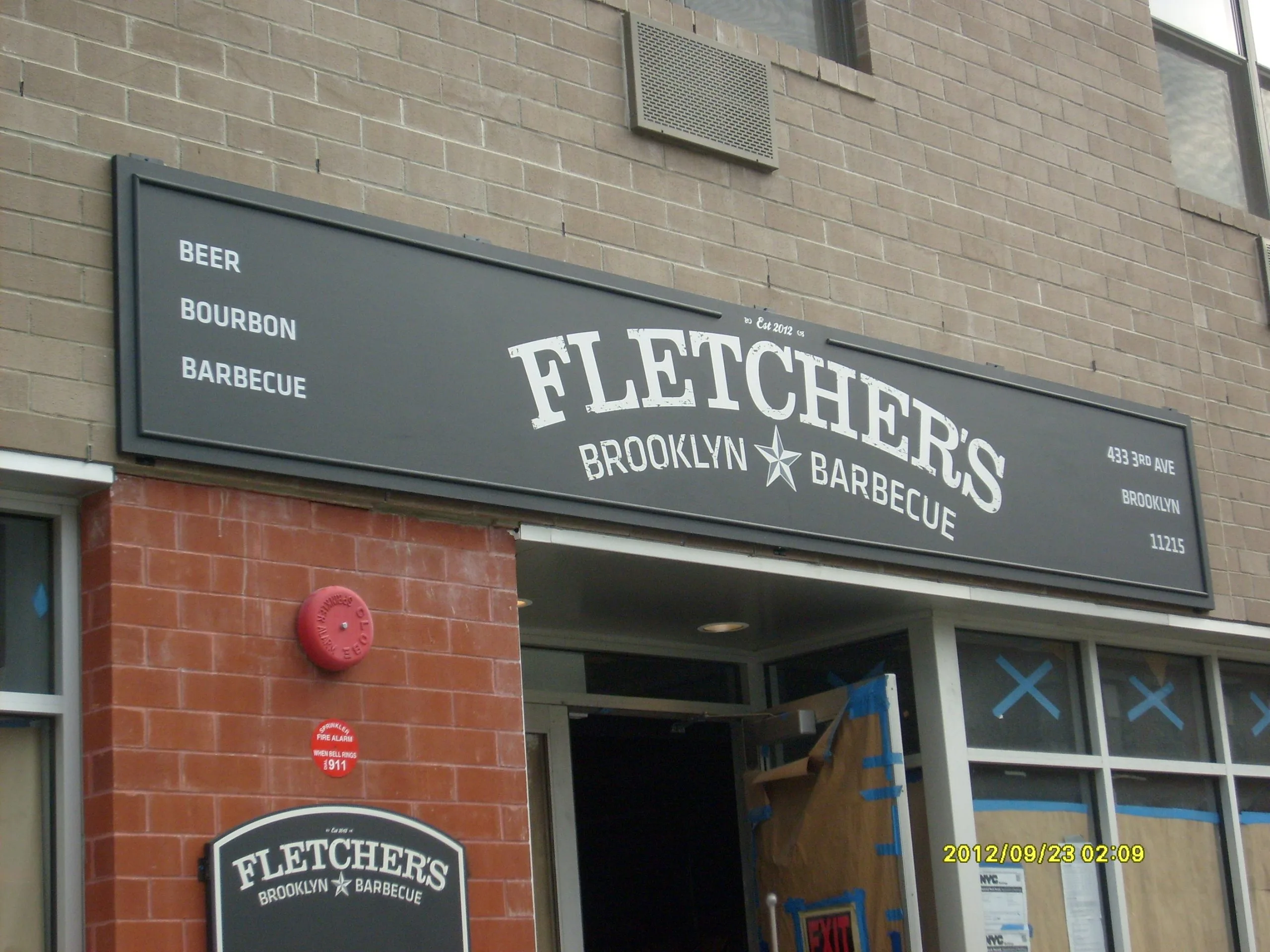
Older commercial buildings usually have a place that was built for a sign. On a traditional storefront that is the sign band or frieze between the display windows and the second floor. Pilasters frame the bays, a cornice caps the storefront and a transom sits above the door. Reading that structure is the first step.
Document the sign band’s height and length, the cornice and pilasters, masonry joints, transom glass, any surviving bracket or anchor points from earlier signs, and the rhythm of neighbouring storefronts. A sign placed in the existing sign band almost always reviews better than one that covers decorative masonry, rises above the cornice or stretches across two bays. Perth Amboy writes this logic into its code by basing wall sign allowances on a signable area below the second story window sills that is free of windows and major architectural detail.
Scale for the Sidewalk, Not the Highway
Historic commercial streets are mostly read on foot and from slow traffic. A modest sign with strong contrast reads well at those distances, and oversized letters can look out of place even when the area is technically allowed.
Design districts often set specific limits for pedestrian scale, such as a projecting sign of only a few square feet per face, modest letter heights, enough clearance to walk beneath and awning lettering kept to the valance. Those standards keep signs small, legible and close to the storefront.
Choose Sign Types That Suit the Building
- Lettering in the sign band: individual letters or a painted or carved panel within the historic sign band reinforce the storefront’s original composition. Carved signs and hand painted signs are common here because their finish suits older facades.
- Projecting or blade signs: a blade sign helps pedestrians who see the storefront at a sharp angle. Reviewers look at bracket design, projection, clearance, attachment and the spacing of neighbouring signs.
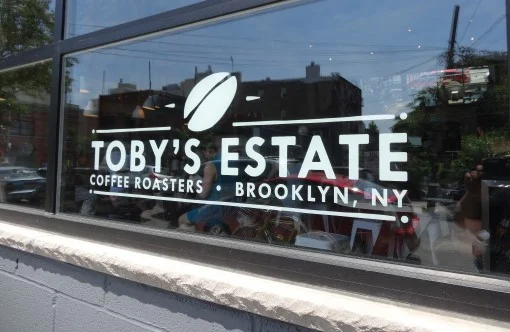
- Window and door graphics: restrained window lettering can carry hours and secondary information. Many towns cap window coverage, and some count window graphics toward total sign area.
- Awnings: a fabric awning can provide shade and identification when its shape, fabric, frame and lettering suit the storefront. It should not hide transoms or cornices, and lettering is often restricted to the valance.
Use Materials Honestly
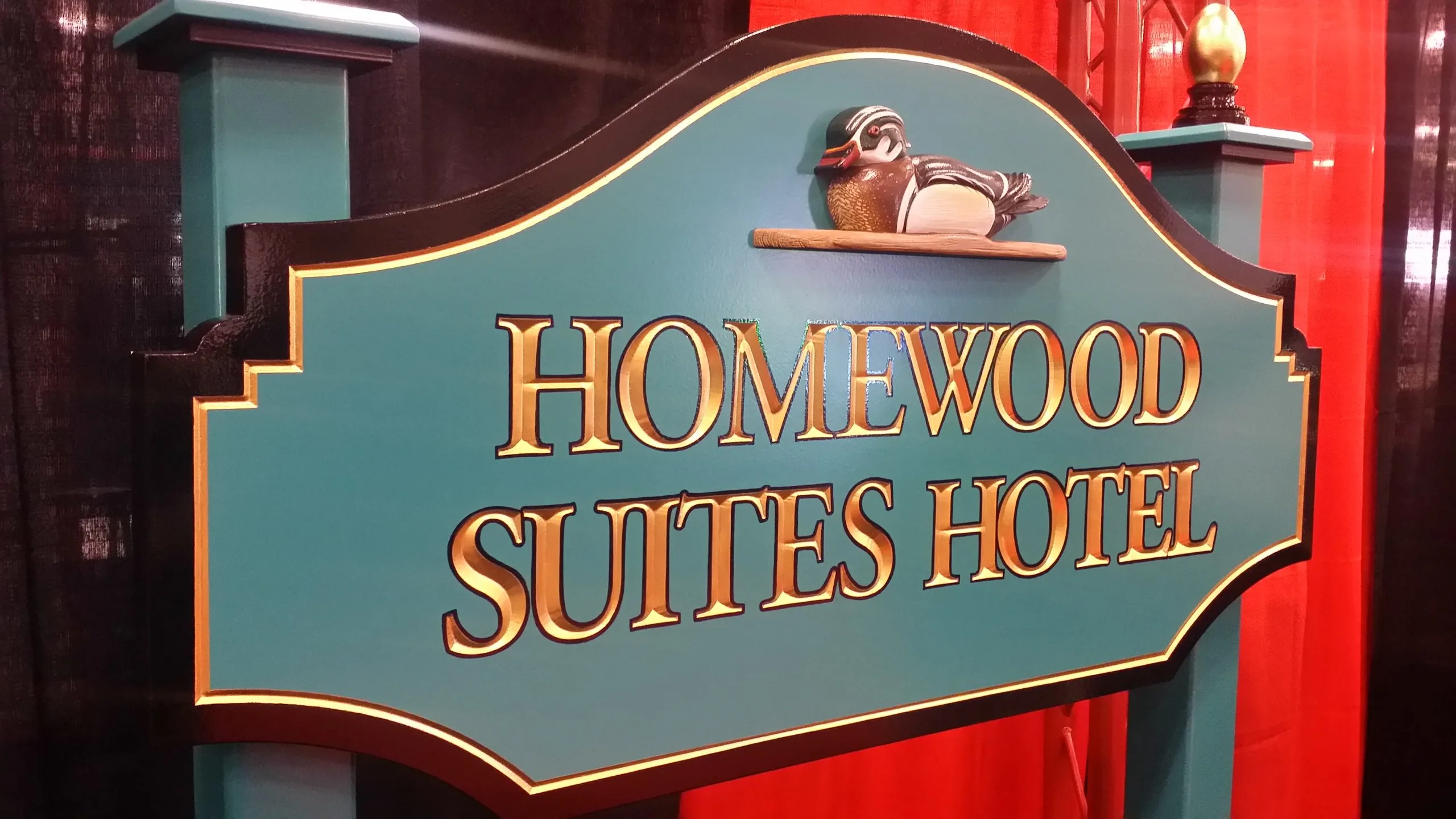
Commissions tend to favour materials that suit the building: wood, metal, paint, glass and well detailed dimensional letters. Traditional should not mean imitation. A plastic cabinet printed to look like wood rarely reviews well, while a simple painted metal panel often does.
Bring physical samples to the review if you can. Renderings do not show sheen, edge thickness, texture or how a color reads against old brick. The National Park Service’s Preservation Brief 25 makes the related point that well made older signs can themselves be significant, so do not remove or cover an old painted sign or bracket without asking first.
Keep Lighting Quiet and Serviceable
External lighting, halo lighting and low output internal lighting may all be acceptable depending on the guidelines and the building. Internally lit plastic cabinets are the type most often refused in historic districts. Show the sign at night in the submission, along with the location of every conduit, raceway, transformer and power supply. An appropriate sign can still be refused if exposed conduit runs across masonry or a power supply sits in a transom.
Protect Historic Fabric
Fasten into mortar joints or approved structural points rather than drilling decorative stone, terra cotta or cast iron. Use as few penetrations as possible, compatible sealants and separation between dissimilar metals to avoid corrosion.
Some ordinances spell out the hardware. Old Bridge requires signs fixed flat to masonry to use drilled holes with non rusting expansion hardware and prohibits wood or fibre plugs, under § 250-52G. Even where the code says nothing, a reversible installation is the standard reviewers expect, consistent with the Secretary of the Interior’s Standards: the sign should be removable later with little permanent damage.
Photograph the wall before work starts, including cracks, staining, old anchors and ghost signs. That record protects the owner and shows the reviewer what was already there.

Prepare a Review Ready Submission
A historic review package usually includes:
- Photographs of the building and its neighbours
- A scaled elevation showing the whole storefront with the sign in place
- Sign dimensions and the area calculation
- Sections and attachment details, with fixing locations
- Materials, colors and finishes, with samples where possible
- Lighting method, equipment locations and a night view
- Every other exterior graphic, including window lettering, door vinyl and awning copy
Present the strongest option for that building rather than several brand variations. A commission asked to choose among generic options will often send the applicant back to design something specific.
- Confirm the review type: designation, overlay or guidelines, in writing.
- Survey the storefront: sign band, cornice, joints and old anchors.
- Design to the building: pedestrian scale, honest materials, quiet lighting.
- Detail the fixings: reversible, into joints, with compatible hardware.
- Submit a complete package: with samples and a night view.
- Build to the conditions: every approval condition on the shop drawing.
Common Mistakes
- Copying a neighbouring sign without checking whether it was ever approved.
- Designing from the logo file before surveying the facade.
- Choosing a historic looking typeface that is hard to read.
- Leaving conduit and fixings off the drawings.
- Assuming window graphics are unregulated.
- Fabricating before written approval arrives.
Commission approvals often carry conditions on color, lighting, dimensions or mounting, and every one belongs on the final shop drawing. For the municipal side of the process, see understanding local sign regulations and avoiding permit delays.
Common Questions About Historic District Signs
Does every building in a historic area need sign review?
No. Review usually follows local designation: a locally designated landmark or a property inside a local historic district or design overlay. Listing on the State or National Register alone does not normally control a private storefront sign. Ask the zoning office which applies to the address.
What is a certificate of appropriateness?
It is the approval a local historic preservation commission or its staff issues for exterior work, including signs, in a designated district. In New Jersey, commissions are set up under the Municipal Land Use Law, and the certificate is typically needed before the zoning or construction permit.
Are illuminated signs allowed in historic districts?
Often, with limits. External lighting, halo lighting and low output lighting are frequently acceptable, while internally lit plastic cabinets are the type most often refused. Show the sign at night and every conduit and power supply in the submission.
How should a sign be fixed to old masonry?
Into mortar joints or approved structural points, with as few holes as possible, non corroding hardware and separation between dissimilar metals. The goal is an installation that can be removed later without permanent damage, and some codes specify the hardware.
Can we just copy the sign next door?
Not safely. A neighbouring sign may predate the current rules, may have been granted relief, or may never have been approved. An existing sign is not evidence that a new one of the same design will pass.
Signs Designed for the Building They Sit On
Gogi Signs surveys historic storefronts before proposing a sign, prepares review drawings that show fixings, materials and a night view, and fabricates carved, painted and dimensional signs in our Linden shop. If a commission adds conditions, they go straight onto the shop drawing.
Request a free quote, or browse the sign gallery for carved and painted signs on older buildings.