An office can be easy for employees to understand and difficult for everyone else.
Staff members already know which elevator to take, where the conference rooms are, which side of the building contains accounting, where deliveries should go, and which door leads back to the parking garage.
A first-time visitor does not.
That difference is one of the most important things to remember when planning office signage.
A workplace has several audiences moving through it every day:
- employees
- clients
- job candidates
- vendors
- contractors
- delivery drivers
- service technicians
- new hires
- executives visiting from another location
Each group may enter the building with different information and different expectations.
A client may know only the company name.
A vendor may know a department but not a contact person.
A new employee may know the floor but not where their team sits.
A delivery driver may need loading access rather than reception.
Good office signage helps these people move through the workplace without relying on staff to explain every step.
At Gogi Signs, we have worked with New Jersey businesses since 2005. One pattern we see across office projects is that the signs people notice least are often the signs doing the most useful work. A clear lobby directory, department sign, conference-room identifier, or directional marker may not become a design centerpiece, but it can save visitors from stopping at reception repeatedly to ask where to go.
This guide focuses on that practical side of office signage: how to plan a workplace for the people who use it every day and the people seeing it for the first time.
Start by Separating Employee Needs From Visitor Needs
Employees and visitors do not use office signs in the same way.
Employees already have context.
They know internal abbreviations.
They know department names.
They know whether “West Conference” means a room or a wing.
They know which doors require access cards.
Visitors may know none of that.
This is why office signage should not be written only from an internal perspective.
Consider a sign that says:
Client Services →
That may be perfectly clear to employees.
A visitor who was told to meet “Sarah in Account Management” may not know whether Client Services is the same department.
Internal terminology should be reviewed from the visitor’s point of view.
If a destination is commonly described in more than one way, the sign system should resolve that confusion rather than reproduce it.
The Visitor Journey Begins Before Reception
Many offices think of reception as the beginning of the experience.
For a visitor, the journey often begins earlier.
They may need to:
- Find the correct building.
- Choose the correct parking area.
- Enter through the right door.
- Identify the correct floor.
- Find the company’s suite.
- Locate reception.
If any of these steps are unclear, the visitor may call the office before ever reaching the front desk.
That is why interior office signage should be considered alongside building identification and property wayfinding.
For larger facilities, our guide to creating a signage system for large buildings explains how directional signs should follow the full visitor journey from property arrival to final destination.
Reception Should Confirm Arrival Immediately
The reception area is usually the first place where the company’s own brand becomes dominant.
A visitor should be able to walk in and understand:
Yes, I am in the right place.
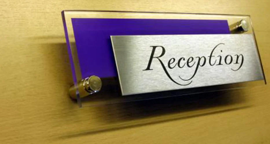
Office reception signage commonly includes:
- company logo
- company name
- suite identification
- reception or check-in instructions
- visitor policies
- digital check-in information
- directional information when reception serves several departments
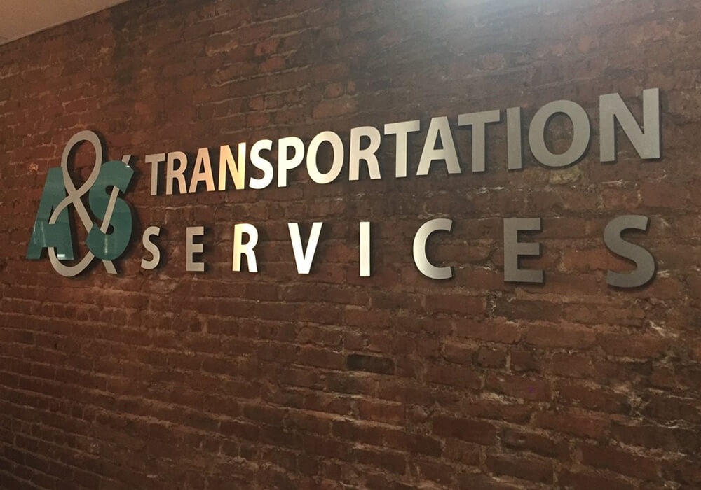
The logo sign often becomes the visual focal point.
But reception signage should also consider function.
If visitors enter from the side, a perfectly centered wall sign may not be visible immediately.
If reception is shared by several businesses, company identification may need to appear before the desk.
If the office has a self-check-in process, the instructions should be obvious before the visitor begins asking for help.
The best reception signs combine branding with clear orientation.

Make the Main Destination Obvious Before Adding Details
Office signs become harder to use when they try to communicate too much at once.
A visitor entering a corporate floor may see a directory containing:
- every employee
- every department
- every room
- every shared space
- several arrows
- building policies
- emergency information
All of that may be useful somewhere.
It does not all belong on one sign.
A simple hierarchy works better.
First level
Where is the visitor generally going?
- Reception
- Human Resources
- Sales
- Training Center
- Conference Rooms
- Executive Offices
Second level
Which specific area or room?
- Conference Room A
- Interview Room 2
- Suite 405
- HR Reception
Final level
Confirmation.
- Room number
- Department name
- Person or function
The information should become more specific as the visitor gets closer.

Employees Need Signage Too
Wayfinding is not only for guests.
Employees benefit from clear office signage in several situations.
New hires
New employees may spend their first weeks learning:
- departments
- meeting rooms
- shared equipment
- stairways
- breakout spaces
- storage
- restrooms
- emergency routes
Growing companies
As teams move or new departments are created, employees may no longer know where everything is.
Hybrid workplaces
Employees who visit the office only a few days each month can become almost like visitors themselves.
Large corporate campuses
Employees moving between floors or buildings may rely on the same directories and directional signs as guests.
Shared offices
Coworking and multi-company offices need clear identification for:
- meeting rooms
- private suites
- shared kitchens
- phone booths
- print areas
- event spaces
The workplace should not assume that everyone using it is familiar with the layout.
Department Signage Reduces Repeated Questions
Large offices often have departments that occupy separate zones.
Examples include:
- Human Resources
- Finance
- Marketing
- Legal
- Operations
- Sales
- IT
- Customer Support
Department signage can help both staff and visitors understand the structure of the office.

It may appear:
- at corridor entrances
- above work zones
- near reception points
- on glass partitions
- outside departmental suites
The design should be visible without making an open office feel like a shopping center.
In many corporate interiors, subtle but consistent identification works better than oversized signage.
Conference Rooms Need a Naming System People Can Learn
Conference-room signage seems simple until a company has ten or twenty rooms.
Problems arise when room names follow no pattern.
One room is called Hudson.
Another is Boardroom 2.
Another is Blue Room.
Another is CR-14.
Employees may eventually learn the names, but visitors and new hires struggle.
A better system might organize rooms by:
Numbers
- Conference 201
- Conference 202
- Conference 203
Letters
- Meeting Room A
- Meeting Room B
- Meeting Room C
A themed naming system
If a company prefers names, the pattern should be consistent and easy to communicate.
For example, all conference rooms might use New Jersey city names, landmark names, or product names.
The sign should still make the room easy to identify in an invitation or direction.

A meeting invitation saying Conference Room B is usually easier for a guest than saying The Edison Room unless the office has good wayfinding supporting that name.
Shared Spaces Need Clear Identification
Modern offices contain many spaces beyond traditional offices and conference rooms.
These may include:
- phone rooms
- wellness rooms
- mother’s rooms
- collaboration areas
- quiet zones
- huddle rooms
- kitchens
- cafés
- print rooms
- copy rooms
- lockers
- mail rooms
- training areas
Some of these spaces may also have accessibility or permanent-room signage requirements depending on their use.
Clear identification helps employees understand how each room is intended to function.
It also prevents a frequent office problem: people opening several doors to find the right space.
Delivery and Vendor Signage Should Not Be Forgotten
Clients are not the only visitors.
Commercial offices regularly receive:
- food deliveries
- couriers
- office supplies
- maintenance staff
- IT contractors
- cleaning vendors
- furniture installers
- service technicians
These visitors may need a different route.
Possible signs include:
- Deliveries
- Loading Entrance
- Vendor Check-In
- Service Entrance
- Receiving
- Mail Room
- Freight Elevator
If the delivery route is not obvious, drivers often end up at the client reception desk.
That creates unnecessary interruption for front-office staff.
Operational wayfinding should be part of the office signage plan.
Visitor Policies Need a Clear Home
Some offices have security or visitor procedures such as:
- check in at reception
- wear visitor badge
- wait for escort
- no photography
- restricted-access areas
- delivery instructions
These messages should be placed where the visitor can act on them.
A policy sign hidden behind reception is too late if the visitor needed to check in before passing the desk.
At the same time, the entrance should not become a wall of warning signs.
Group policies logically and keep priority information easy to scan.
Security Signage Should Be Clear Without Making the Office Hostile
Security and hospitality can work together.
Signs may need to communicate:
- Employees Only
- Authorized Personnel
- Badge Access Required
- Visitors Please Check In
- Restricted Area
The wording and visual treatment should match the environment.
A law firm, medical office, warehouse office, and technology company may all need access-control signs, but the tone can differ.
Good signage communicates the rule clearly without making every visitor feel as if they entered a secure industrial facility.
Glass Offices Create New Signage Opportunities
Many modern workplaces use:
- glass conference rooms
- glass office fronts
- glass entry doors
- glass partitions
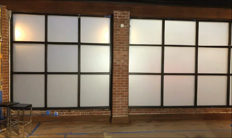
These surfaces can support both identification and privacy.
Common applications include:
- room names
- department identification
- frosted privacy bands
- logos
- decorative patterns
- safety markings on large glass surfaces
Glass signage should consider what is visible from both sides.
A graphic that looks correct from the corridor may appear reversed or visually awkward from inside the room.
Privacy needs should also be reviewed based on room function.
A conference room used for confidential meetings may need more privacy than a casual collaboration space.
Wayfinding Should Reflect How the Office Actually Operates
Floor plans show walls.
They do not always show behavior.
Employees may create informal routes that differ from the architectural plan.
A hallway may look like the main route on paper but be avoided because a large department occupies it.
One elevator may be used for visitors while another is primarily used by employees.
A door shown as an entrance may remain locked most of the day.
Before planning directional signs, observe how the space is actually used.
Ask staff:
- Where do visitors usually get lost?
- Which rooms are difficult to explain?
- Where do delivery drivers go by mistake?
- Which entrances create confusion?
- What directions does reception repeat every day?
These questions reveal practical sign needs quickly.
Corporate Office Signage Should Feel Consistent Across Locations
Companies with multiple offices often struggle with inconsistency.
One location may use:
- brushed metal room signs
while another uses:
- printed acrylic
and a third uses:
- generic plastic holders
Some variation is unavoidable because buildings differ.
But the company can still establish standards for:
- typography
- colors
- room naming
- logo use
- icons
- sign proportions
- finish families
- directory style
This creates a recognizable workplace experience without requiring identical signs in every building.
For companies expanding into new locations, signage standards also make future planning easier.
Temporary Signage Should Still Look Intentional
Offices change frequently.
A room may be temporarily reassigned.
A department may move during renovation.
An event may need temporary directions.
A new tenant may move in before permanent signs are complete.
Temporary signs are sometimes necessary.
But a printed sheet taped to a wall can easily remain for months.
A better office system can include planned temporary formats such as:
- changeable holders
- printed inserts
- temporary vinyl graphics
- freestanding directional signs
- modular sign frames
Temporary does not have to mean improvised.
Plan for Accessibility From the Beginning
Accessibility should be part of the sign plan rather than a final check.
Depending on the room and application, permanent signs may have requirements involving:
- tactile text
- Braille
- contrast
- non-glare finish
- mounting location
- character size
Directional and informational signs may also need to be designed with accessibility in mind.
This affects layout, materials, mounting, and sometimes room naming.
If accessibility requirements are considered after decorative signs are already designed, the office may end up with two visual systems that do not match.
Planning them together creates a more coherent result.
Interior Office Signage Should Be Easy to Maintain
Office signs are touched, cleaned, changed, and sometimes damaged.
Consider how each sign will age.
Ask:
- Will this surface show fingerprints?
- Can housekeeping clean it safely?
- Can a tenant name be replaced?
- Can the room name change?
- Will adhesive damage the wall?
- Can the sign be removed during a renovation?
- Will the finish still look appropriate after several years?
High-touch signs and frequently updated directories may need different materials than a permanent wall logo.
Common Office Signage Problems
Visitors cannot identify the correct company
Building directories or suite identification may be weak.
The lobby looks branded but the rest of the office does not connect
The sign family stops at reception.
Conference rooms have confusing names
The room system grew without a standard.
Employees repeatedly give directions
A sign may be missing at a decision point.
Vendors enter through reception
Operational signs are incomplete.
Temporary signs become permanent
No changeable sign format was planned.
Departments use different sign styles
Individual teams created their own signs over time.
ADA signs look unrelated to the office
Accessibility signage was ordered separately.
Directories are outdated
There is no easy update method.
Glass graphics block too much or too little
Privacy was considered only after installation.
A Practical Office Signage Audit
You can learn a lot about an existing office by walking it in several roles.
Walk it as a client
Can you find reception and the meeting room?
Walk it as a new employee
Can you find departments, shared rooms, and amenities?
Walk it as a delivery driver
Can you find the correct receiving point?
Walk it as a vendor
Do you know where to check in?
Walk it after normal business hours
Are entrances and exits still clear?
Walk it without asking questions
Every time you feel tempted to ask someone for directions, note the location.
Those are likely sign opportunities.
A Simple Planning Checklist for Employees and Visitors
Arrival
- Is the business easy to identify?
- Is visitor parking clear?
- Is the correct entrance obvious?
Reception
- Does the company name confirm arrival?
- Are check-in instructions easy to see?
- Does reception know where visitors commonly get lost?
Navigation
- Are major departments identified?
- Are directional signs placed before turns?
- Are conference rooms easy to find?
- Are elevators, stairs, and restrooms clear?
Employees
- Can new hires understand room and department names?
- Are shared spaces identified?
- Do hybrid workers need additional orientation?
Vendors
- Are delivery and service routes clear?
- Is receiving identified?
- Are restricted areas marked?
Accessibility
- Have permanent-room requirements been reviewed?
- Do signs have readable contrast and placement?
Maintenance
- Can directories be updated?
- Can temporary information be displayed professionally?
- Are frequently touched signs easy to clean?
Office Signage Should Reduce Questions, Not Create More of Them
A useful office sign system makes the workplace easier to understand for people who already know it and people seeing it for the first time.
Employees should be able to identify spaces quickly.
Visitors should reach meetings without depending on reception for every turn.
Vendors should know where to check in.
Deliveries should go to the right entrance.
Room names should make sense.
Directories should stay current.
The brand should feel consistent from reception through the rest of the office.
That does not require filling every wall with signs.
It requires putting the right information where people actually need it.
Gogi Signs has been working with New Jersey businesses since 2005, helping companies plan and produce office, interior, directional, and branded signage. If an office has grown beyond a few room labels and a reception logo, the next step is to look at the workplace as a full user journey—from arrival to destination and back again.