Interior Sign Planning for Offices and Commercial Buildings

Office signage planning and installation

Office signage often gets treated as a finishing detail.

The walls are painted. Furniture is installed. The reception desk is in place. Teams have moved in. Then someone asks:

What signs do we still need?

That is usually when problems become obvious.

Visitors cannot tell which suite belongs to the company. The lobby has a logo, but the hallways have no directional signs. Meeting rooms are labeled inconsistently. ADA signs were ordered separately and do not match the rest of the interior. A directory was installed before tenant names were finalized. Employees know the building well, so no one noticed that first-time visitors regularly take the wrong corridor.

A good office sign program avoids this by planning the interior as a connected system.

For corporate offices, professional buildings, multi-tenant properties, medical offices, coworking environments, and other commercial interiors, the purpose of signage is not simply to decorate walls. It should identify the business, guide people through the space, support accessibility, communicate room functions, and reinforce the brand without making the environment feel cluttered.

At Gogi Signs, we have been producing commercial signage for New Jersey businesses since 2005. One thing we see repeatedly is that the most useful office signage is planned around how people actually enter, move through, and use the space.

That starts before choosing materials.


What Office Signage Usually Includes

The exact sign package depends on the building, but interior office signage commonly includes:

  • Lobby and reception signs
  • Suite identification
  • Building directories
  • Tenant directories
  • Floor directories
  • Directional signs
  • Wayfinding signs
  • Department signs
  • Meeting room signs
  • Conference room signs
  • Office identification
  • ADA-compliant room signs
  • Restroom signs
  • Elevator and stair identification
  • Regulatory signs
  • Wall graphics
  • Branded interior graphics
  • Donor or recognition displays
  • Temporary changeable signs

Some offices need only a few of these.

Others require a full signage system that extends from the building entrance to individual rooms.

The key is to identify what each sign needs to accomplish.


Start With the Visitor Journey

A sign plan should follow the path of a first-time visitor.

For a typical office, that journey may look like this:

  1. Arrive at the building.
  2. Confirm the correct entrance.
  3. Enter the lobby.
  4. Find the company or suite.
  5. Reach the correct floor.
  6. Locate reception.
  7. Find a meeting room or department.
  8. Find restrooms or elevators.
  9. Return to the exit.

Every transition creates a potential point of confusion.

Employees may not notice these problems because they already know the building.

Visitors do not.

A practical office signage plan asks:

  • Where will someone pause?
  • Where will someone need to make a decision?
  • What information should be visible before that decision?
  • What confirmation does the visitor need after turning or changing floors?

This same principle is central to large-property navigation, which we cover in Creating a Signage System for Large Buildings.


The Reception Area Sets the Tone

Office reception signage has two jobs.

First, it confirms that the visitor reached the correct company.

Second, it creates the first interior expression of the brand.

Office reception signage

This is why reception and lobby signs often receive more design attention than other interior signs.

Common approaches include:

  • Dimensional letters
  • Acrylic logo signs
  • Metal lettering
  • Standoff signs
  • Backlit logo signs
  • Printed wall graphics
  • Custom fabricated logo displays

The right choice depends on:

  • wall size
  • viewing distance
  • lighting
  • interior finishes
  • brand personality
  • budget
  • installation conditions

A large polished-metal logo may make sense in a corporate headquarters.

A smaller dimensional acrylic sign may be enough for a professional office.

The scale should fit the wall and the room.

A logo that feels large in a design proof may look undersized on a 20-foot reception wall.


Reception Signs Should Work With the Interior, Not Fight It

The sign should feel intentional within the room.

Look at:

  • wall color
  • desk location
  • ceiling height
  • lighting
  • furniture
  • architectural details
  • sightlines from the entrance

If the reception desk blocks the lower half of the wall, the logo may need to be mounted higher.

If the visitor enters from an angle, the best sign location may not be centered on the wall.

If the wall has heavy texture, thin lettering may not create enough separation.

Good office reception signage is part of the space rather than an object added to it.


Directories Need to Be Easy to Scan

Directories are especially important in:

  • multi-tenant office buildings
  • medical buildings
  • law offices
  • coworking spaces
  • professional centers
  • government facilities
  • mixed-use properties

A directory should help the visitor answer one question quickly:

Commercial office tenant directory

Where is the company, person, or department I need?

That means information should be organized logically.

Possible structures include:

Alphabetical by company

Useful when visitors know the tenant name.

By floor

Useful in multi-story buildings.

By department

Useful in corporate or institutional environments.

By suite number

Useful when visitors already have an appointment address.

The best system depends on what information visitors usually know before arriving.


Plan Directories for Change

Tenant names change.

Departments move.

Companies expand.

Staff changes.

A directory that looks polished on installation day can become messy if updates require adhesive patches or handwritten labels.

For frequently changing information, consider:

  • removable inserts
  • changeable panels
  • modular systems
  • printed replacement strips
  • magnetic components

Permanent elements can still use more fixed materials.

The sign system should distinguish between information that is stable and information that will change.


Wayfinding Should Be Placed at Decision Points

Directional signs are most useful where someone must choose a path.

Examples include:

  • lobby intersections
  • elevator exits
  • long corridors
  • hallway junctions
  • stair landings
  • reception areas
  • transitions between departments

The sign should appear before or at the decision.

Office wayfinding directional signs

A directional sign installed after the visitor has already turned does not help much.

For each location, ask:

  • What choices exist here?
  • Which destinations matter?
  • How far away will the sign be read?
  • Is the visitor walking or standing?
  • Does the information need to be repeated later?

The answer determines content, size, and placement.


Keep Directional Information Simple

Office interiors can contain dozens of destinations.

Trying to list all of them on every sign makes the system harder to use.

Organize information by levels.

Building level

  • Main Lobby
  • Elevators
  • Parking
  • Conference Center

Floor level

  • Suites 300–340
  • Human Resources
  • Accounting
  • Executive Offices

Final destination

  • Suite 318
  • Conference Room B
  • Marketing
  • Reception

Give visitors the amount of information they need at that moment.

Not everything at once.


Room Identification Needs Consistency

Meeting rooms, offices, conference rooms, storage rooms, break rooms, restrooms, and departments should follow a consistent naming and numbering system.

For example:

  • Conference Room A
  • Conference Room B
  • Conference Room C

is easier to understand than:

  • Boardroom
  • Blue Room
  • Meeting 3
  • Executive Room

unless those custom names are part of a deliberate system.

The same applies to office numbering.

A predictable sequence helps visitors and employees understand the building.


ADA Signage Should Be Planned With the Interior System

Accessibility signage should not be left until the end as a separate visual project.

Permanent rooms and spaces may require signs with specific accessibility characteristics.

Depending on the application, requirements can involve:

  • tactile characters
  • Braille
  • contrast
  • non-glare finishes
  • mounting height
  • mounting location
  • character sizing

The exact requirements depend on the sign and space.

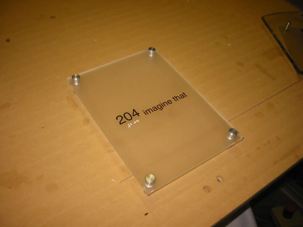
From a design perspective, the important point is that ADA signs can still belong to the same visual family as the rest of the office signage.

Colors, materials, shapes, and layout can be coordinated while meeting applicable requirements.


Office Signage Should Support Brand Consistency

Corporate office signage is one of the most visible physical expressions of a brand.

That does not mean every sign should carry the logo.

It means the system should feel related.

Consistency can come from:

  • color palette
  • typography
  • icon style
  • material choices
  • edge shapes
  • mounting methods
  • spacing
  • finish
  • tone of language

A lobby sign may feature the full logo.

Directional signs may use only brand colors and typography.

ADA room signs may use the same general material family.

The result should feel like one system.

Consistent interior office signage


Interior Branding Should Have a Purpose

Wall graphics and branded interior displays can add personality to an office, but they should support the environment.

Common uses include:

  • company mission statements
  • timelines
  • brand graphics
  • product photography
  • city imagery
  • value statements
  • milestone walls
  • recognition displays

The strongest applications are usually tied to a meaningful location.

A company timeline may work well in a client corridor.

A mission statement may fit near reception.

A large graphic may make sense in a collaborative space.

Branding every empty wall can make the office feel visually noisy.


Think About Privacy

Interior office signage sometimes intersects with privacy needs.

Examples include:

  • frosted glass graphics
  • conference room privacy bands
  • office-door frosting
  • privacy films
  • decorative glass graphics

These can help manage visibility while keeping glass partitions and doors consistent with the brand.

For meeting rooms, the placement of frosting should consider both privacy and visibility.

A full opaque treatment may provide privacy but make the space feel closed.

A partial band may be enough in another office.

The right treatment depends on how the space is used.


Office Signs Need to Match Viewing Distance

A meeting-room sign read from three feet away can use smaller text than a directional sign viewed from across a lobby.

That sounds simple, but office sign systems sometimes use the same text size everywhere.

Think about:

  • viewing distance
  • approach angle
  • lighting
  • hallway width
  • wall color
  • pedestrian speed

Directional information needs to be seen sooner.

Room identification is read closer.

Directories may require several levels of text size.

Each sign type should be designed for how it is actually used.


Materials Should Match the Sign’s Job

Interior office signs can use many materials.

Common choices include:

  • acrylic
  • aluminum
  • dimensional letters
  • vinyl graphics
  • printed panels
  • engraved materials
  • layered sign systems
  • metal finishes

The material choice should consider:

  • brand
  • durability
  • cleaning
  • replacement frequency
  • changeability
  • mounting surface
  • budget

A permanent lobby logo and a frequently changing tenant directory do not need the same construction.


Plan Installation Before Finalizing the Design

Interior installation can affect the design.

Consider:

  • wall type
  • glass
  • studs
  • electrical access
  • furniture
  • elevators
  • security
  • occupied workspaces
  • installation hours
  • access restrictions

A heavy dimensional sign may require different mounting than a light acrylic panel.

A backlit logo may require electrical coordination.

A wall graphic may require a properly prepared painted surface.

A sign mounted behind a reception desk may need to be installed before furniture is fixed in place.

Planning these details early avoids unnecessary disruption.


Construction Schedules Matter

For new offices and renovations, signage is often one of the final trades on site.

But design decisions need to happen earlier.

Waiting until the last week can create problems with:

  • approvals
  • fabrication time
  • ADA review
  • electrical work
  • wall preparation
  • access
  • contractor coordination

A better process is to identify signage needs during the interior planning phase, even if installation occurs near the end.

This allows the sign package to be coordinated with:

  • architectural drawings
  • finish schedules
  • electrical plans
  • room names
  • tenant requirements
  • occupancy timelines

Common Office Signage Mistakes

Planning only the lobby sign

A strong reception logo cannot solve missing room identification or poor wayfinding.

Adding directions after people complain

The need for directional signage can often be identified before move-in.

Inconsistent room names

If internal documents say “Conference B” but the sign says “East Meeting Room,” visitors and employees receive conflicting information.

Tiny directory text

Directories need to be readable in the environment where they are installed.

No plan for tenant changes

Fixed directories can become expensive to update.

Ordering ADA signs separately

They may end up looking unrelated to the rest of the interior.

Too much branding

Every wall does not need a logo or slogan.

Poor sign placement

A sign hidden behind an open door or installed beyond a decision point is not useful.

Ignoring installation conditions

Wall construction and access can affect mounting.

Waiting until the end of construction

Late planning creates rush decisions.


A Practical Office Signage Planning Checklist

Before approving an office signage package, review the following.

Arrival

  • Can visitors identify the correct suite or business?
  • Is the entrance clear?
  • Does the building directory need updating?

Reception

  • Is the logo sign visible from the entrance?
  • Is it correctly scaled for the wall?
  • Does it fit the interior finishes?

Navigation

  • Are elevators and stairs easy to locate?
  • Are hallway intersections signed?
  • Do visitors know where to go after leaving the elevator?
  • Are departments and suites clearly grouped?

Rooms

  • Are room names and numbers consistent?
  • Which rooms require permanent identification?
  • Which signs may need accessibility features?

Branding

  • Are colors, typography, and materials consistent?
  • Do directional signs fit the brand without becoming hard to read?
  • Are wall graphics used purposefully?

Updates

  • Which information changes frequently?
  • Can directories or tenant signs be updated easily?
  • Can the system expand later?

Installation

  • What are the mounting surfaces?
  • Is electrical work needed?
  • Are there occupied-space restrictions?
  • Does installation need to happen after hours?

Office Signage Works Best When It Is Planned as One System

A good office sign program should make the space easier to understand without demanding attention.

Visitors should know where to enter.

They should recognize the company when they arrive.

They should find the right floor, department, or meeting room without asking for directions.

Required room signs should be integrated into the visual system.

Directories should be easy to update.

Branding should support the interior rather than overwhelm it.

That outcome requires planning the signs together.

For a new office, signage should be considered while the interior is still being designed.

For an existing office, the best starting point is often a walkthrough from the visitor’s perspective.

Where do people hesitate?

Where do they ask questions?

Which signs are outdated?

Which destinations are hard to find?

Those observations reveal where signage can do useful work.

Gogi Signs has been helping New Jersey businesses plan, produce, and install commercial signs since 2005. Whether the project involves a new headquarters, office renovation, tenant move, reception area, or property-wide interior signage update, the goal is the same: create a sign system that makes the space easier to use and keeps the brand consistent from the entrance to the final room.

Share Now:

Leave a Reply

Your email address will not be published. Required fields are marked *

Recent Posts

Gogi Signs
Contact Details
Why Choose Gogi Signs?
Request a Service
Do you have a file to share?
Contact Details
Gogi Signs
Contact Form
Please submit the form below for your general questions.
Do you have a file to share?