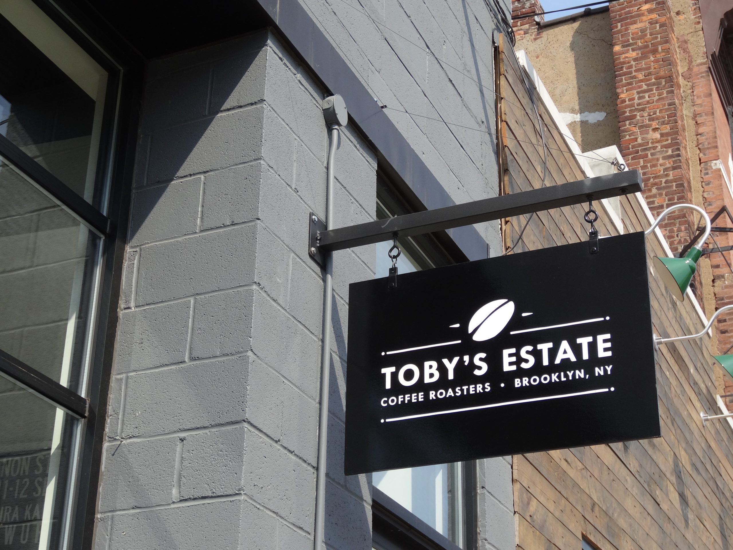
Customers make judgments before they have complete information.
They look at the condition of a property, the ease of the entrance, the clarity of the signs, and whether the physical environment matches what they expected. Those observations do not prove how well a company performs, but they shape the attitude with which the customer begins the interaction.
Signage is one of the most visible pieces of that evidence.
Customers Read Condition as a Signal
A faded sign does not necessarily mean a business provides poor service. A missing letter does not reveal the quality of its products. Even so, customers can interpret visible neglect as a sign that details are being missed elsewhere.
The opposite is also true. Clean, current, well-maintained signage suggests that the property is actively managed. It does not need to be elaborate or expensive. Fit, finish, legibility, and condition usually communicate more than decorative complexity.
This is why routine maintenance matters to perception. Dirt, peeling vinyl, failed lighting, obsolete tenant names, and temporary repairs gradually change how the business presents itself.
Clarity Feels Professional
People often describe a property as professional when it is easy to understand.
The business name is visible. Parking and entrances are marked. A directory reflects current tenants. Interior signs use consistent room names. Visitors can reach their destination without asking several people for help.
None of these details is dramatic. Together, they communicate that the organization has anticipated the visitor’s needs.

Confusion creates the opposite impression. Contradictory arrows, unexplained abbreviations, outdated information, and homemade notices suggest that the environment has developed without a clear owner.
Materials Set Expectations
Customers notice materials even when they do not know their technical names.
A dimensional metal or acrylic lobby sign may communicate permanence and precision. Painted graphics can feel integrated with the architecture. Printed vinyl can deliver color and detail. A changeable panel system can communicate order in a property where names need frequent updates.
No material automatically creates a premium impression. The specification needs to suit the setting and the promise of the business. A deliberately simple sign can feel appropriate for a practical service company, while an ornate sign may feel out of place. A high-end finish loses its effect if the scale, mounting, or surrounding area appears unresolved.
Material decisions should therefore begin with context: what customers expect, how close they will be, what the building already communicates, and how the sign will age.
Design Changes What Customers Assume
Typography, color, spacing, illumination, and scale influence the personality customers assign to a brand.
Large, high-contrast lettering may feel direct and accessible. Restrained typography and precise spacing can feel formal. Bright colors and energetic graphics may suit a family-focused or entertainment setting. A medical office may need a calmer and more legible approach.
These are not rigid rules. The same color or typeface can produce different impressions depending on how it is used. The important point is that design choices create expectations, whether the business planned them or not.
Readability remains the first requirement. A style that makes the name difficult to recognize sacrifices communication for personality.

Consistency Affects Confidence
A customer may encounter a business name on a map listing, website, exterior sign, entrance, directory, and reception wall within a short period.
When those touchpoints agree, the business feels coherent. When they use different names, old logos, or conflicting visual styles, the customer must decide whether they have found the right organization.
The inconsistency may be harmless—a rebrand in progress or an old tenant panel—but the customer does not have that context. Consistency removes a question that should never have been introduced.
This confidence works alongside the memory effects discussed in How Commercial Signs Build Brand Recognition.
Different Customers Read the Same Sign Differently
A regular customer already knows the entrance and may barely notice the exterior sign. A first-time visitor depends on it. An employee knows the building’s internal language. A delivery driver needs direct labels. A person with limited vision may require stronger contrast and more deliberate placement.
This means perception should not be judged only by the owner or design team. The sign must be evaluated from the positions, distances, and levels of familiarity that real users bring to the property.
Front-desk questions, delivery problems, customer feedback, and observations during a site survey can reveal how those audiences actually interpret the environment.
Signage Can Make a Business Feel More Approachable
Some commercial properties unintentionally feel closed or difficult to enter.
Tinted glass hides the interior. The primary door resembles a service entrance. Hours are missing. A tenant name appears only on a distant monument sign. The customer may be at the correct location but still hesitate.
Entrance identification, current hours, visible access instructions, and an orderly storefront reduce that hesitation. For retail and hospitality businesses, windows can also provide a useful glimpse of what is offered inside. For appointment-based businesses, the priority may be privacy combined with clear arrival instructions.
Approachability is not a single visual style. It is the absence of unnecessary doubt.

Expectations Begin Before the Customer Arrives
Customers often reach the property with an image of the business already in mind. They may have seen polished project photographs, a professional website, premium pricing, or reviews describing attentive service.
The physical setting either supports or challenges that image. A current and well-integrated sign makes the transition feel natural. An improvised entrance or visibly neglected identifier forces the customer to reconcile two versions of the company.
This does not mean every business needs expensive fabrication. Expectations should match the company’s position. A practical trade contractor may benefit more from direct, durable identification than decorative complexity. A hotel, design studio, or specialty retailer may need the environment to carry more visual character.
The relevant question is whether the signage feels intentional and appropriate for the experience being offered.
Message Hierarchy Shapes the Business’s Personality
The amount and order of information influence perception as much as color or material.
A sign crowded with services, claims, phone numbers, and promotions can feel anxious or unfocused. A sign with too little context may leave an unfamiliar name meaningless. The right balance depends on viewing time and what the audience already knows.
Hierarchy tells people what the organization considers important. A healthcare entrance that prioritizes department and access information feels different from one dominated by promotional copy. A restaurant window that makes the menu and entrance clear feels different from one covered edge to edge with competing offers.
Before adding information, decide what the customer should understand first, second, and only if they have time to continue reading.
Fabrication Quality Is Most Visible Up Close
Customers may not know the names of sign materials, but they can see alignment, finish, and fit.
Uneven mounting, exposed adhesive, rough edges, poorly matched repairs, and inconsistent spacing can undermine a premium substrate. Conversely, a modest material installed cleanly and suited to the environment can feel deliberate and credible.
The sign should also age in a way the business can maintain. A finish that requires frequent specialized care may be a poor choice if no one will own that maintenance. Replacement components and access requirements should be considered before installation, particularly for signs customers view from a few feet away.
Illumination adds another layer. Brightness, color temperature, halo effects, and uneven lighting change how the business appears after dark. A sign that feels restrained during the day may become visually dominant at night. Evening review is essential when nighttime customers form a meaningful part of the audience.
Privacy and Security Affect Perception
Some businesses must balance welcome with controlled access.
Privacy film, locked doors, intercoms, visitor check-in, and restricted routes can be necessary. Without clear signs, those measures may feel unfriendly or confusing. With appropriate instructions, the same controls communicate care and professionalism.
Tell visitors what to do before they encounter the barrier. Identify the intercom, state whether appointments are required, distinguish public and staff entrances, and explain where deliveries belong. Provide only the information the intended visitor needs without exposing sensitive operations.
Security messages can be firm without appearing improvised or hostile. Consistent wording and placement help the controls feel like part of a managed process.
Evaluate Perception With Better Questions
Owners are too familiar with their properties to judge them entirely from memory.
Photograph the approach from customer positions and compare those images with the current website and map listings. Ask staff which questions occur repeatedly. Read reviews for comments about finding, entering, or navigating the location. Invite someone unfamiliar with the site to follow the normal arrival instructions.
Do not ask only whether they like the sign. Ask what they believe the business is, where they would enter, what they expect inside, and which information they trust. Those answers reveal whether the signage creates the intended understanding.
When changes are made, document the same views again. Perception is subjective, but the conditions shaping it—legibility, condition, consistency, access, and information—can be observed and improved.

The Same Design Does Not Suit Every Setting
Customer expectations change by industry and type of visit.
A restaurant sign may need to communicate energy, visibility, and openness. A law or financial office may favor restraint and permanence. A pediatric facility can use warmth and color while still keeping directions clear. An industrial property may prioritize direct identification, safety, and separation of visitor and truck traffic.
Context within the same industry also matters. A neighborhood storefront, suburban professional building, hospital campus, and urban high-rise present different architecture, approach speeds, neighboring signs, and access patterns.
This is why copying a sign admired elsewhere can produce an unconvincing result. The material or style may be attractive, but the surrounding conditions and customer expectations may not match.
Begin with the audience, property, and promise of the business. Decide whether the primary impression should be approachable, precise, established, energetic, discreet, or highly visible. Then test whether the typography, color, scale, material, lighting, and condition support that direction without making communication harder.
Perception is strongest when the sign feels specific to the business and natural to the place where it appears.
Perception Should Match Reality
The purpose of signage is not to create an image the business cannot support. It is to present the real business accurately and confidently.
A growing company may need signs that reflect its current scale rather than the temporary identity it used when it opened. A longstanding business may need to preserve familiar elements while repairing signs that now appear neglected. A professional office may need clearer visitor guidance more than a dramatic visual change.
At Gogi Signs, we have worked with New Jersey businesses since 2005. We find that the most credible signage decisions begin with an honest question: what should a customer understand and expect before entering? The sign should make that answer easier to see.