People remember a shape and a color long before they remember a name.
Brand recognition is what happens when customers know a business before they read its name. They see a color, a logo shape or a familiar sign style and recognize it from the road, the parking lot or a van passing by. Commercial signs are one of the main places that recognition is built, because they repeat the same identity in front of local people every day.
This guide explains what makes a sign memorable, how to adapt a logo for signs, and how repetition across locations and vehicles turns a sign into recognition.
Recognition Starts With Distinctive Cues
| Cue | Why it helps recognition | How to use it on signs |
|---|---|---|
| Color | Seen first and from farthest away | Keep the brand color exact on every sign |
| Logo shape | Remembered even when text is too small to read | Use the symbol large, and consistently |
| Letter style | Becomes familiar with repetition | Use the same typeface or logotype everywhere |
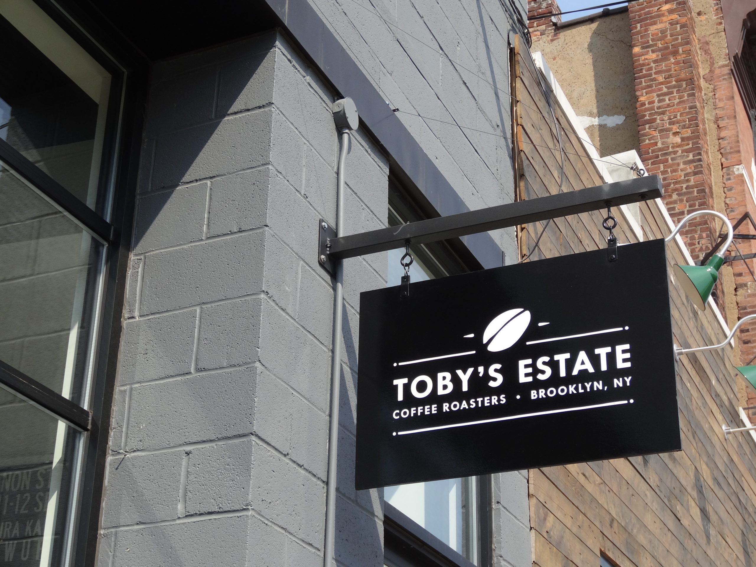
| Sign form | A recognizable format, such as a blade or a shaped cabinet | Repeat it at each location |
The strongest brands usually own one or two of these. A single color and a simple symbol, used the same way every time, do more for recognition than a busy logo with many details.
Adapt the Logo for Sign Scale
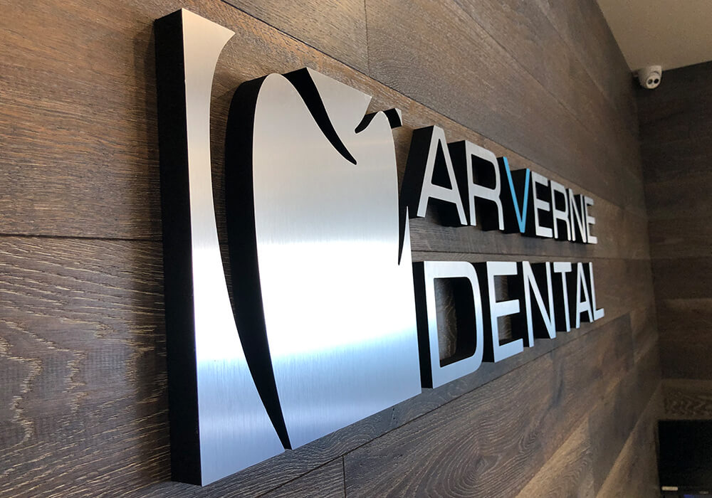
Logos are usually designed for screens and business cards, where people look closely. A sign is read from a distance and often at speed, so thin lines, small taglines and fine detail disappear. A sign version of the logo may simplify details, enlarge the symbol or drop the tagline, while keeping the shapes and colors customers know. Our guide on working with a professional sign designer explains how that adaptation works.

Readability Comes Before Memorability
A sign cannot be remembered if it cannot be read. Letter height must suit the viewing distance, and contrast must be strong enough in daylight and at night. The United States Sign Council Foundation publishes guideline standards for sizing on premise signs by viewing distance and speed, and our guide on sizing signs for viewing distance and speed puts them into practice.
Repetition Builds Familiarity
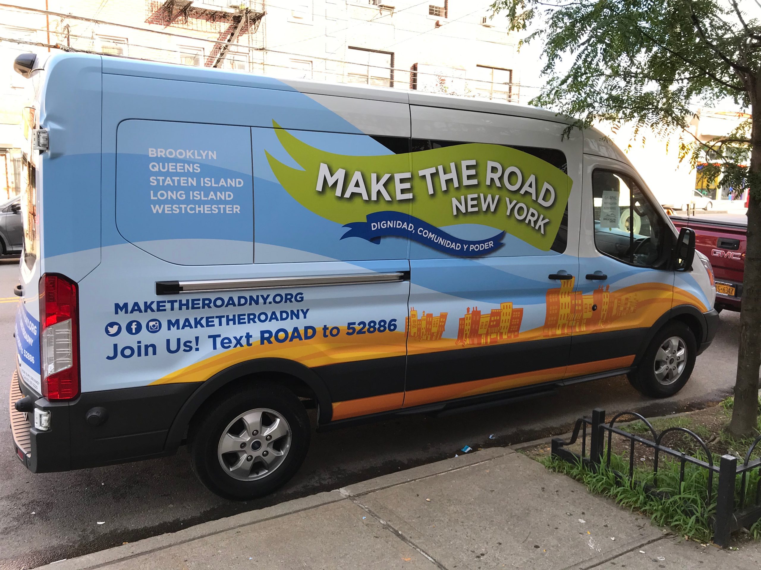
Recognition grows each time a customer sees the same identity. The storefront sign, the window graphics, the door, the interior, the vehicles and the online profile should all show the same logo and colors. A delivery van parked outside a customer’s home, wrapped in the brand colors, reinforces the storefront they drive past later. See our Fleet Wraps page for matching vehicles to your signs.

Location Becomes Part of the Brand
For local businesses, the place itself becomes part of what people remember, such as the corner with the blue storefront awning or the plaza with the bright red channel letters, whether that corner holds a Bayonne storefront sign or a Queens shop sign. Keeping the sign consistent and well lit keeps that landmark working. Changing it often, or letting it fade, makes customers look twice.
Growth Makes Recognition Harder to Protect
As a business adds locations, each site brings a different facade, landlord rules and local ordinances. Without a standard, each location ends up slightly different. A short sign standards guide keeps the cues the same while letting the format change. Our guide on how consistent signage builds customer trust explains what to include.
Protect Familiar Elements During a Rebrand
When a business updates its identity, keeping one familiar element, such as the color or the symbol, helps existing customers recognize the new signs. Our guide on rebranding without replacing every sign covers how to roll out changes.
Common Questions About Signs and Brand Recognition
How do signs build brand recognition?
By repeating the same colors, logo and style in front of local people every day, so they recognize the business before reading its name.
Should my sign use my exact logo?
Usually a sign version of it. Fine details and taglines may need simplifying so the logo stays clear at distance, while the shapes and colors stay the same.
What matters most for a memorable sign?
A distinctive color and a simple, clear shape, used consistently. Readability comes first, because a sign must be read before it can be remembered.
Do vehicle wraps help brand recognition?
Yes. Vehicles carry the same identity across your service area, so customers see the brand more often and in more places.
How can multiple locations stay recognizable?
With a short sign standard that fixes the logo, colors and fonts while letting sizes and sign types change for each building.
Will a rebrand lose recognition?
It can. Keeping one familiar element, such as the brand color or symbol, helps customers connect the old and new signs.
Signs People Recognize
Gogi Signs designs, builds and installs storefront signs, logo walls and vehicle graphics across New Jersey and New York City, keeping your colors, logo and style consistent everywhere they appear.
See our custom channel letters page for storefront options, then request a free quote.