Customers judge the price, quality and care of a business from its sign before they see anything else.
Signage and customer perception are closely linked, because the sign is often the first physical evidence a customer has about a business. Before they see a price or a product, they read the materials, the lettering, the lighting and the condition of the sign, and they form an expectation of what is inside.
That expectation works for you when the sign matches the business, and against you when it does not. A premium salon with a plastic banner looks cheaper than it is, while a value store with a hushed, minimal sign can look too expensive to walk into. This guide explains what customers read from a sign and how to match it to your positioning.
What Customers Read From a Sign
| Sign detail | What customers tend to infer |
|---|---|
| Materials | Price level and permanence |
| Lettering style | Personality, such as traditional, modern or playful |
| Lighting | Whether the business is open, and its energy |
| Amount of text | Clarity and confidence, or clutter |
| Condition | How much care goes into the whole business |
Materials Signal Price and Permanence
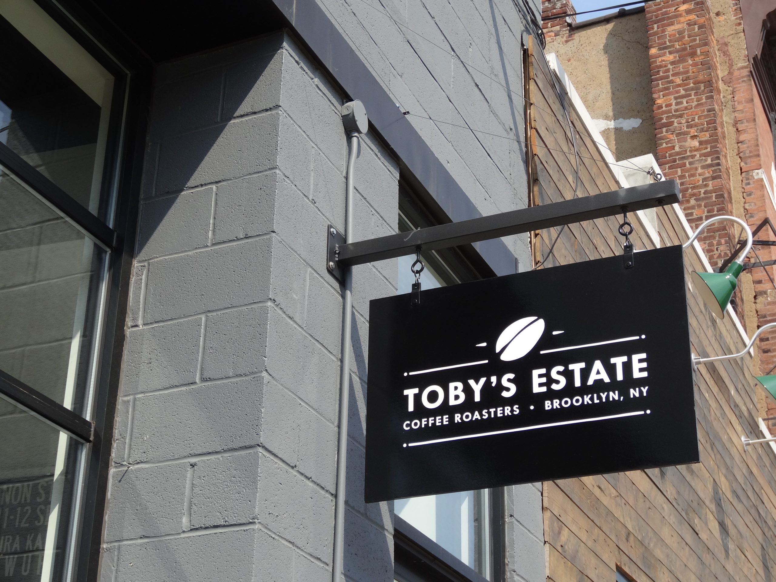
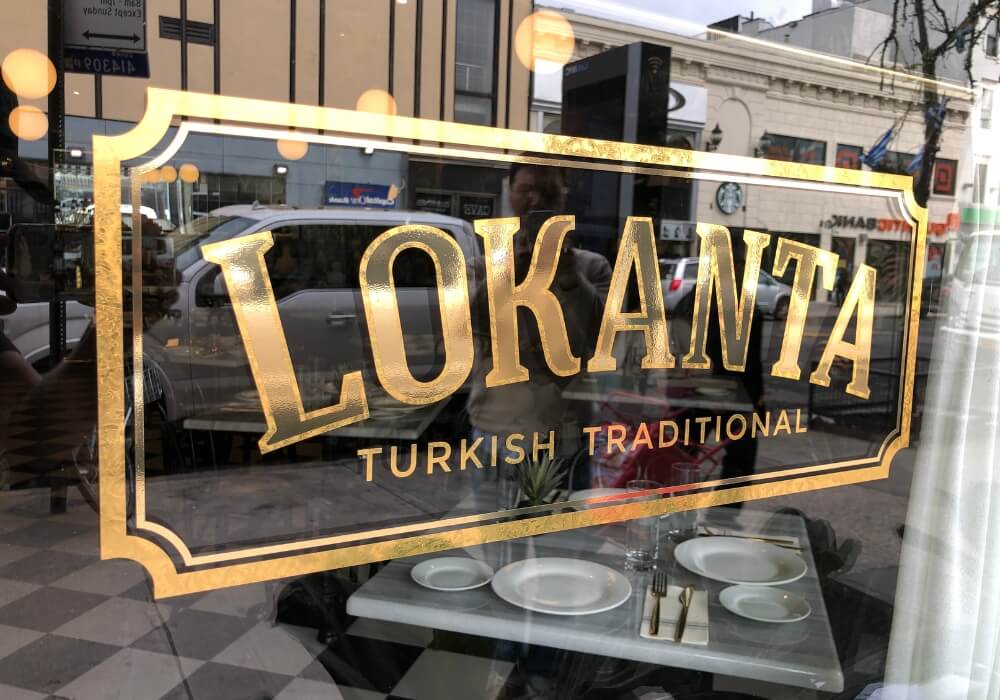
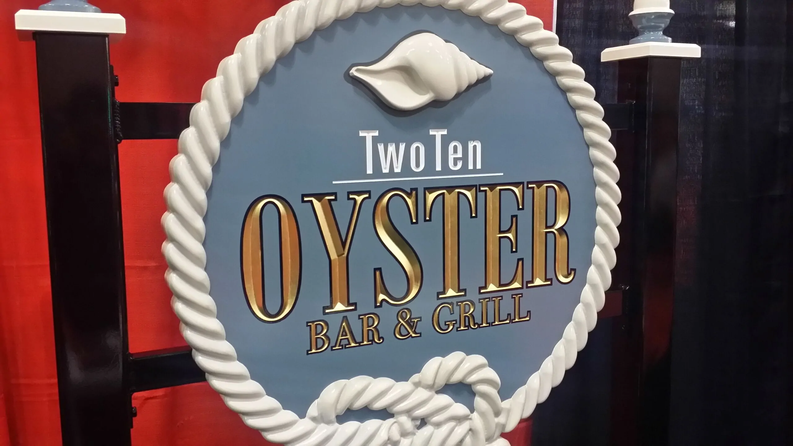
Brushed metal letters, dimensional letters and gold leaf suggest a settled, quality business, while a printed banner suggests something temporary. Neither is wrong, but the material should fit the promise. Gold leaf on glass, for example, signals tradition and craft, which suits a restaurant, barber or jeweler. See our Gold Leaf Decals page for that look.
Lettering Sets the Personality
A hand drawn script feels personal, a heavy sans serif feels direct and practical, and a classic serif feels established. The lettering should match how you want customers to feel, and it must still be readable at the distance people see it. Our guide on typography tips for readable business signs explains how to keep character without losing legibility.
Lighting Sets the Energy
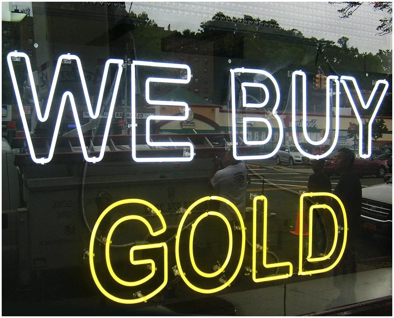
Bright, front lit channel letter signs and neon feel open, busy and energetic, which suits quick service, retail and nightlife. Soft halo lighting feels calm and refined, which suits offices, spas and upscale shops. Choose the lighting style for the mood as well as the visibility. Our guide on illuminated vs non illuminated signs covers the options.
Less Text Reads as More Confident
A sign crowded with services, phone numbers and slogans reads as busy and a little anxious. A sign that carries the name and one clear line reads as confident. Put the detail in windows and inside, where people have time to read it.
Condition Speaks for the Whole Business
Customers notice dark letters, faded faces and peeling vinyl, and many assume the inside is cared for to the same standard. Research summarized by the Signage Foundation on on premise signs supports what owners see every day, that the sign shapes how people judge a business. Keeping the sign in good repair is part of protecting that impression. Our guide on how to maintain outdoor business signs explains a simple routine.
Match the Sign to Your Positioning
- Premium retail and hospitality: metal or halo lit letters, gold leaf, restrained wording.
- Family restaurants: warm colors, clear lettering, a friendly, well lit storefront.
- Medical and professional offices: clean, calm signs that prioritize clarity and wayfinding, as around the hospital campuses served by our Morristown sign company and New Brunswick sign services.
- Fitness and youth brands: bold color, energetic type and strong lighting.
- Value retail: big, bright, easy to read signs that make the offer obvious.

The Sign Should Match the Experience
The best sign is honest. If the sign promises luxury and the store feels rushed, customers notice the gap. If the business is genuinely excellent and the sign is tired, customers may never find out. Our guide on how consistent signage builds customer trust explains how to keep the whole experience aligned.
Common Questions About Signage and Perception
Does my sign affect what customers think of my business?
Yes. Customers judge price, quality and care from the sign’s materials, lettering, lighting and condition before they see anything else.
What sign style looks most premium?
Usually dimensional metal or halo lit letters, gold leaf and restrained wording. The right choice still depends on your brand and building.
Can a sign look too expensive for my business?
It can. A very refined sign on a value business can make customers think prices are high, so match the style to your positioning.
Does a damaged sign really put customers off?
It often does. Dark letters and faded faces suggest the business is not looking after details, so repairs are worth doing promptly.
How much text should a storefront sign have?
Usually the name and one short line. More detail belongs in windows, on doors and inside.
Should my sign match my interior design?
Yes, ideally. Materials, colors and lettering that carry through from outside to inside make the experience feel consistent.
Signs That Set the Right Expectation
Gogi Signs designs and builds signs across New Jersey and New York City in materials and styles chosen to match your brand, from gold leaf glass to halo lit metal.
See our Sign Design page, browse the gallery of completed signs, then request a free quote.