ADA rules apply to the signs that identify permanent rooms and spaces, not to every sign in the building.
Accessible signage is a system, not a braille add on. The 2010 ADA Standards for Accessible Design identify where signs are required and set technical rules for tactile characters, braille, visual characters, pictograms, finish, contrast and mounting. Meeting ADA sign requirements depends on what each sign communicates.
This guide helps owners recognize the main categories and prepare better questions. It is not a substitute for review by the project’s architect, accessibility professional, code official or legal counsel. In New Jersey, accessibility for new construction and alterations is also enforced through the barrier free subcode of the state’s Uniform Construction Code.
ADA Sign Requirements at a Glance
| Sign category | Typical examples | Main requirement |
|---|---|---|
| Permanent room and space identification | Restrooms, room numbers, stairs, exits | Tactile characters, Grade 2 braille, set mounting height and location |
| Directional and informational | Directions to restrooms, departments, accessible routes | Visual characters with contrast, non glare finish and minimum height |
| Pictograms for permanent rooms | Restroom symbols | Pictogram field at least 6 inches high with a text descriptor below |
| Accessible parking | Accessible and van accessible spaces | Symbol of accessibility, lowest edge at least 60 inches above the ground |
| Outside the scoping requirement | Directories, menus, occupant names, logos, some temporary signs | Exception from these provisions, other rules may still apply |
First Classify the Sign by Its Job
The standards do not apply one identical format to every sign. Three categories are especially important.
Permanent Room and Space Identification
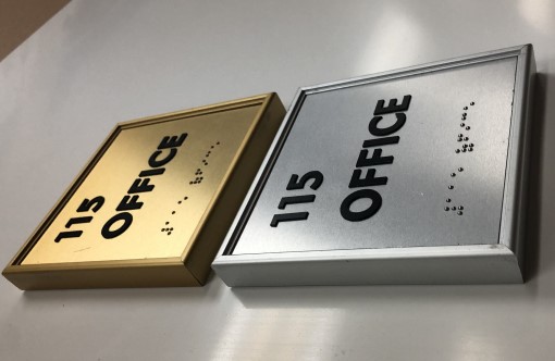
Signs identifying permanent rooms or spaces generally require tactile characters and braille. Typical examples include restroom identifiers, room numbers, stair identifiers and permanent room names. Where a pictogram designates a permanent room, it also has technical requirements and needs a tactile text descriptor.
Directional and Informational Signs
Signs directing people to rooms or providing information about interior spaces generally must meet visual character requirements. Examples include directions to restrooms, departments, accessible routes or exits. These are commonly visual rather than tactile, although the full code context matters.
Signs Outside the Scoping Requirement
The federal standards list exceptions, including building directories, menus, occupant names, company names and logos, and certain temporary signs. An exception from one ADA sign provision does not necessarily remove obligations under building, fire, accessibility or local rules.
The Technical Requirements
Tactile Characters and Braille
Tactile room signs use raised characters that can be read by touch. The standards control character case, style, proportions, height, stroke, spacing and line separation. Tactile characters are raised at least 1/32 inch, uppercase, between 5/8 inch and 2 inches high based on the uppercase letter I, and must use conventional, non italic, non script forms.
Braille must be contracted Grade 2 and positioned below the corresponding text according to the standards. It is not enough to paste generic braille beads under copy. The translation, dot shape, spacing, capitalization indicators and location all need to be correct.
Production artwork should be proofread in both print and braille. A misspelled room name is obvious to a sighted reviewer, while an incorrect braille translation may survive approval unless someone specifically checks it.

Mounting Height and Door Location
For tactile signs, the baseline of the lowest tactile character must be at least 48 inches above the finished floor or ground, and the baseline of the highest tactile character no more than 60 inches. This is a character based range, not a universal instruction to place the sign center at one height.
At a single door, a tactile sign is generally placed on the wall at the latch side. Rules also address double doors, doors without available latch side wall space and door swing. The required clear floor area must allow a reader to approach without standing within the door swing.
Field conditions matter. A designer should not finalize every sign location from a room list alone. Door handing, sidelights, casework, wall returns and door closers can change the correct placement.
Visual Readability
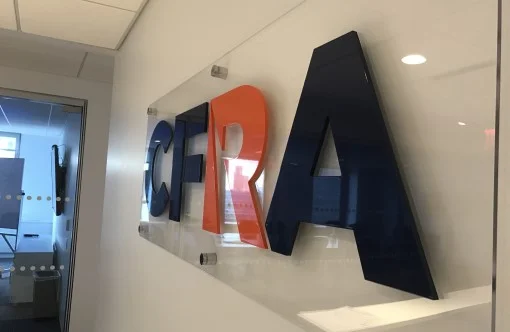
Visual characters must contrast with their background, using light on dark or dark on light, and both characters and background require a non glare finish. The standards also regulate character style, proportions, stroke, spacing, line spacing, height and placement.
Contrast is not limited to black and white. It means the characters can be readily distinguished from the field. A finish that looks sophisticated under sample room lighting may create glare in the installed corridor, so evaluate material, lighting direction, reflections and viewing angle together.
Character height for visual signs depends on mounting height and viewing distance. For signs mounted between 40 and 70 inches above the floor and read from less than six feet, the minimum is 5/8 inch, rising with distance. Do not use one small type size for an entire wayfinding sign program. Our guide to sign letter size and viewing distance explains the sizing.
Pictograms and Accessibility Symbols
Where a pictogram is used to designate a permanent room or space, it must appear within a field at least 6 inches high and have a text descriptor below the field. The International Symbol of Accessibility and other specified symbols must follow the applicable standard.
Custom decorative icons may be useful additions, but they should not distort or replace a required standardized symbol. Keep the regulatory symbol clear and use branded graphics in a supporting role. The U.S. Access Board’s guide to signs illustrates each requirement.
Common Errors to Prevent
- Adding braille to every sign without first classifying the sign.
- Mounting tactile signs on the door instead of at the required adjacent location.
- Measuring to the center of the panel rather than to the tactile character baselines.
- Using glossy metal or acrylic that produces distracting glare.
- Choosing decorative, condensed or italic type for regulated copy.
- Providing insufficient contrast because two brand colors are close in value.
- Omitting tactile exit door or stair information from the room schedule.
- Treating a paper proof as proof of compliant fabrication and placement.
- Failing to coordinate signs with door swings, glass sidelights and wall controls.
A Better Planning Workflow
- Start with the door and room schedule: identify permanent spaces, directional decisions, exits, areas of refuge, accessible entrances, restrooms, elevators and parking.
- Classify each sign: record its governing requirement, not just its message.
- Build prototypes: review character size, contrast, finish, tactile quality, braille, pictograms and mounting alongside the brand system.
- Get qualified review: have an accessibility or design professional approve the schedule and sample before the full package.
- Create a location plan: sign codes, copy, door relationship, mounting details and elevations.
- Inspect the installation: against that plan, door by door.
Accessibility can be lost in the final ten feet if an otherwise correct panel is mounted on the wrong side of a door.
Build a Sign Classification Schedule
Do not decide compliance from the message alone. Record the room or destination, whether it is permanent, whether the sign identifies or directs, whether a pictogram is used, the applicable character type, mounting condition and drawing reference.
| Sign condition | Planning question |
|---|---|
| Permanent room | Are tactile characters and braille required? |
| Directional information | Which visual character requirements apply? |
| Exit or stair condition | Which egress provisions govern? |
| Accessible entrance | Is identification and direction to the accessible route required? |
| Directory or occupant name | Does an exception apply, and do other rules still govern? |
| Temporary information | How long will it remain and what route must it protect? |
Inspect the Fabricated Sample
Check tactile height and profile, braille translation and dot form, spacing, contrast, glare, pictogram field, edge finish and mounting template. A digital proof cannot verify tactile or material performance. Use the actual wall color and expected lighting when reviewing contrast, because highly reflective metal, clear acrylic, patterned backgrounds and dramatic spot lighting can reduce readability even when the colors look separated on screen.
Control Substitutions
Material, typeface, paint, mounting hardware or panel size substitutions can affect compliance. Require the fabricator and contractor to route changes through the same review used for the original sample. At installation, compare each sign code and message with the location plan and photograph representative locations for the closeout record.
Accessibility and Brand Can Work Together
Compliance establishes minimum communication conditions. It does not require every facility to look identical. Brand character can appear through panel shape, carefully selected colors, secondary materials, border details, consistent layouts and non regulated companion graphics.
Protect the functional layer first: readable type, adequate contrast, correct tactile and braille execution and predictable placement. Then build the visual identity around it. See our ADA Signs page for formats, and our Egress Maps page for evacuation plans.
For a larger facility, connect these requirements to the route planning process in creating a signage system for large buildings. Office teams can apply the same discipline through our guide to interior sign planning for offices.
Common Questions About ADA Sign Requirements
Do all signs in my building need braille?
No. Braille and raised characters belong on signs identifying permanent rooms and spaces, such as restrooms, stairs, exits and numbered rooms. Directional and informational signs have visual requirements but do not need tactile characters, and temporary or promotional signage is outside the scoping requirement.
Where exactly should a room sign be mounted?
Beside the latch side of the door, not on the door itself, with tactile characters between 48 and 60 inches above the floor, positioned so someone can approach and touch it without the door swinging into them. Mounting on the door is the most common error, because the sign moves when the door does.
Can ADA signs match our brand?
Yes, within limits. The constraints are on character form, contrast, finish and mounting, not on color palette or material. A non glare finish with genuine light to dark contrast can still be produced in brand colors. What will not work is a low contrast tone on tone treatment or a decorative typeface.
Is a sign compliant because the supplier says it is?
Not reliably. Inspect a fabricated sample before the full run: check character height and form, braille position and dot quality, contrast and finish under the actual lighting. Substitutions made late in a job are a frequent source of non compliant deliveries.
What is the most expensive ADA mistake?
Ordering a whole building’s worth of signage before classifying the signs. If the schedule is wrong, the error is repeated across every sign and corrected by replacing all of them, usually after an inspection has already flagged it.
Interior Signage That Passes Inspection
Gogi Signs fabricates ADA compliant room identification, wayfinding and egress signage from our shop in Linden for offices, schools and medical buildings, from Trenton office signs to Camden building signage, and we produce a sample for approval before a building wide run. If you want the schedule checked before anything is made, we will walk the floor plan with you.
Request a free quote with your door schedule, or see our Office Signs range.